Waterrijk Community School
Waterrijk Community School
Waterrijk Community School

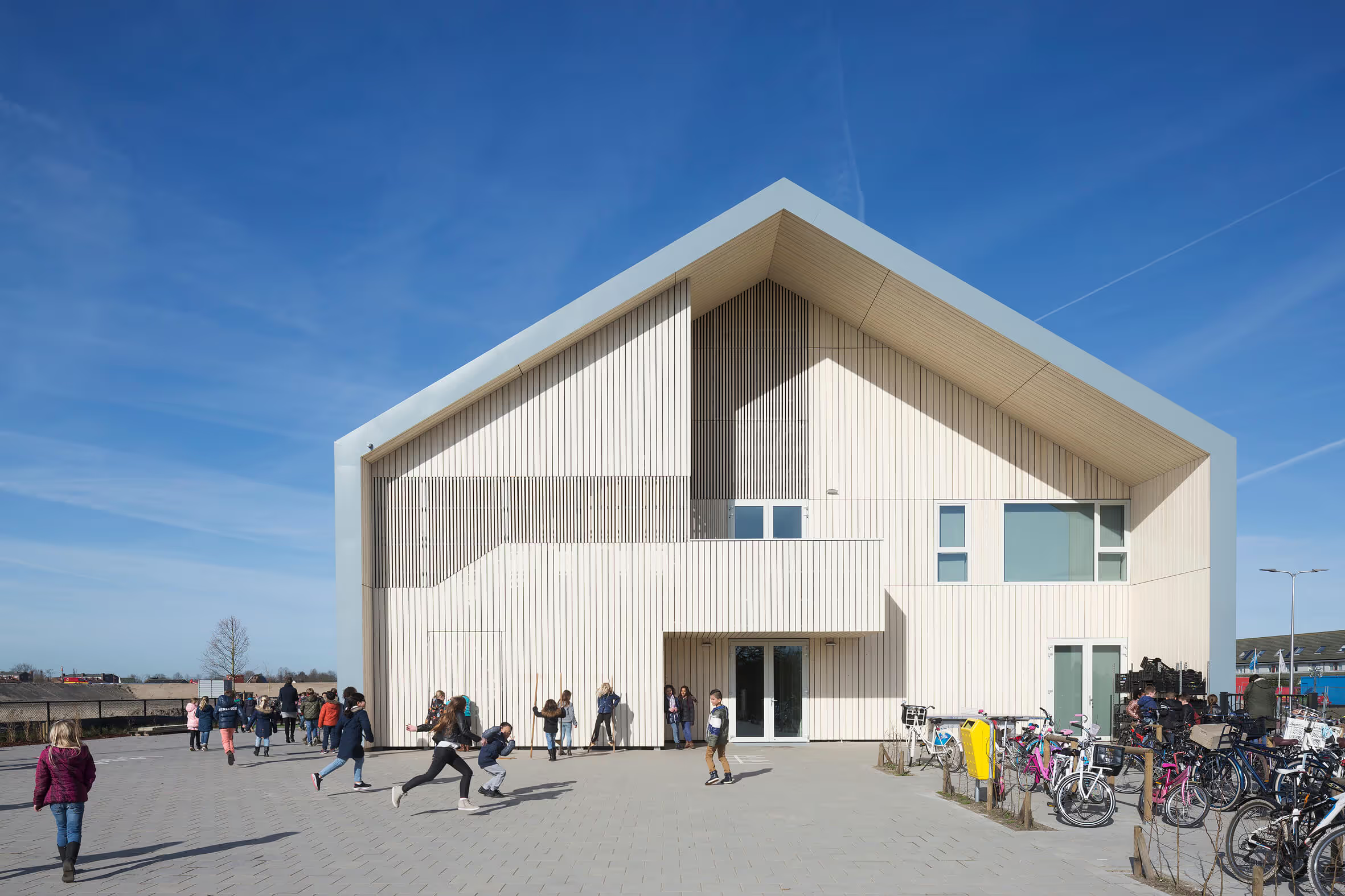
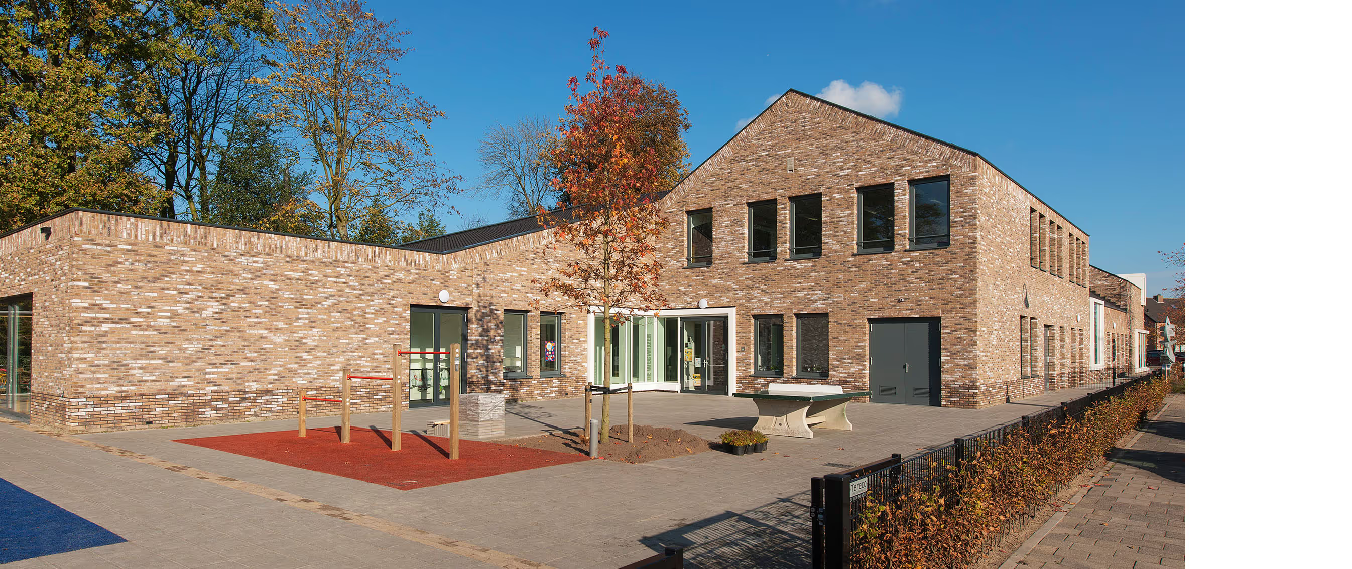
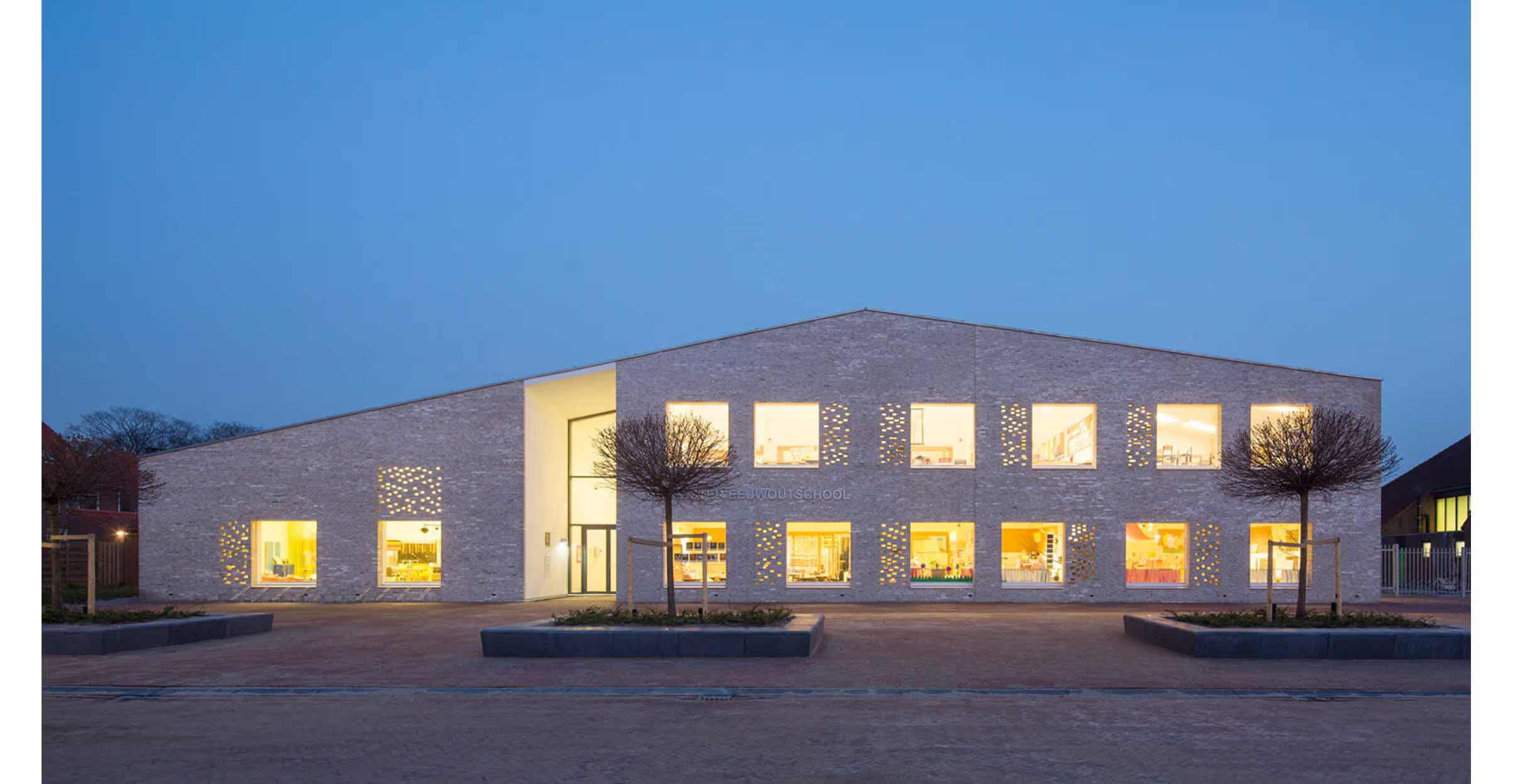
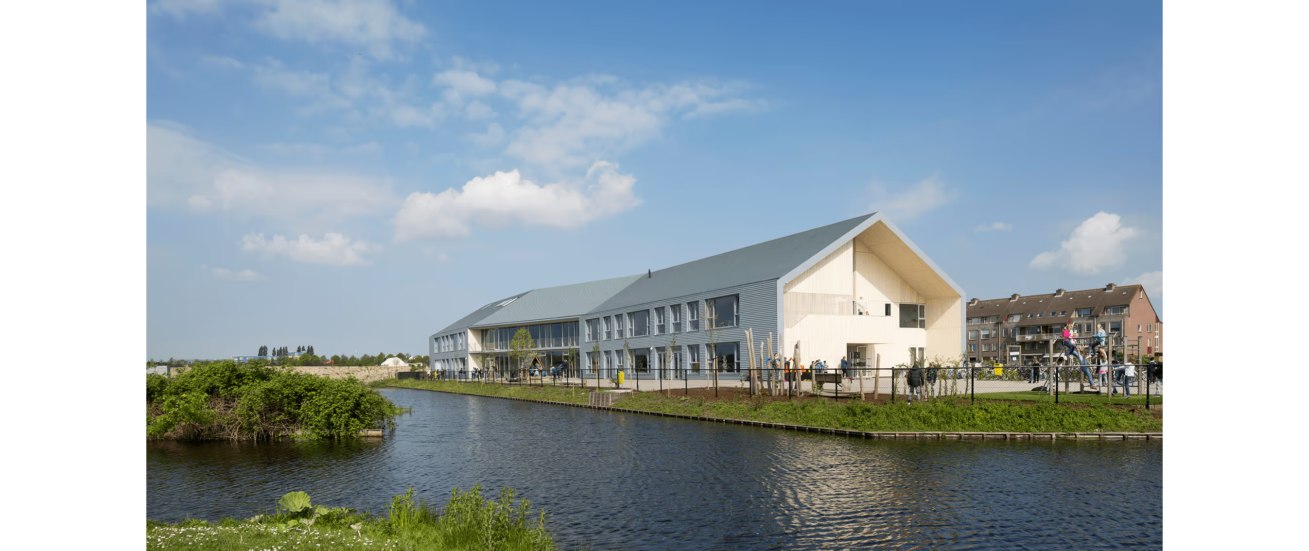
Archetypal barn shape with sleek details
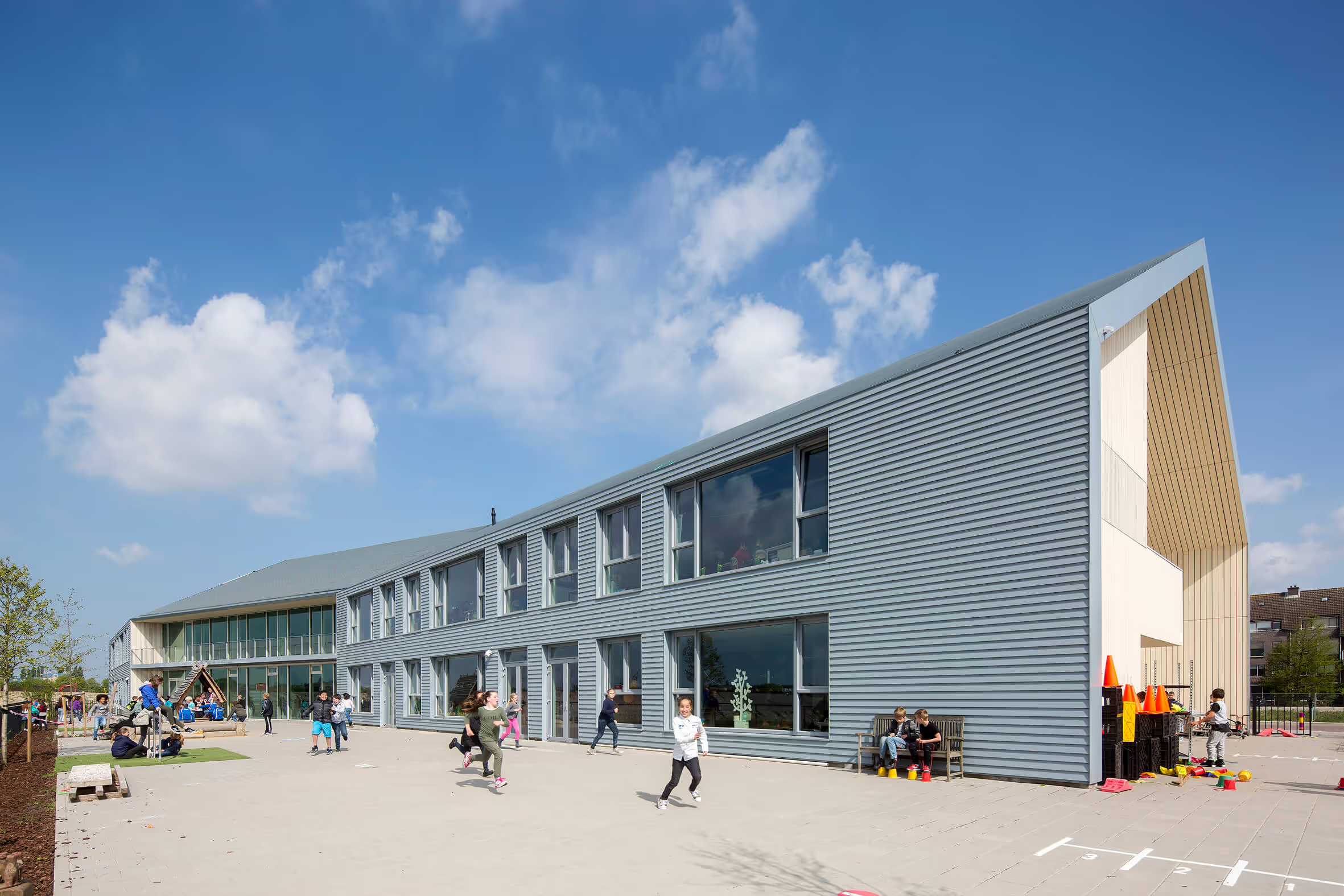
Simple head design, meticulous details
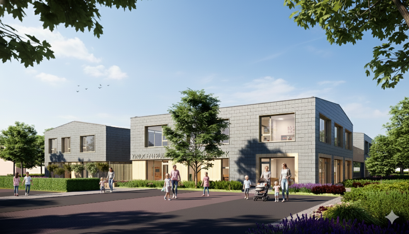
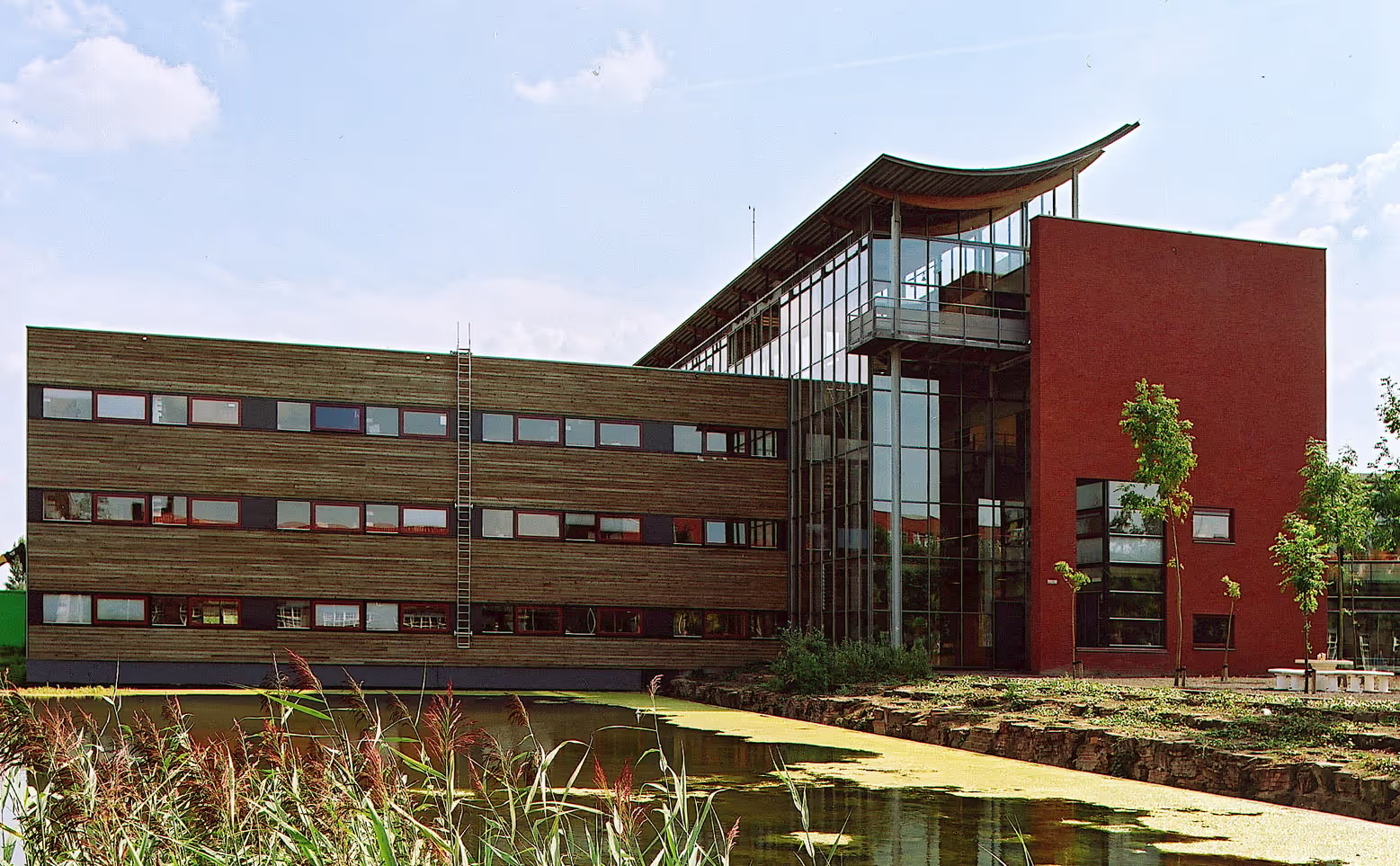
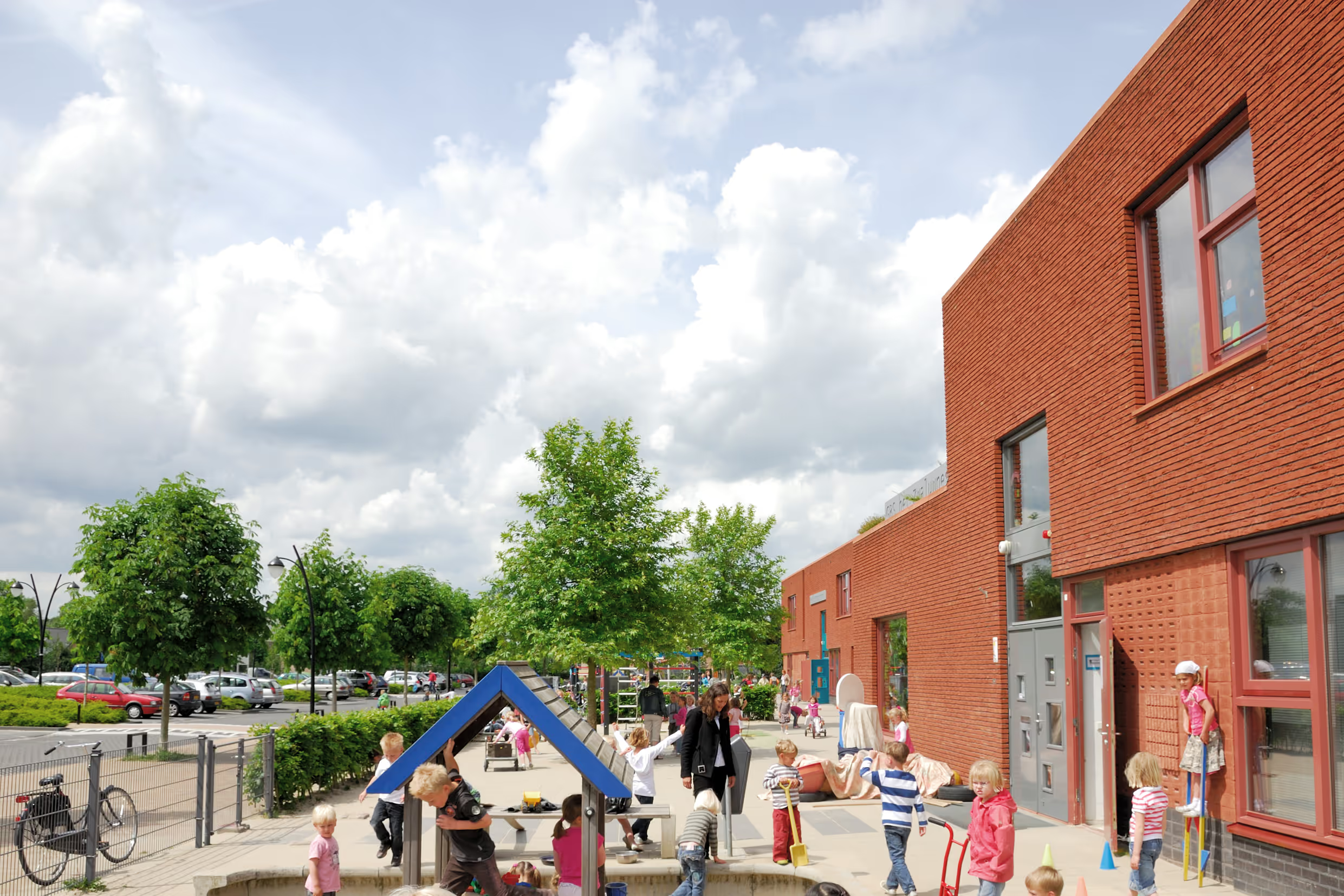
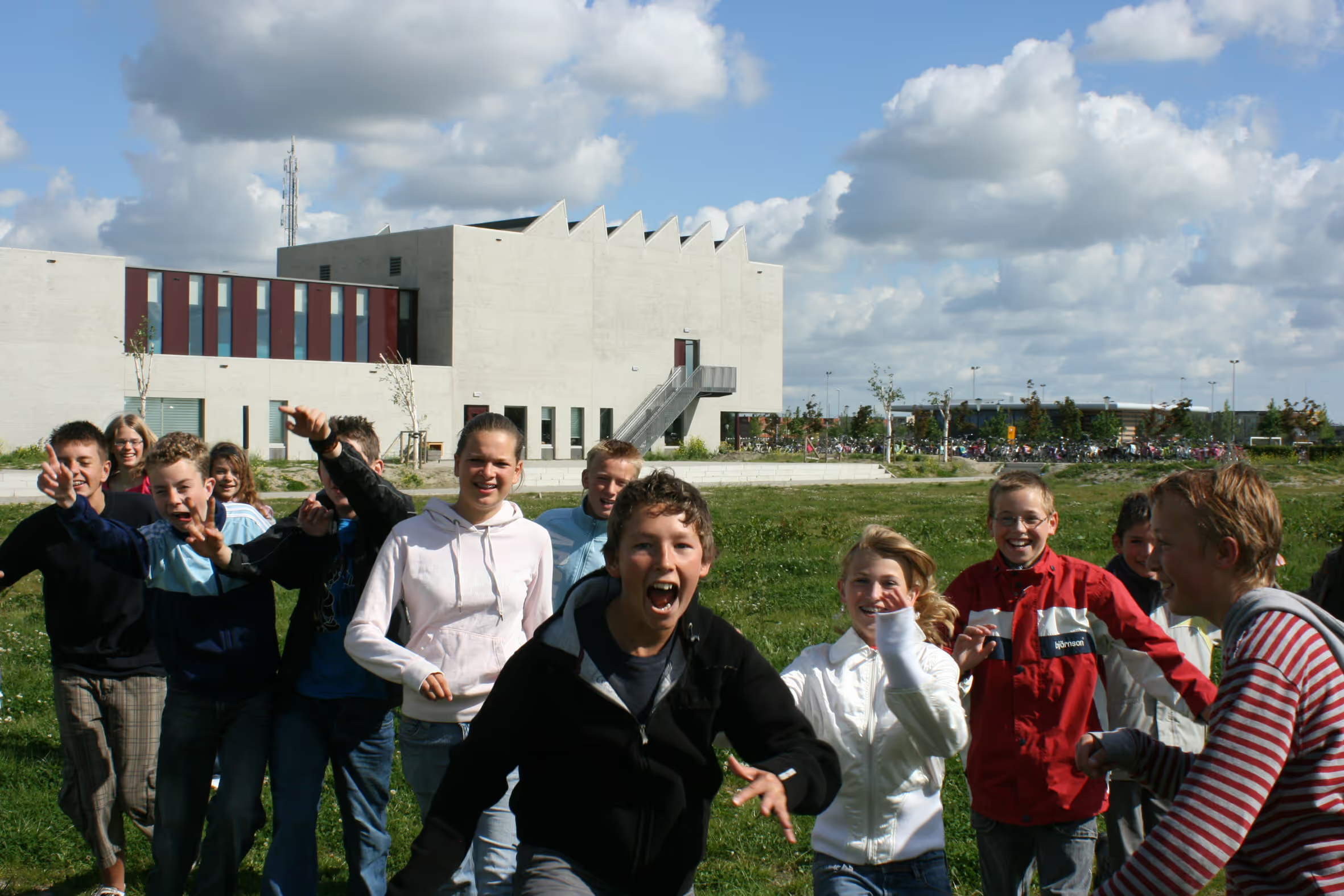
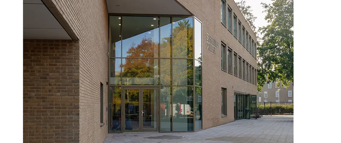
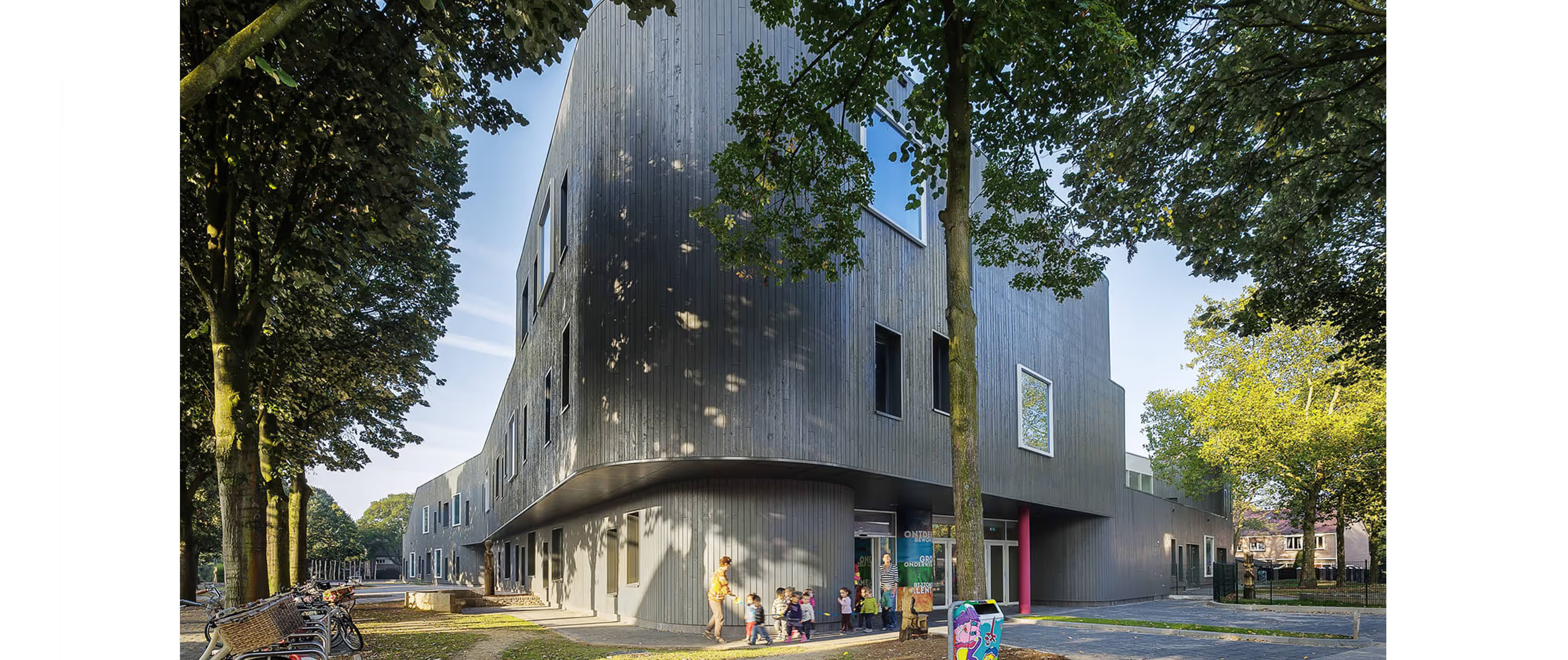
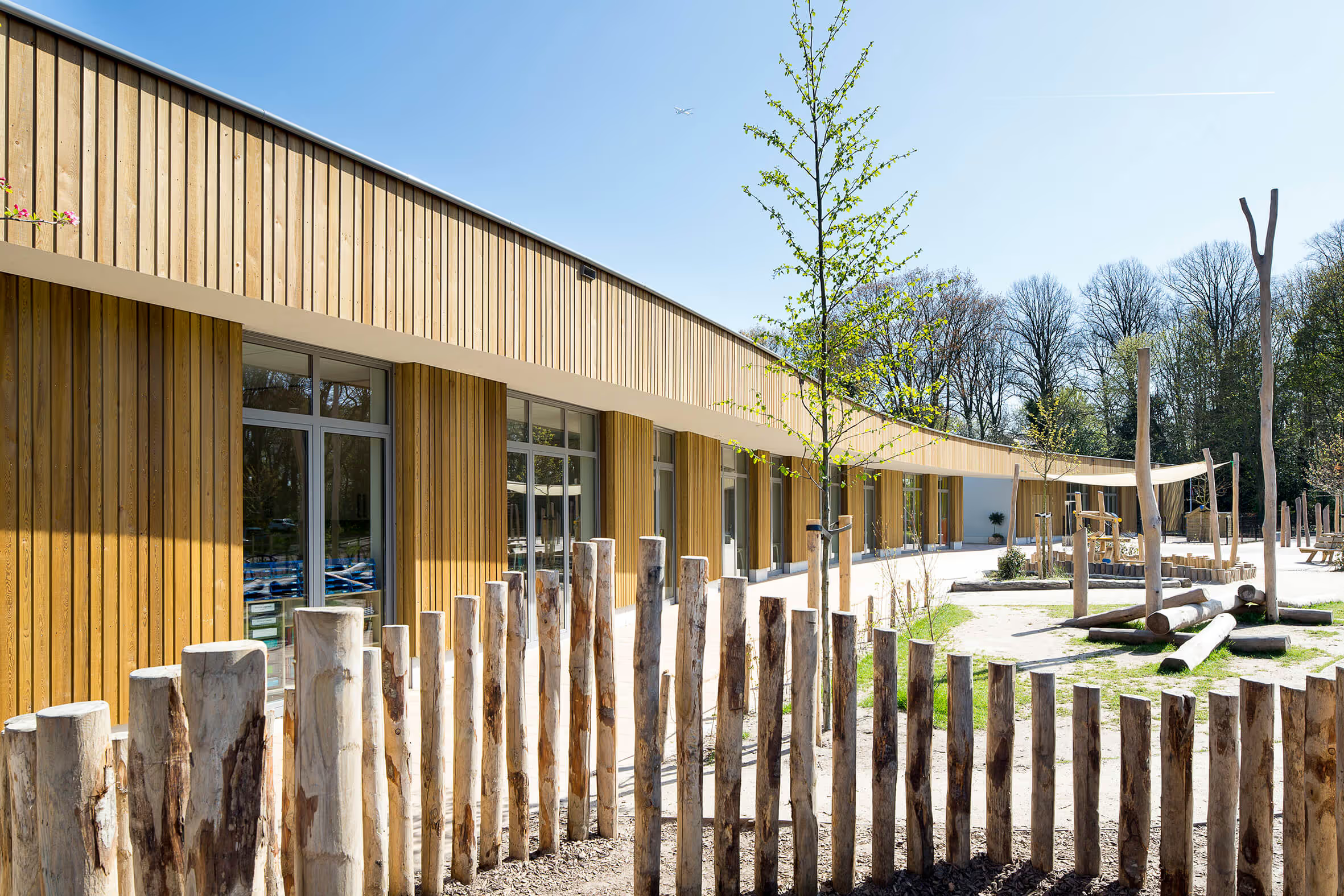
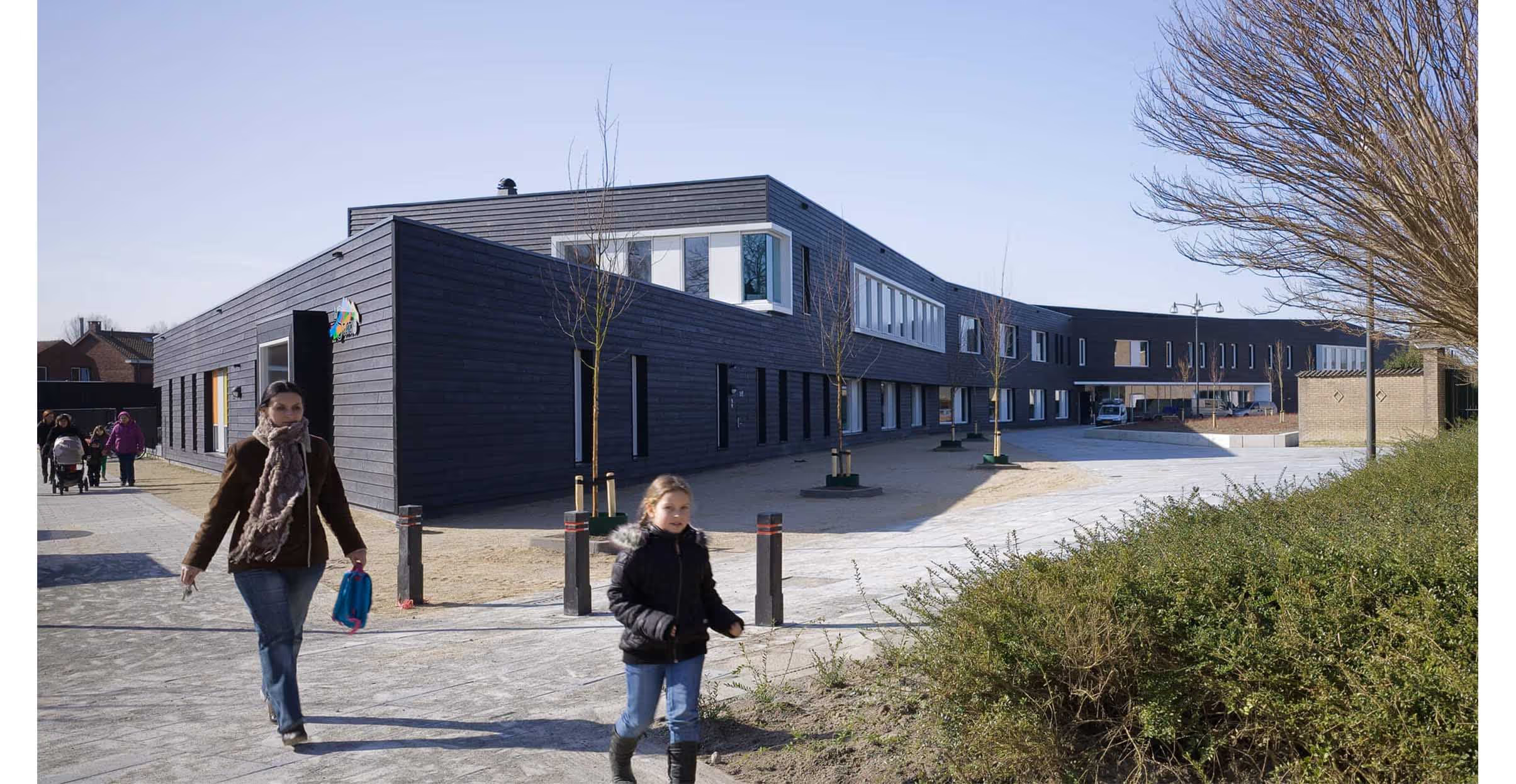
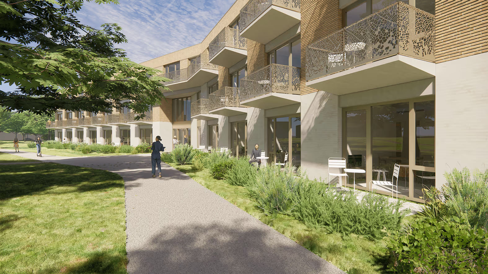
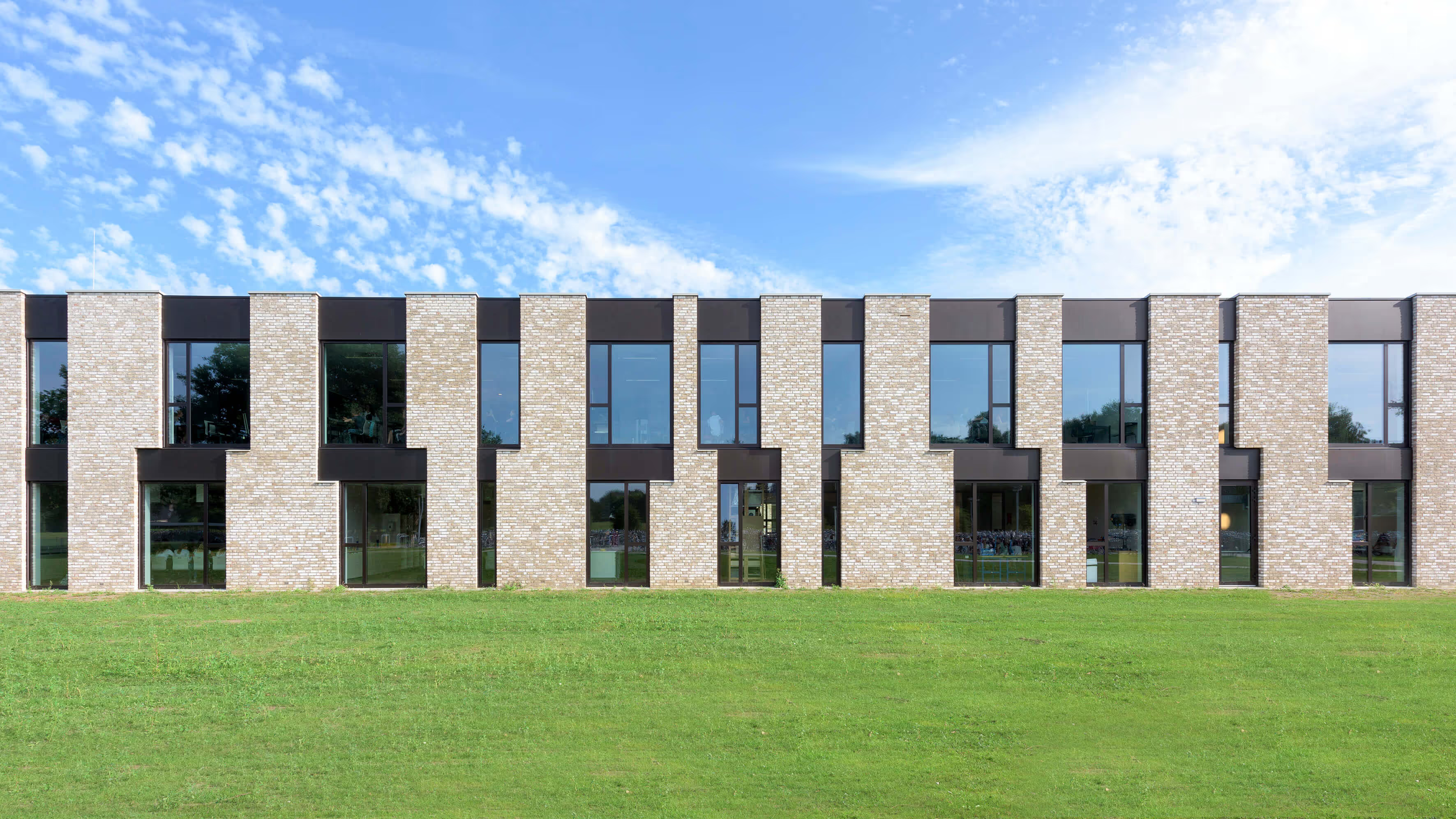
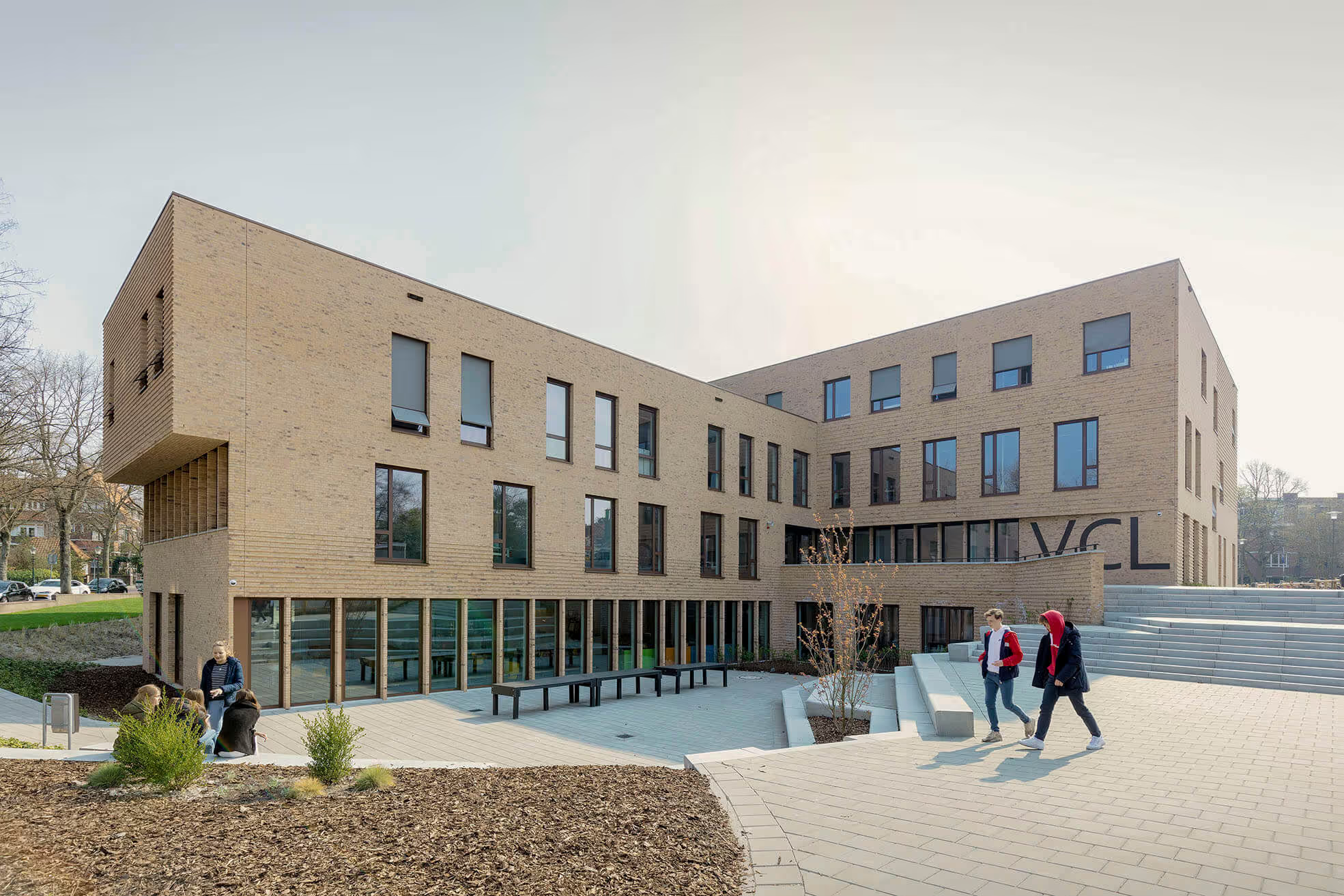
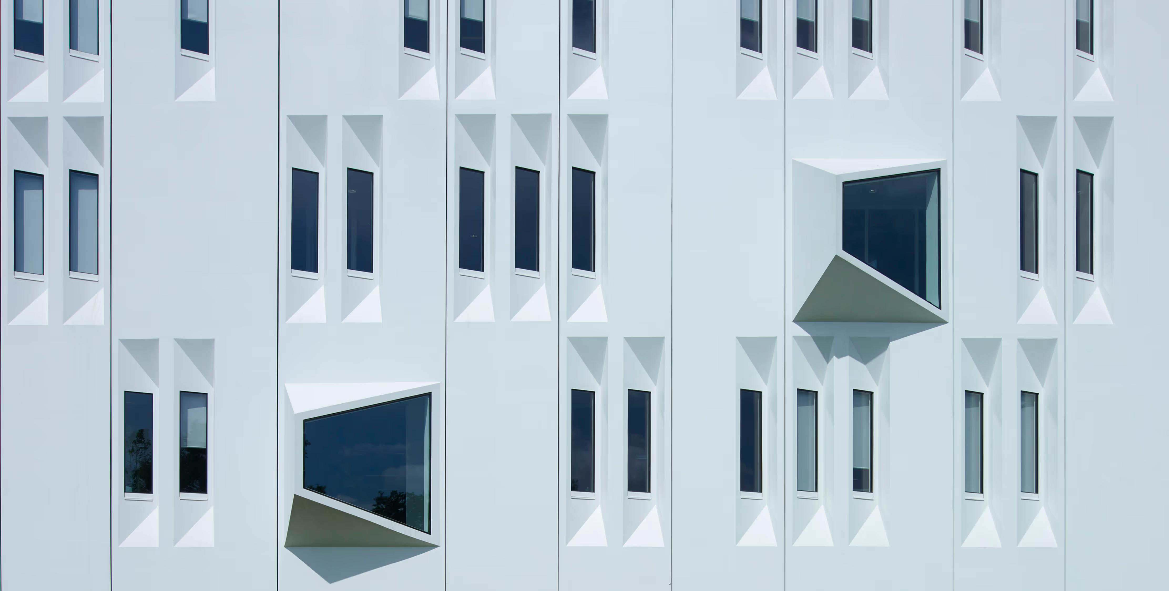
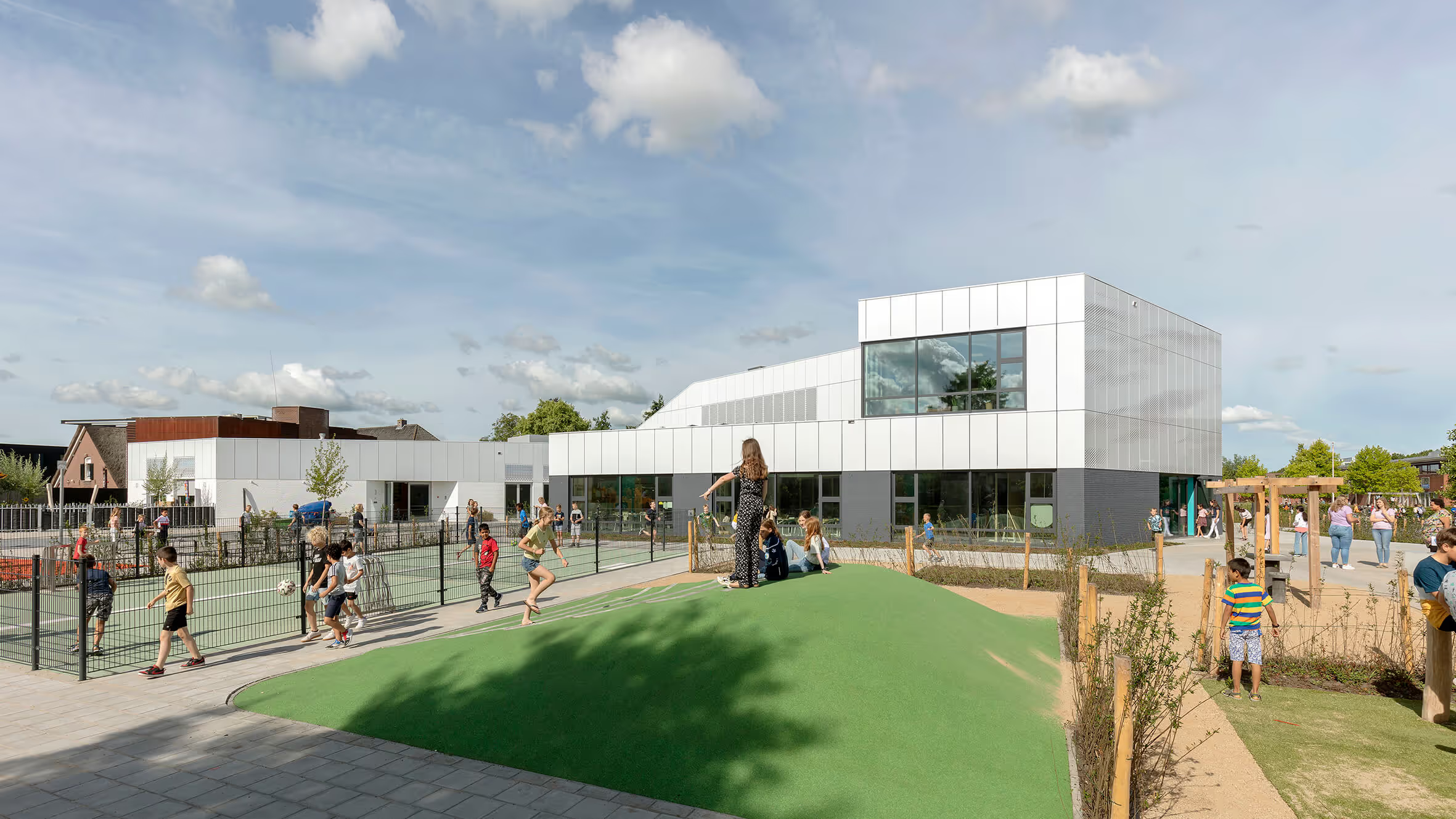
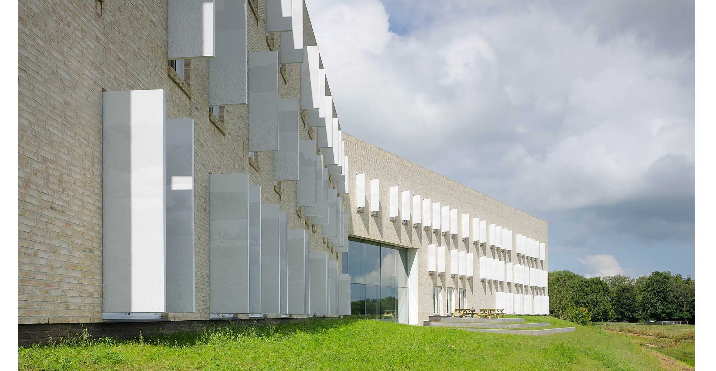
PRO's design is characterized by a simple main design; two long barn-shaped volumes with a double bend and a swinging roof. The oblique line provides an optical division to match the environment in scale without the building disintegrating. The archetypal barn shape gets extra emphasis because the roof and façade are made of one material and allow the contours to stick through at the heads. The basis may be relatively simple in form and design, but the elaboration has careful and sleek detailing. No mast gutters, for example, but hidden gutters in the eaves. The curved lines, material transitions and windows are also tightly detailed. The central hall has large glass windows with natural sun protection in the shape of an overhang and balcony.
Light and friendly
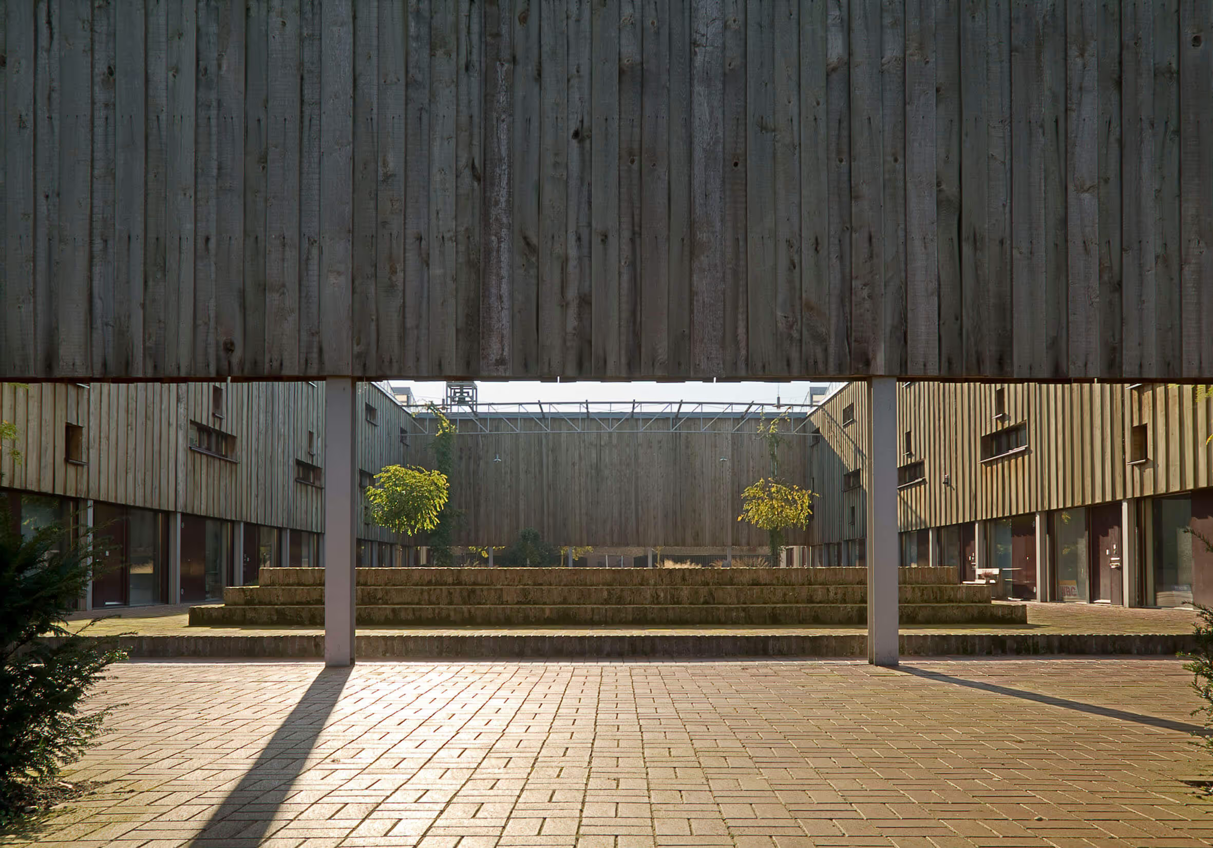
In line with the urban planning conditions for the use of color and materials and the ambitions in terms of investment and operating costs, a steel pot lid profile in a cool shade of gray was chosen as the basic material. This has been combined with blond wood to make the color scheme more friendly and inviting. Vertical planks are installed in various widths, in open and closed structures. The result is a light, calm and natural façade with a lot of refinement, which combines beautifully with the green surroundings.
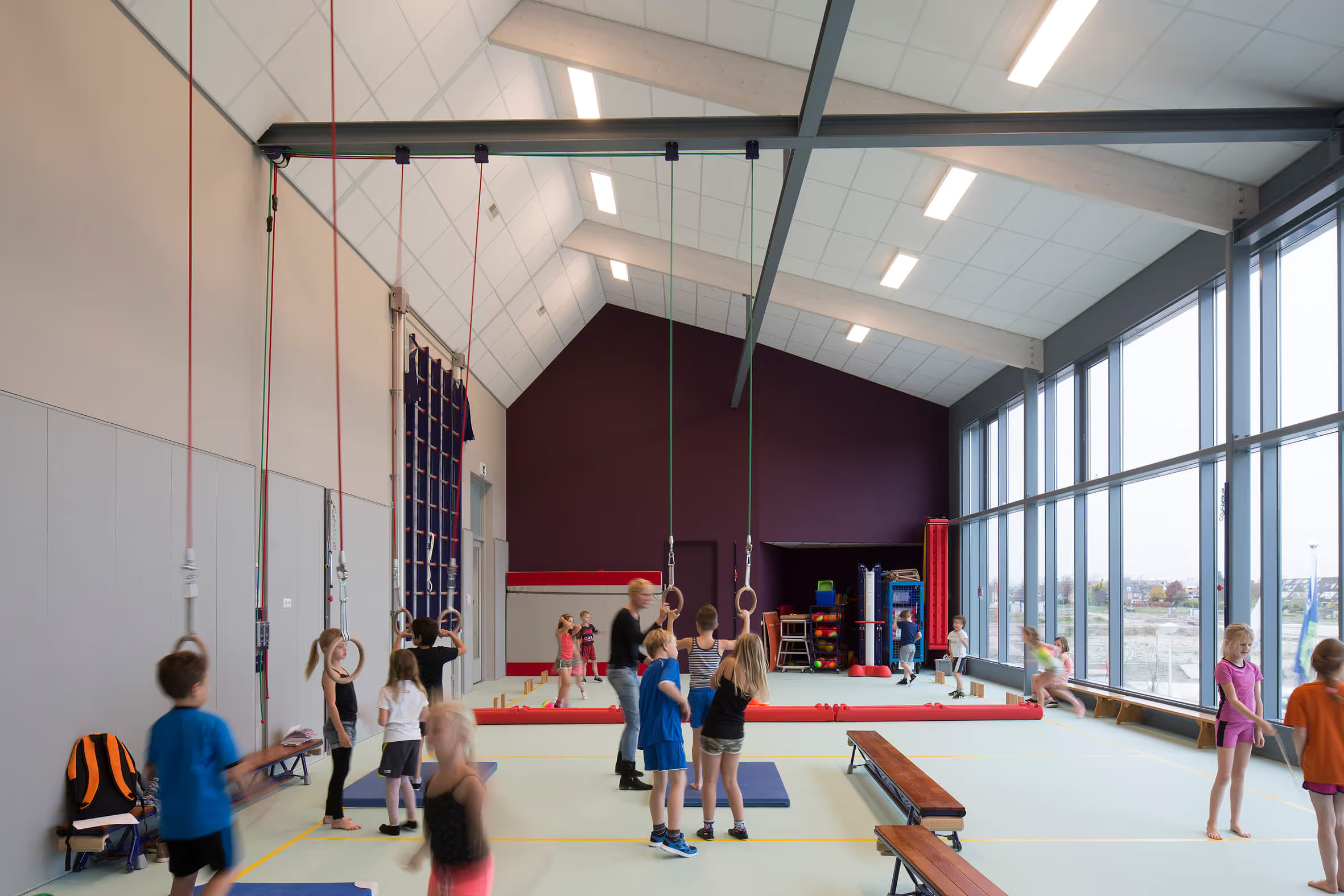
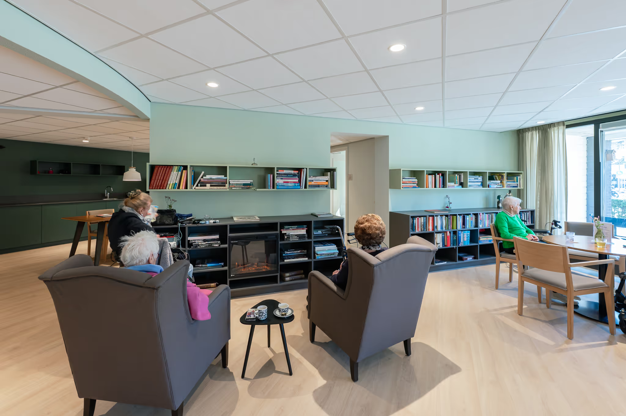
The blond wood also appears in the interior: in the rafters and the permanent furnishings. The light floor and crisp white walls are combined with a contemporary color palette that matches Junis Childcare's corporate identity and the needs of the Immanuel team.
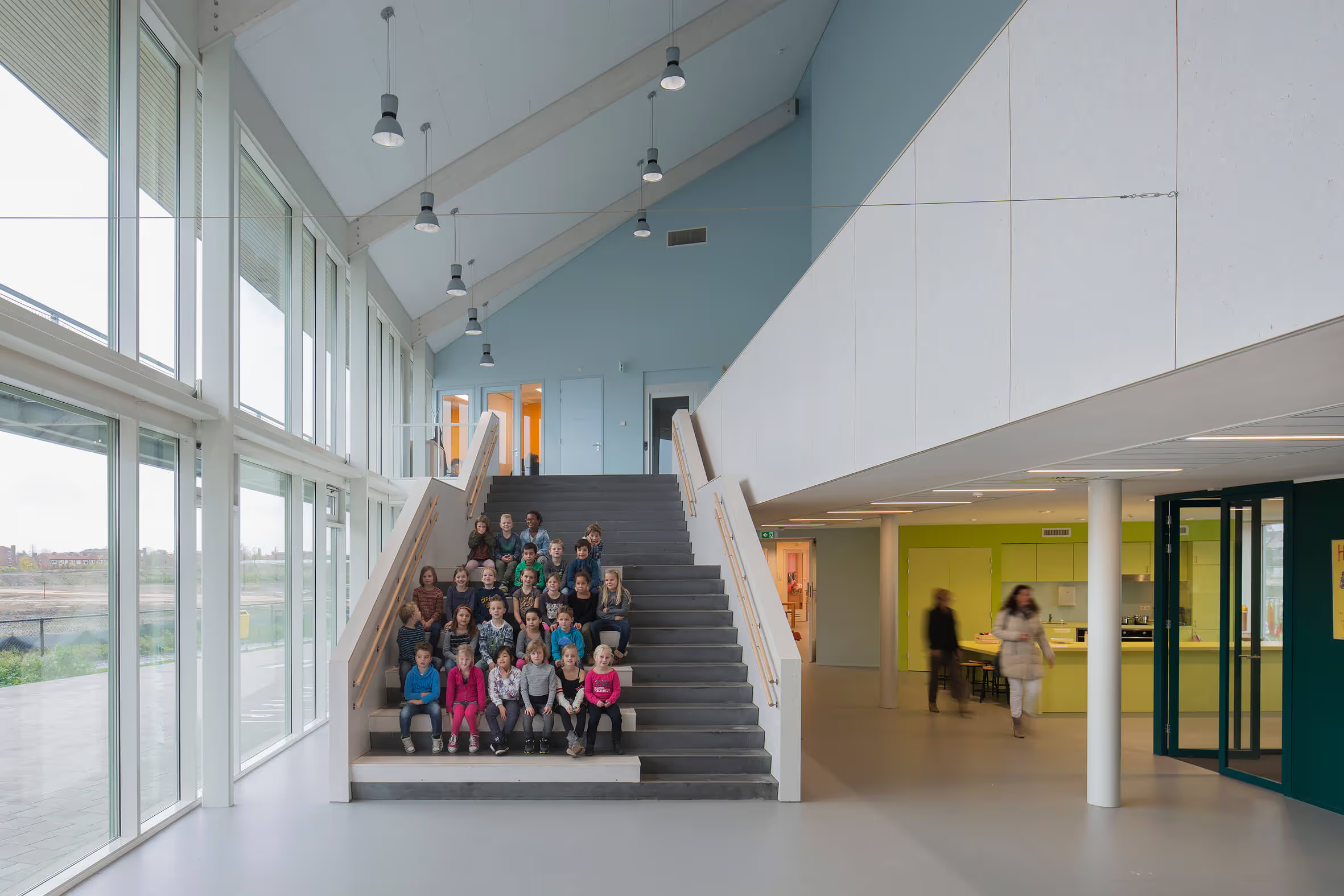
Multifunctional hall
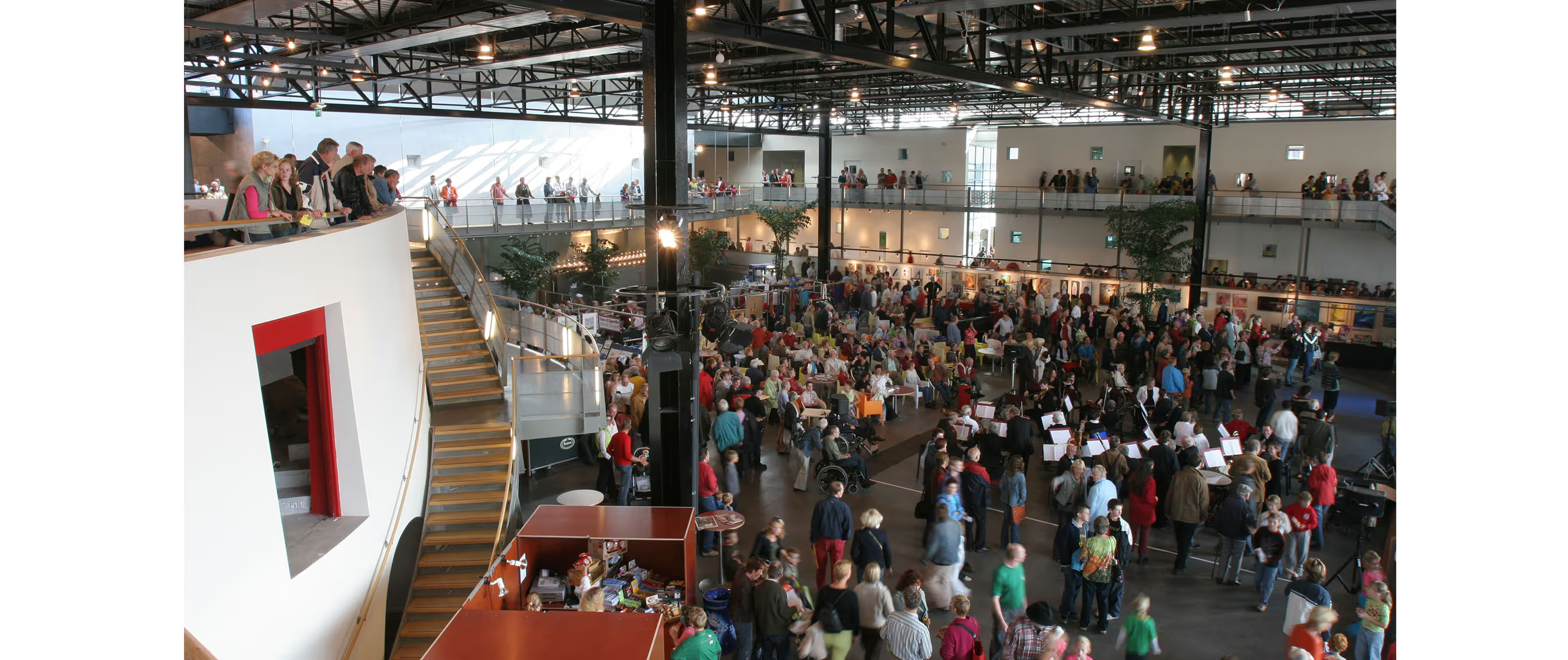
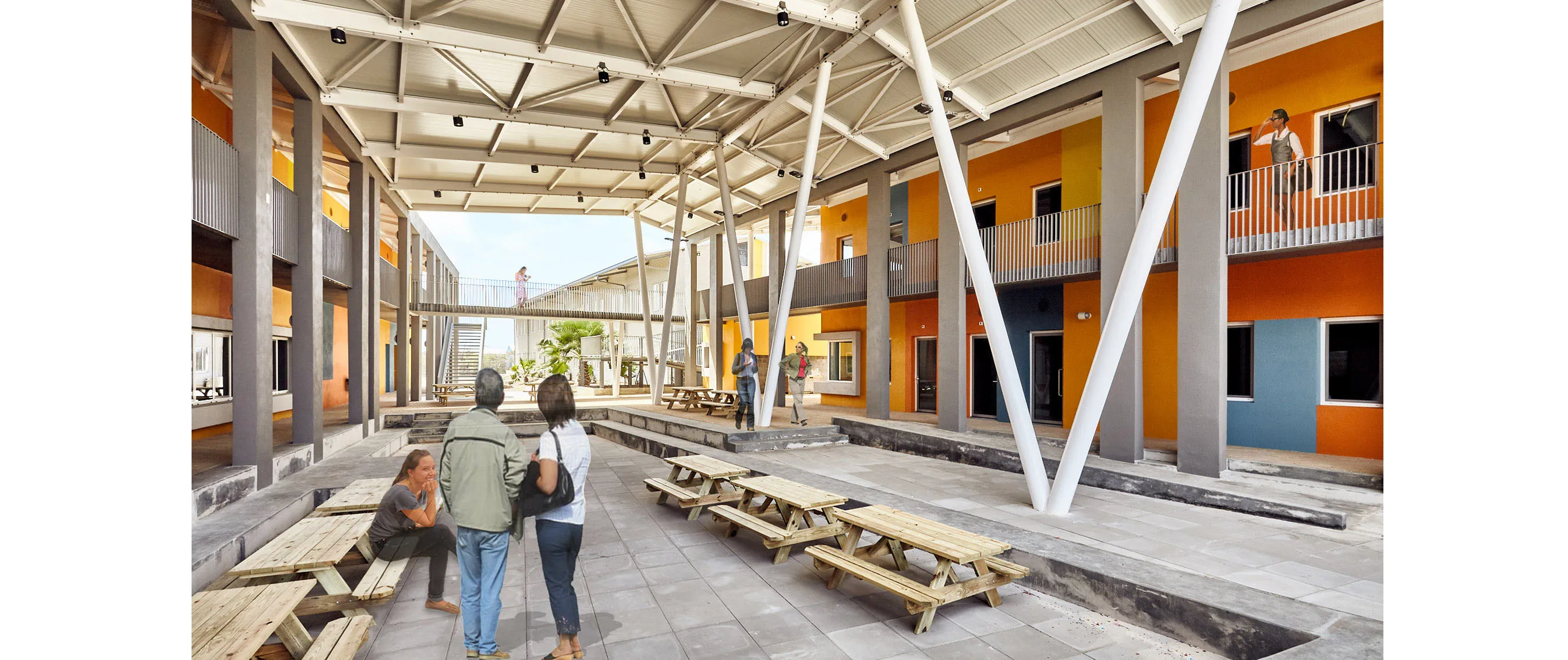
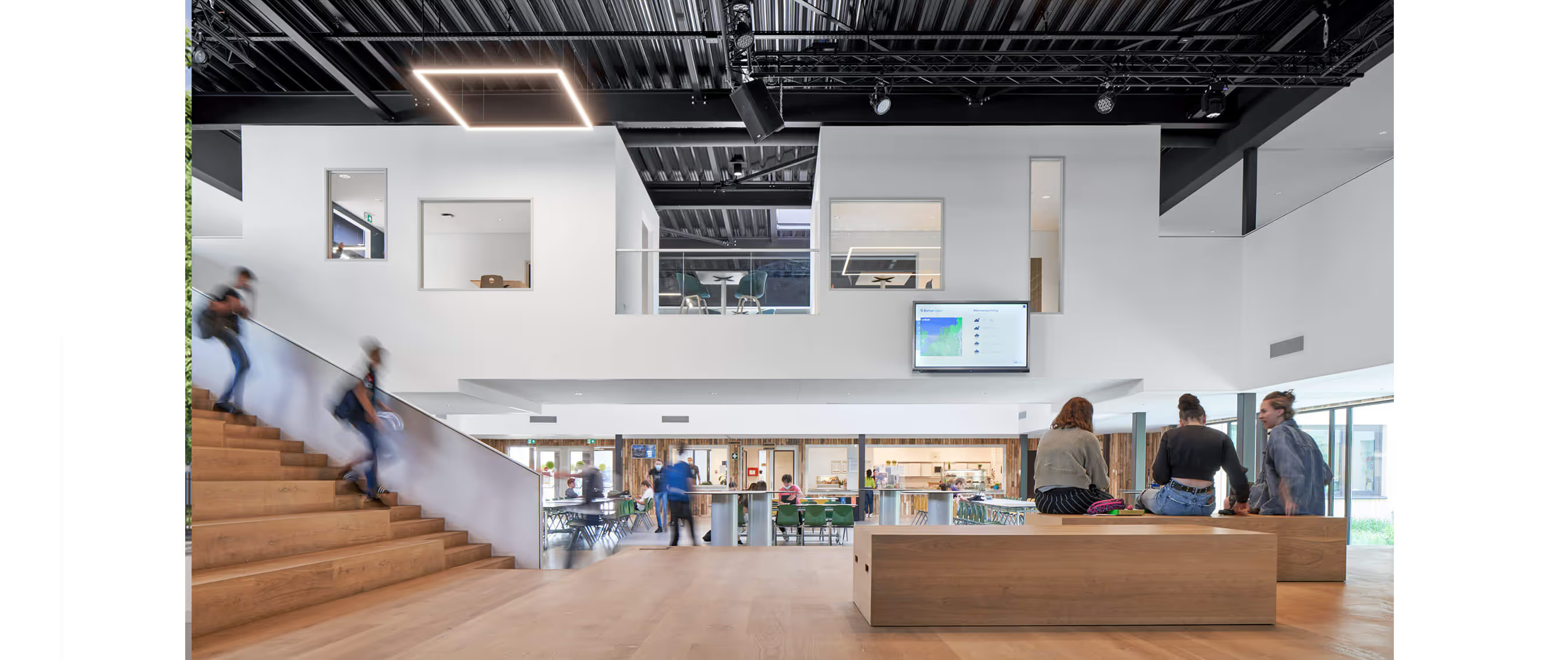
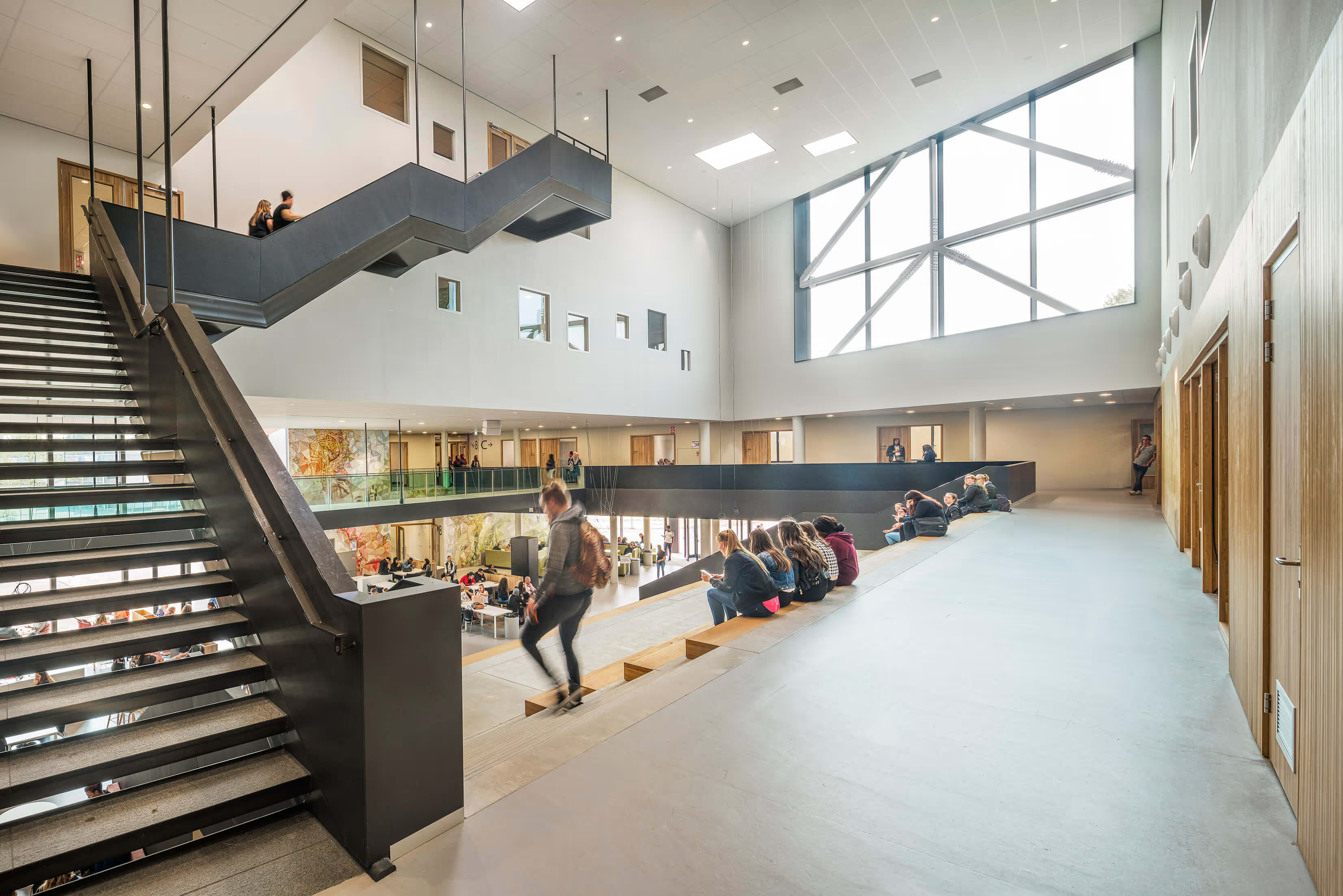
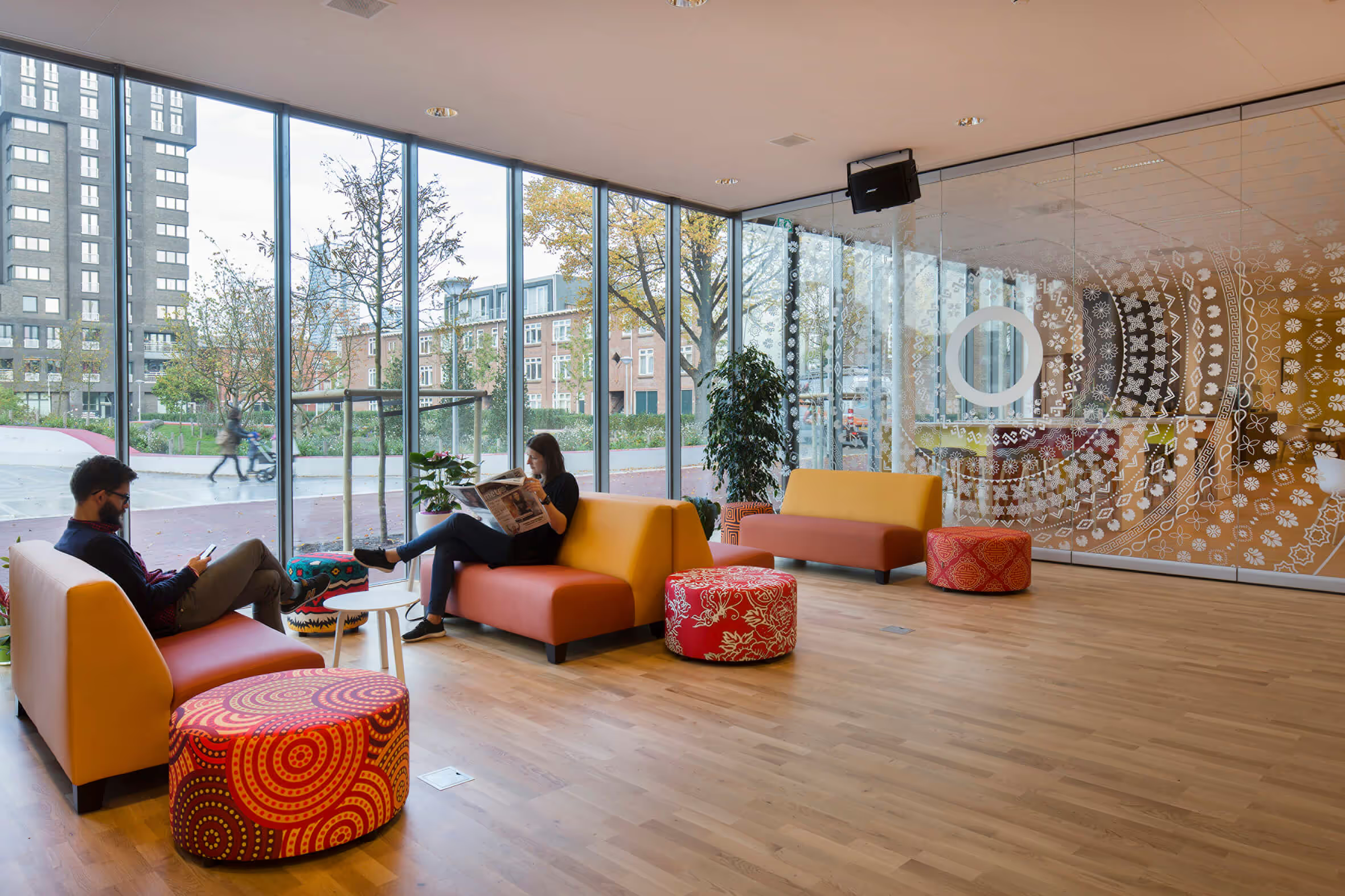
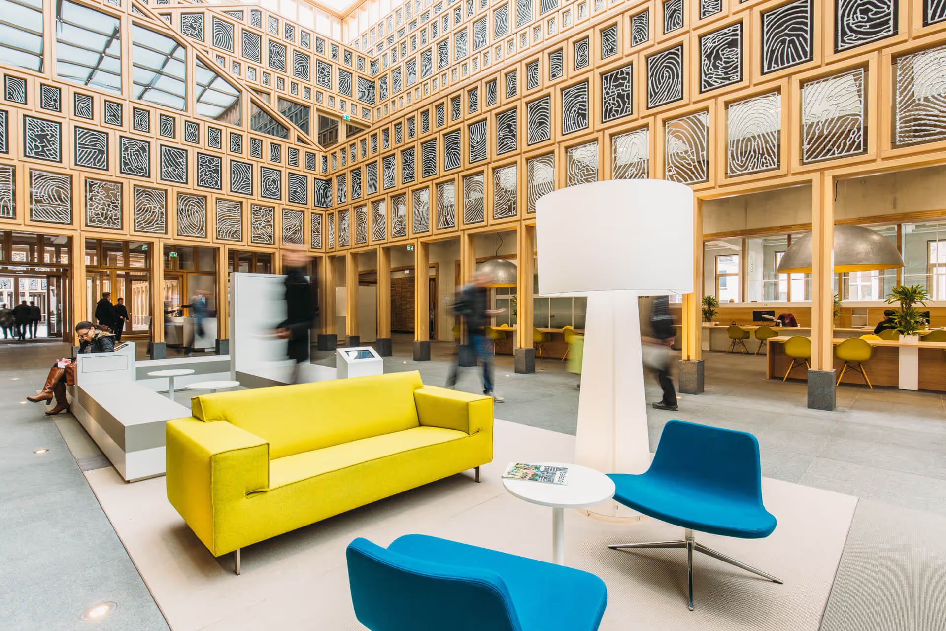
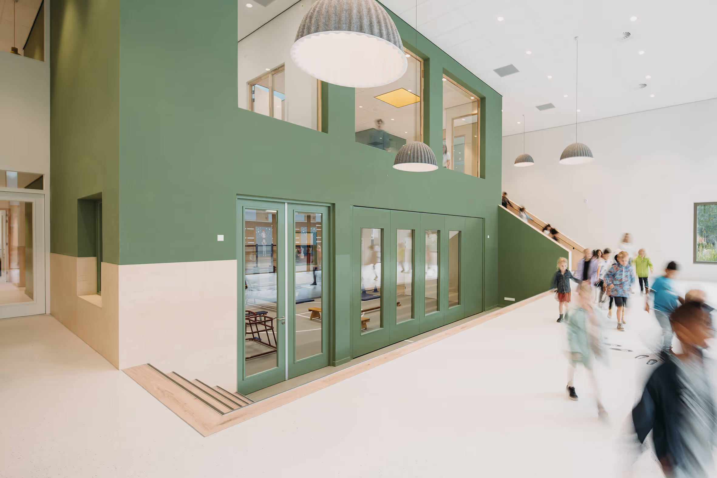
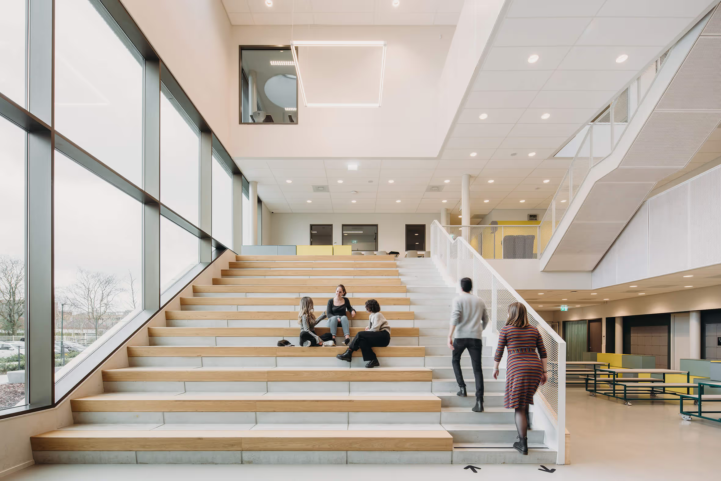
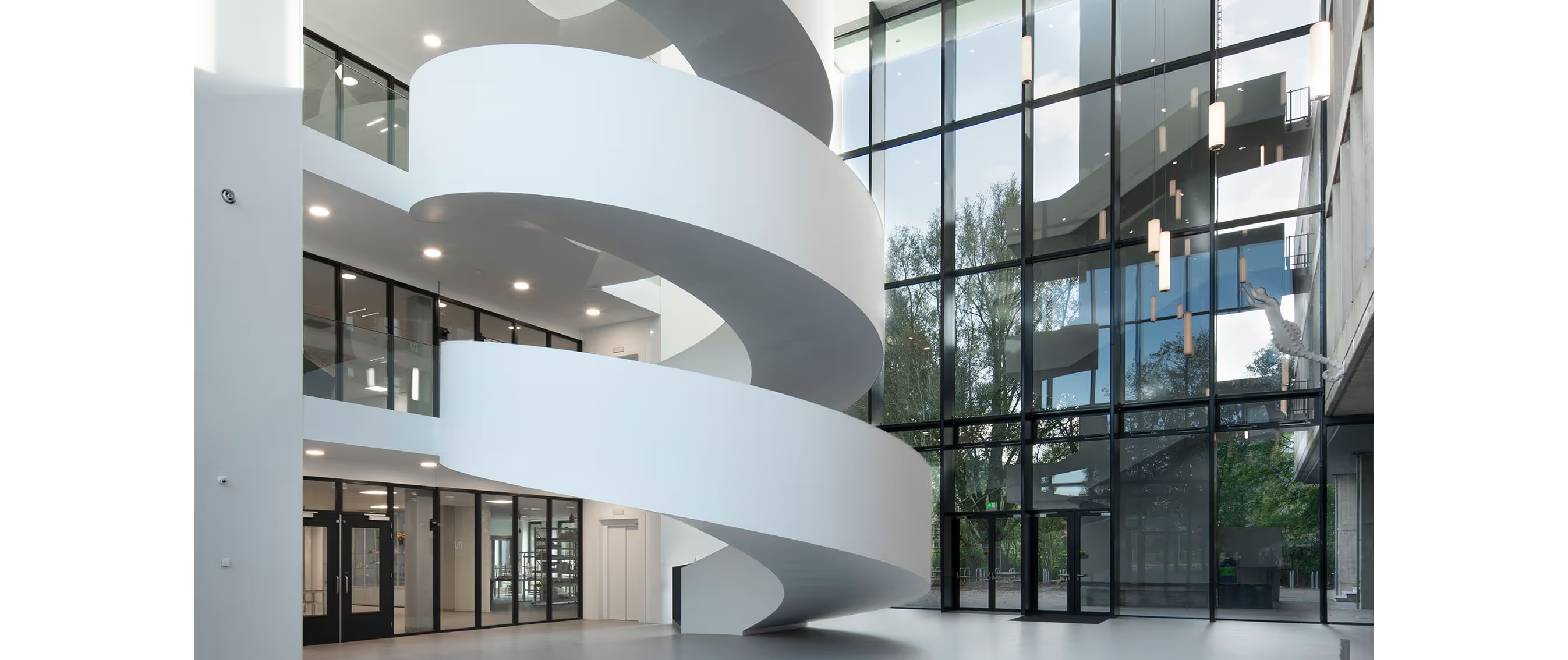
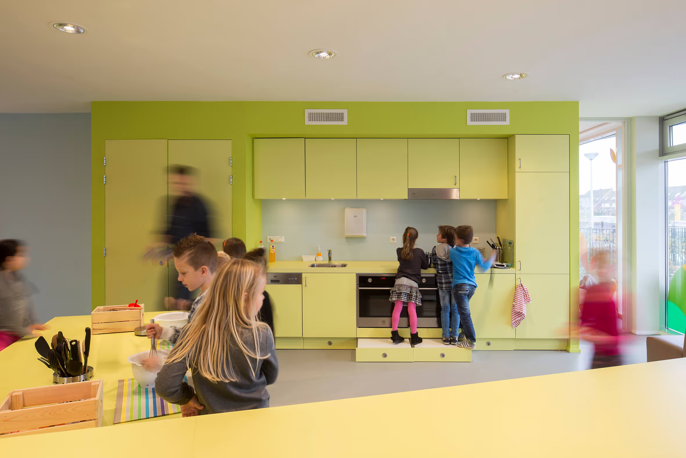
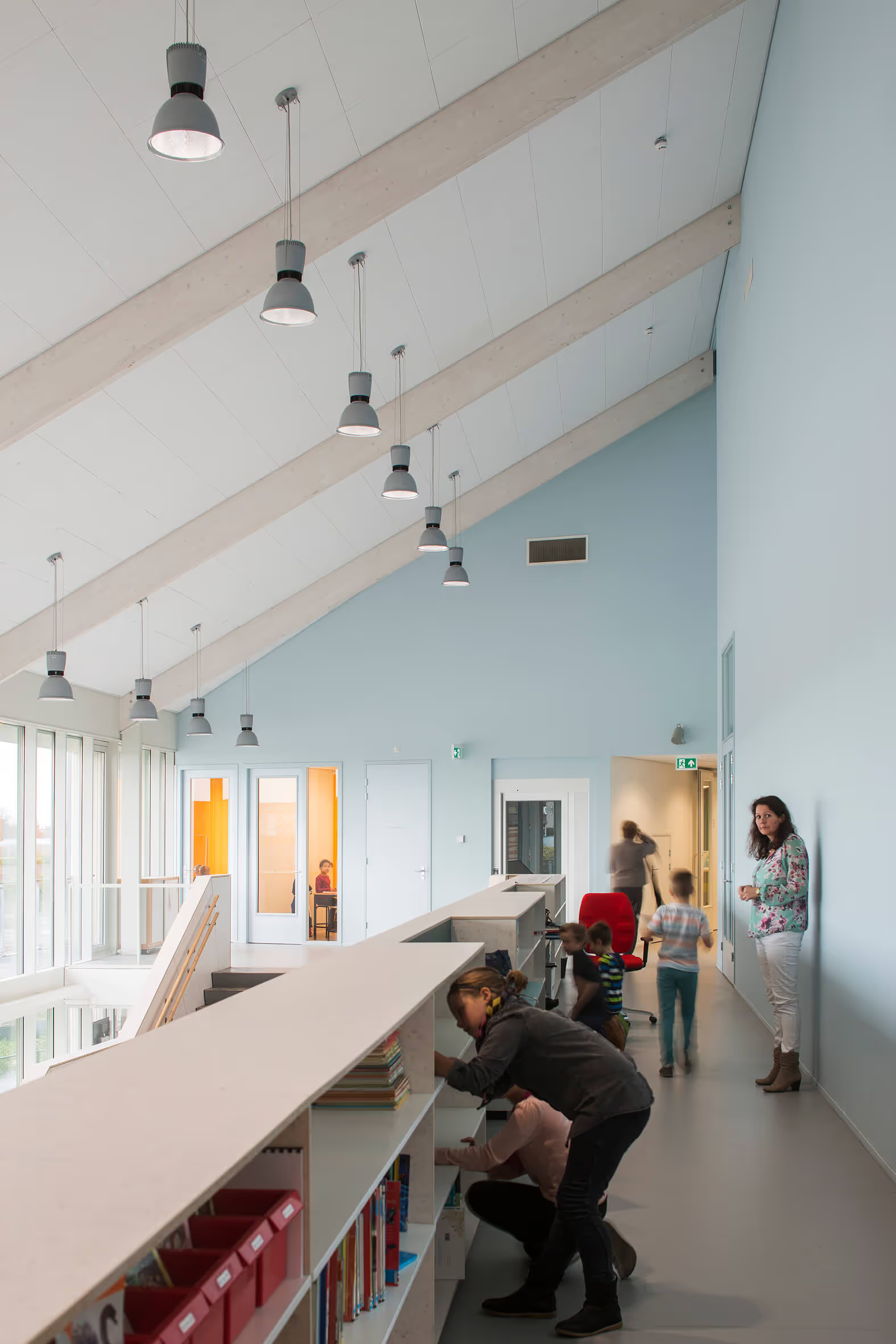
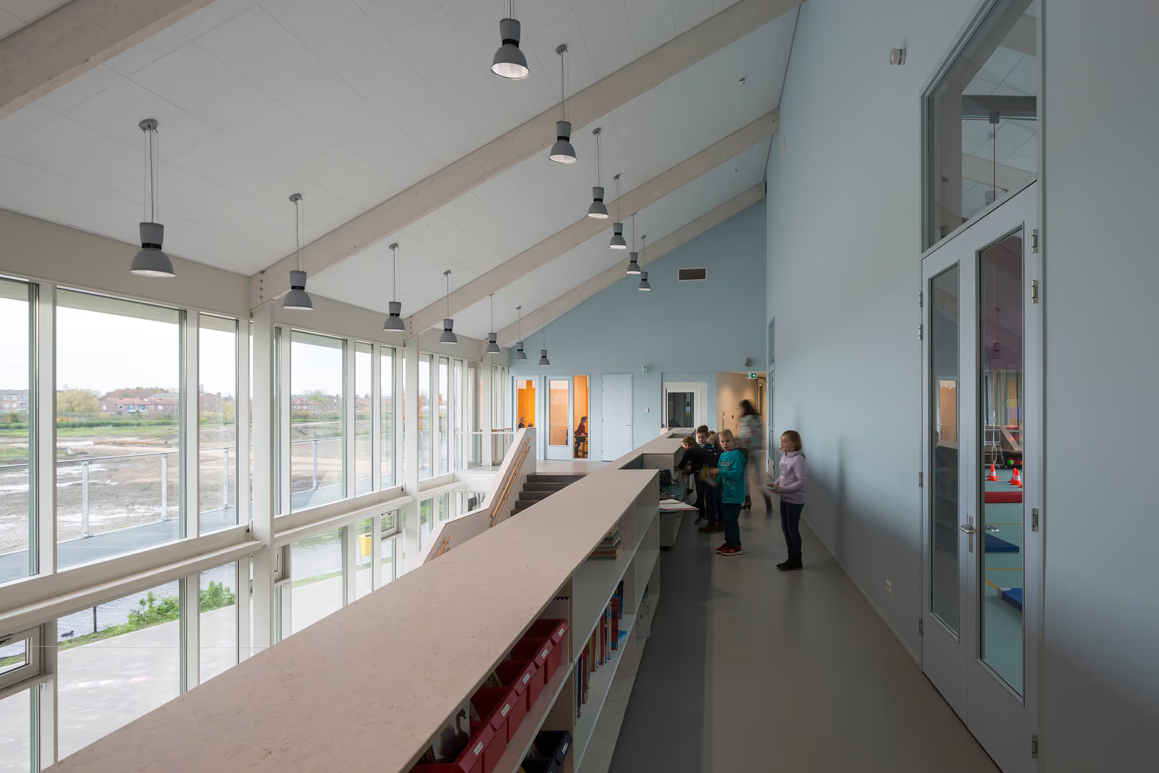
The heart of the Community School is spacious and highly multifunctional. The hall is bright and inviting with a transparent façade on both sides. Details of the hall include:
- the large loft with a wide staircase with seating elements
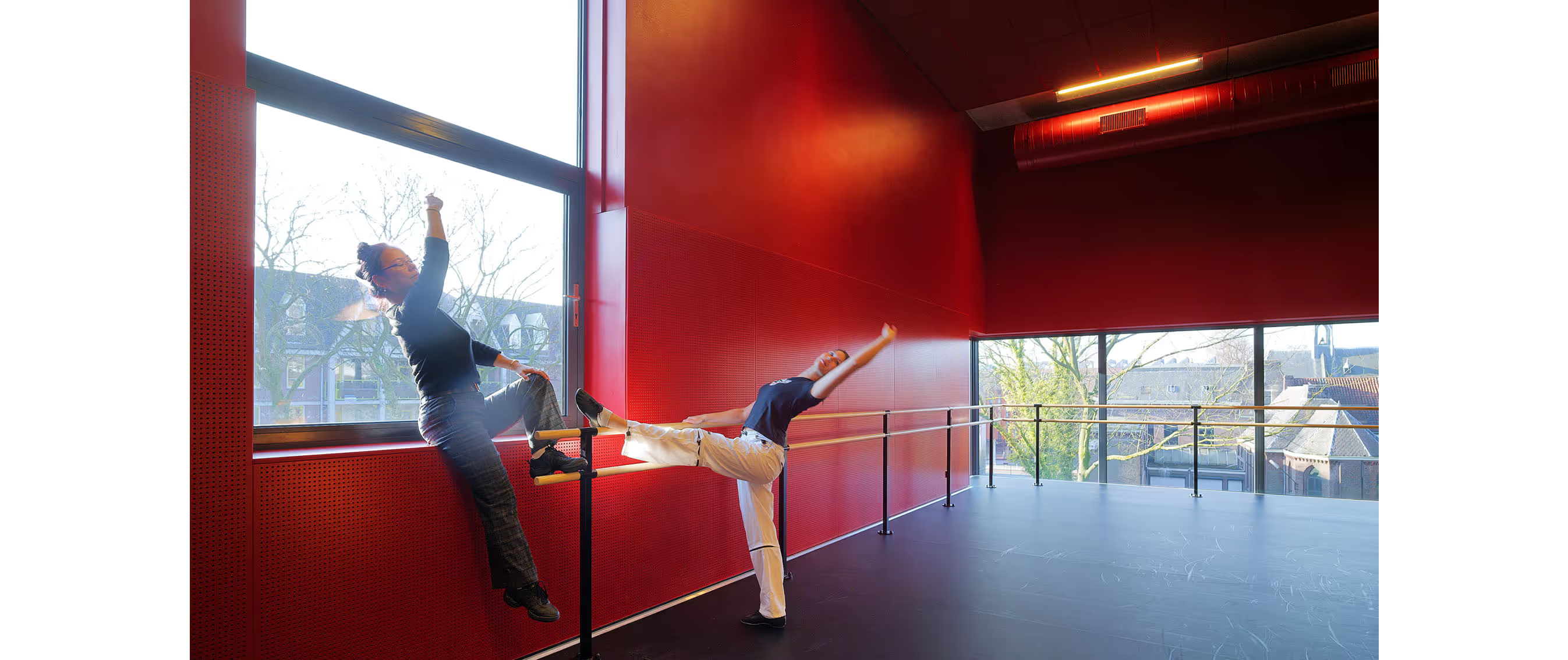
- a stage for dance and music lessons with hidden storage space for crafts
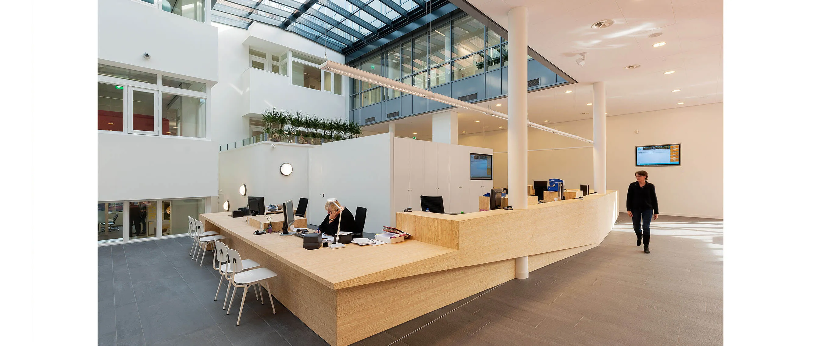
- a multifunctional kitchen furniture and a reception desk;
- a “book bridge”: a 19m long walkway with bookshelves and media spaces;
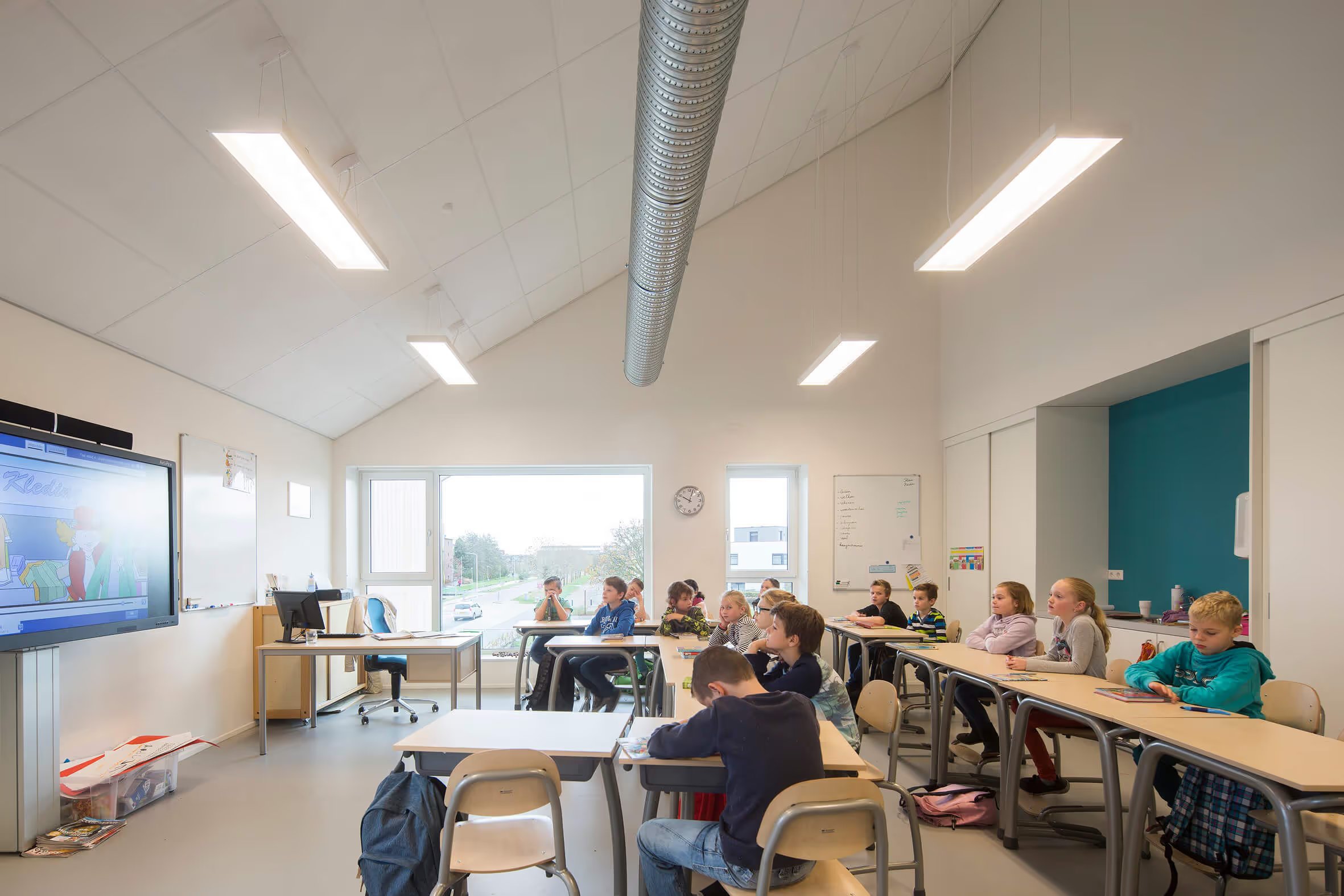
Not only the hall but the entire layout has been well thought out with the users. Such as the location of the team room, the wardrobe solution, the toilet distribution and the learning plazas with extra work space for groups of students. Users see multifunctionality as added value and not everything has to be kept in a closed room. This also provides flexibility and freedom of layout for the future.

Boskoops green
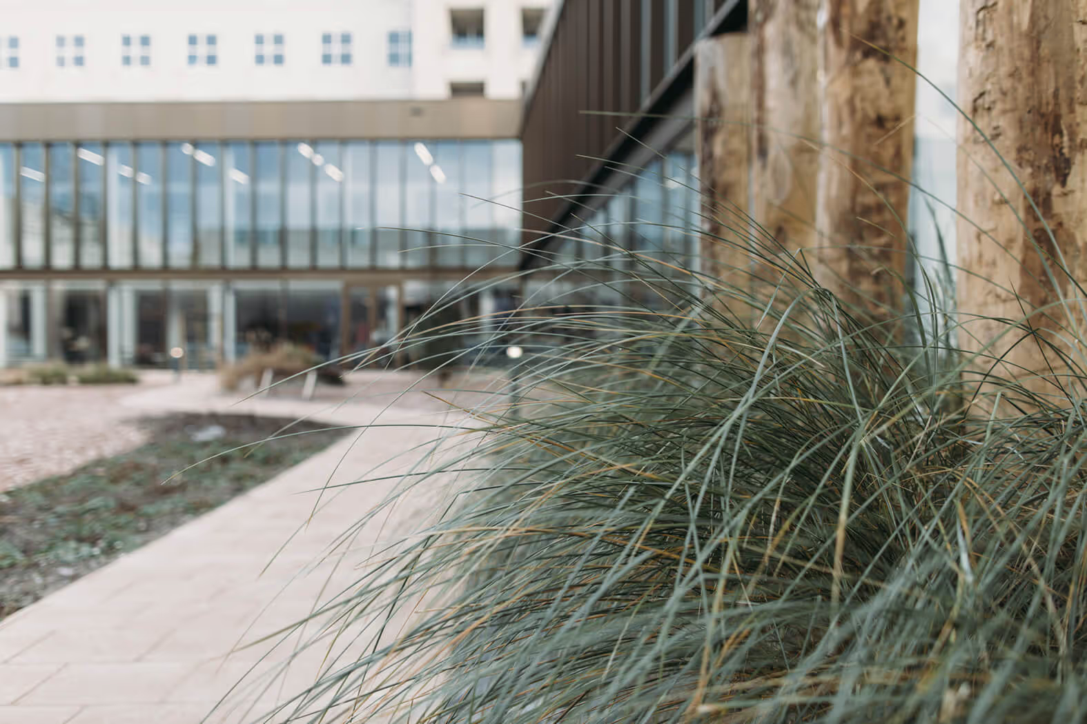
The outdoor themes are green, natural materials and discovery. No fierce seesaws, but natural play elements, such as a willow tent and a climbing tree and lots of plants. How could it be otherwise in a village that is famous for its floriculture. The location borders a wetland area, but the school is not afraid of that. “If you don't have a duckweed on your head, you don't live in Boskoop” is the motto. So no huge fences, but a friendly green buffer with a low barrier in it, and be happy that you can play outside in this green spot with a view and sun.
Users are also involved in the process beyond the boundaries of the school site; for example, the municipality, together with school, childcare and a traffic engineer, looked at the safety of picking up and delivering and the best connection to the routing in the neighborhood. Their influence is clearly reflected in the end result!
Durability and installation principle
“Prevention is better than cure” is the motto and “make sure you can invest as much as possible in education itself”. So: first insulate properly, let in plenty of daylight and keep the heat from the sun out. Only then do we look for installation solutions and sustainable generation. At the top of the ridge, an installation attic has been kept free. This space connects to the corridor zones and toilets below, where the ceilings are lower than in the classrooms. As a result, there is relatively little loss of space and pipe distances remain short and channel diameters limited. And from a spatial point of view, the façade zones remain completely freely divisible. Now and in the future, when educational visions change.
