Metis Montessori Lyceum
Metis Montessori Lyceum
Metis Montessori Lyceum

New life for a school building with history
Renovation of the atmosphere and historic architecture
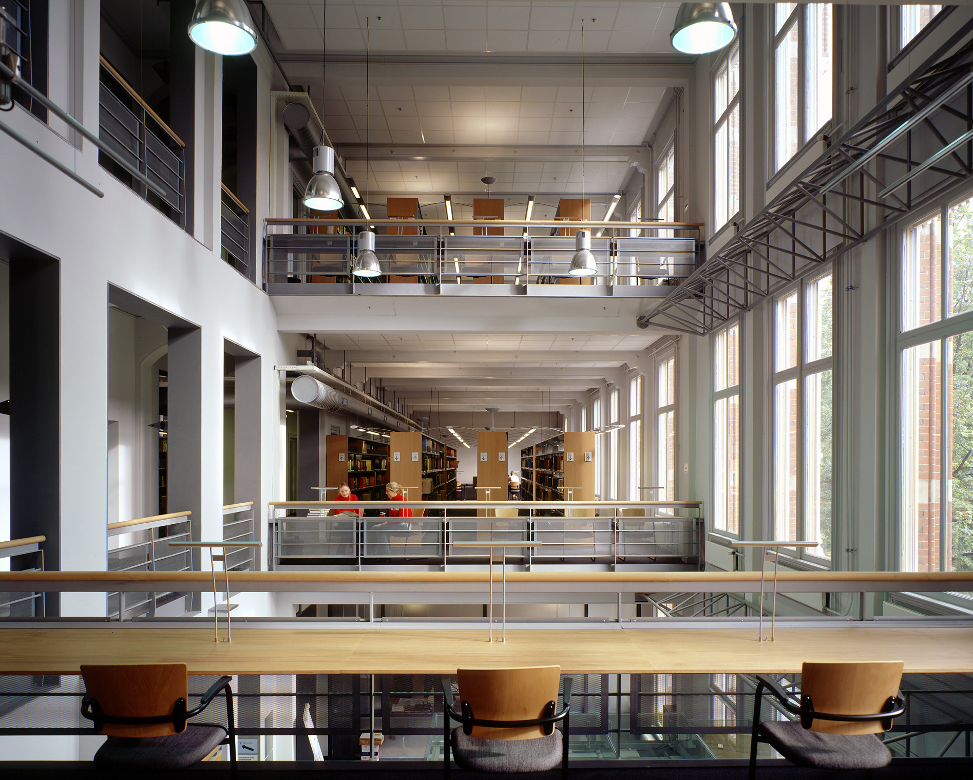
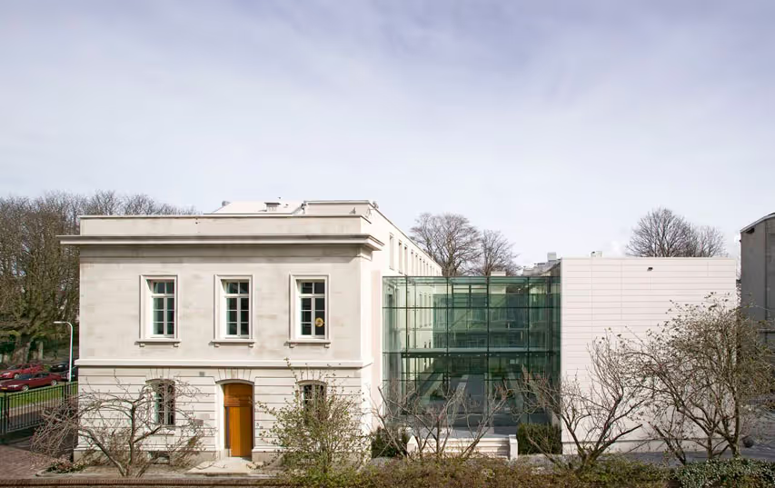
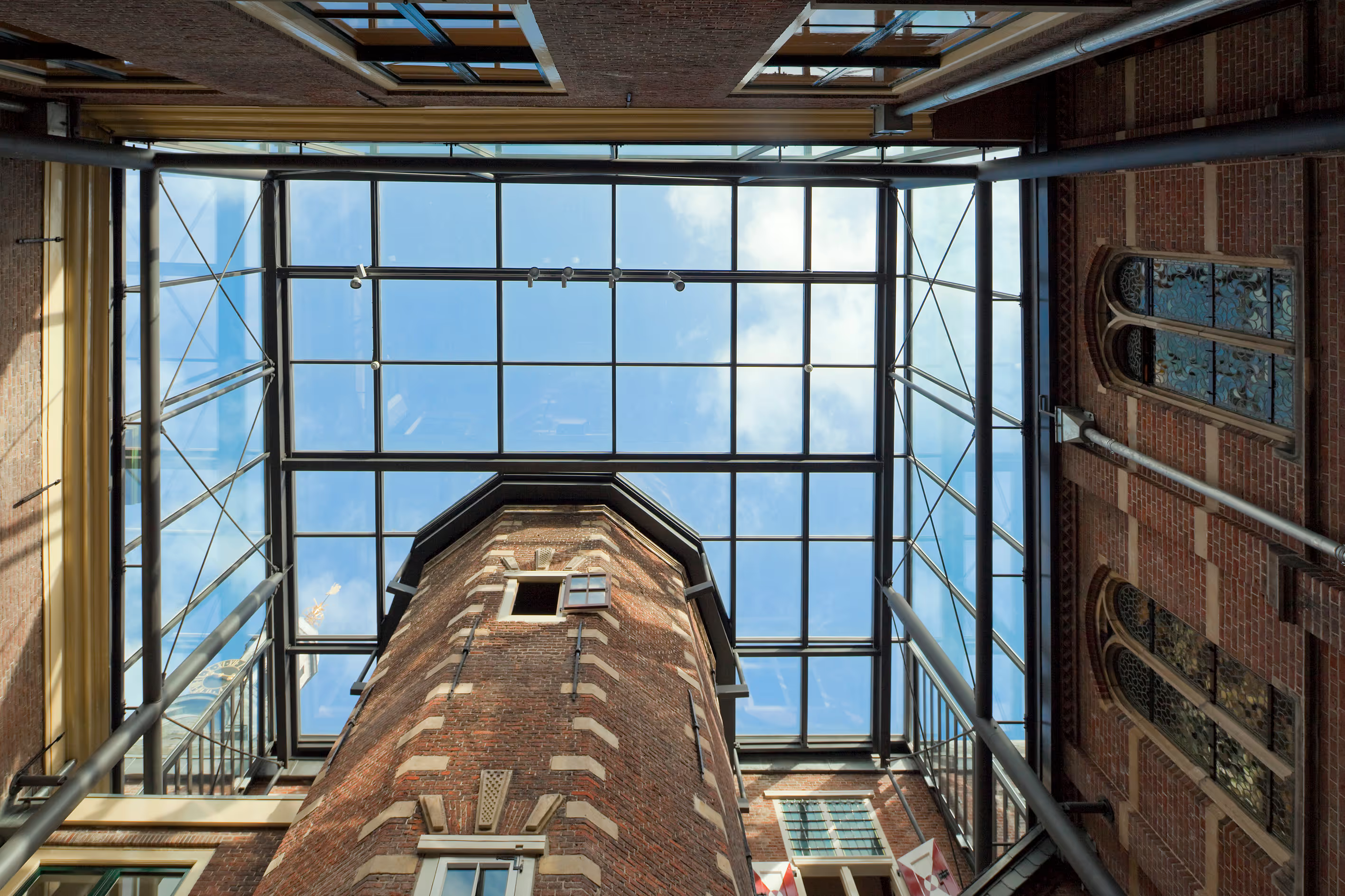
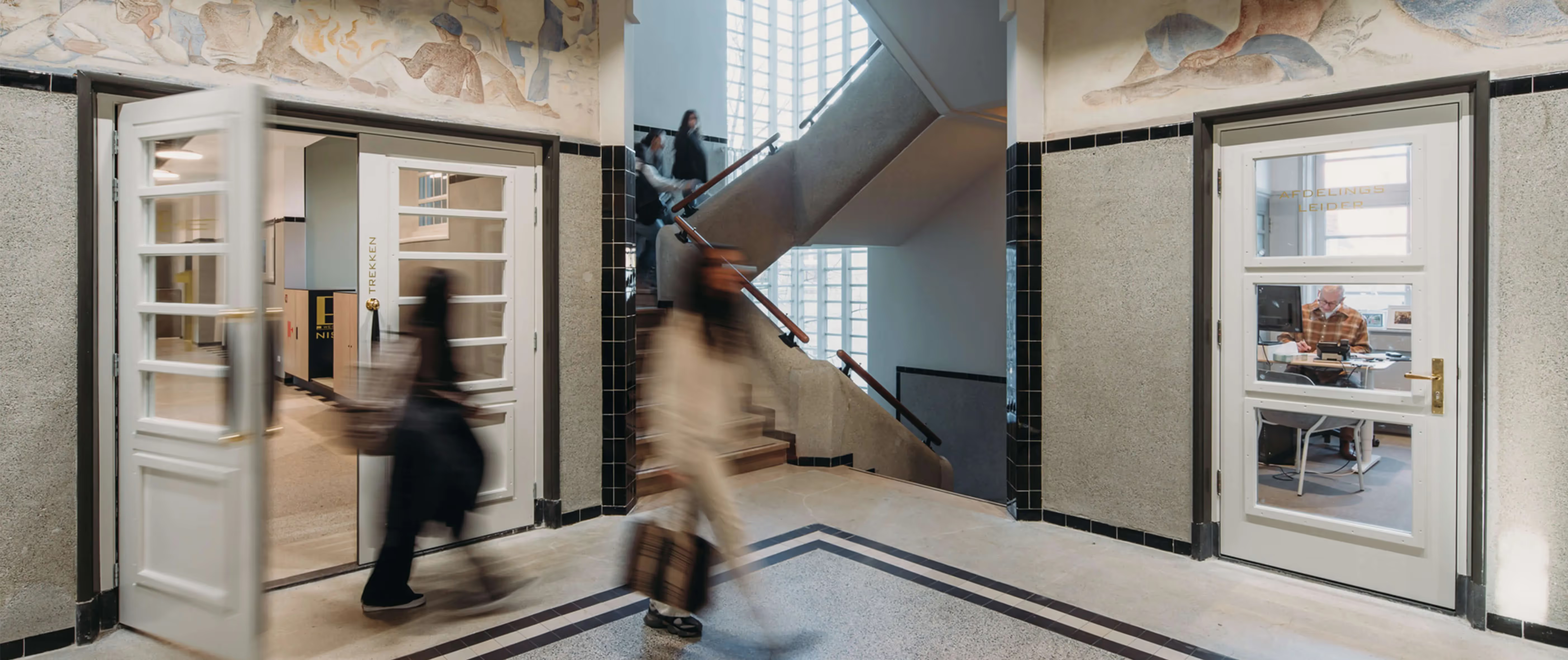
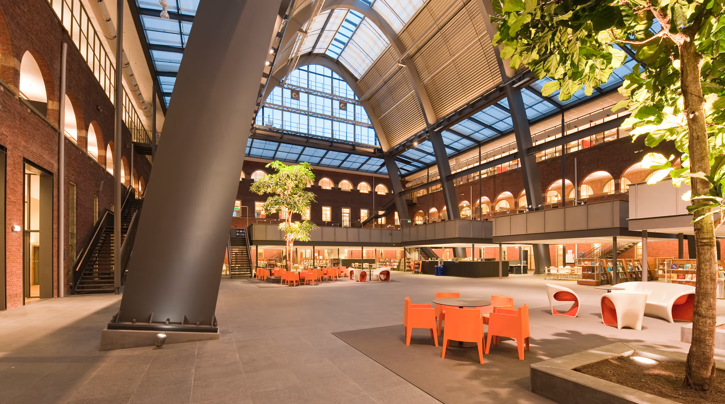
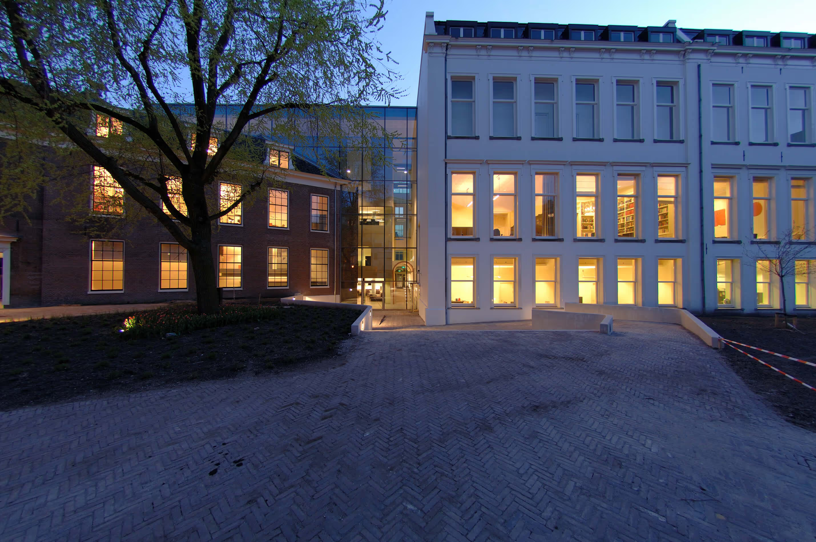
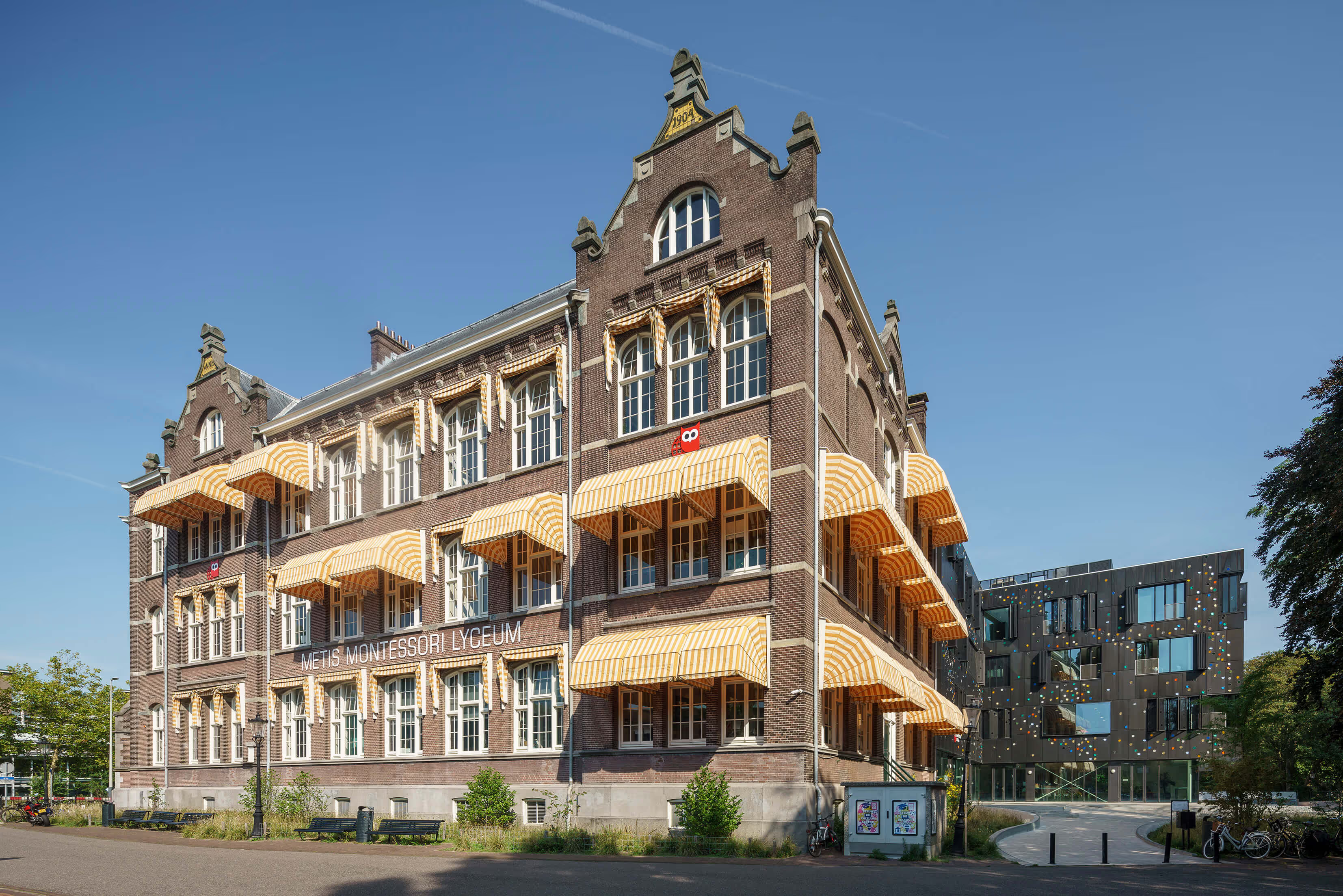
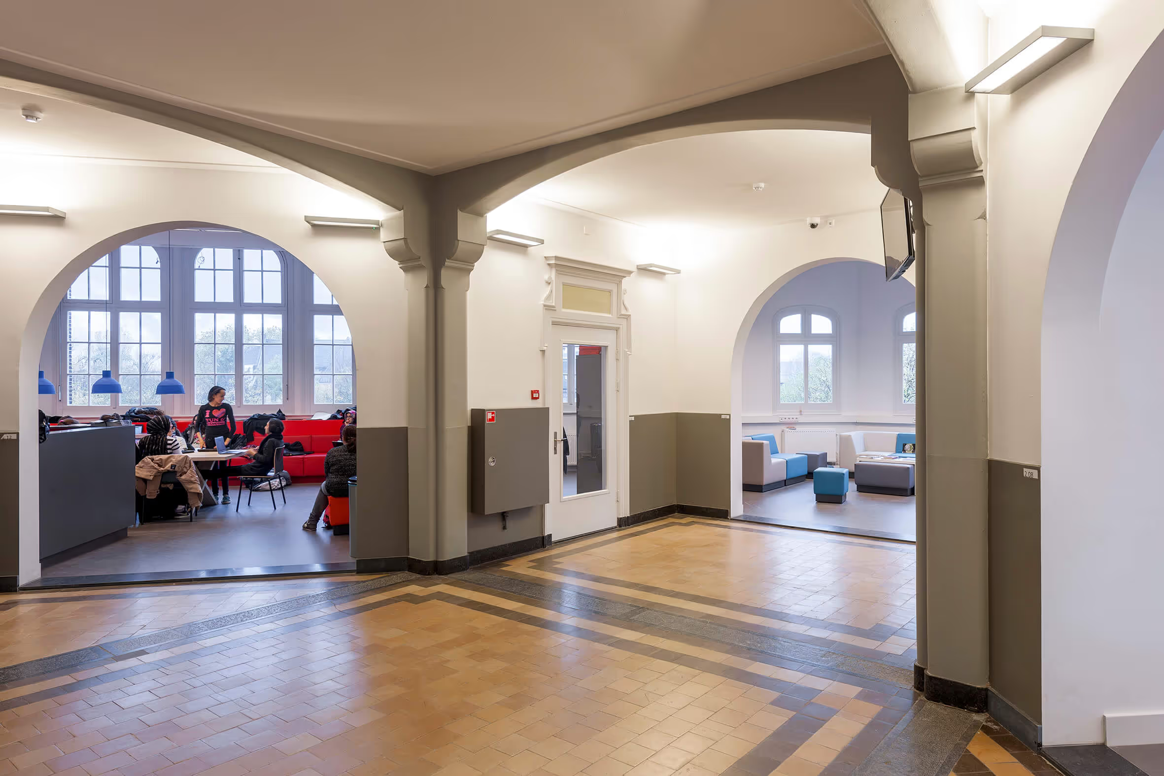
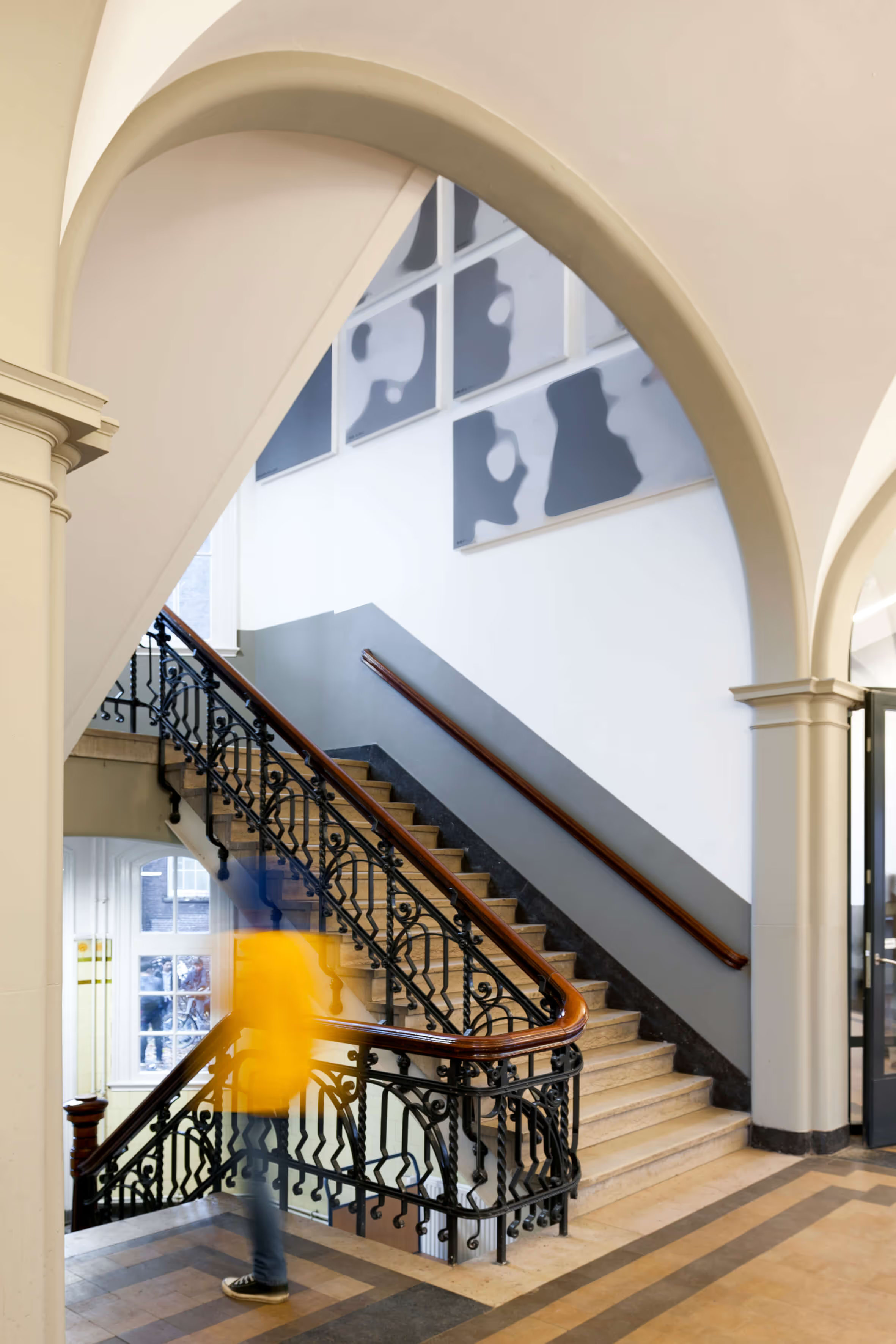
In 2013, the Metis Montessori Lyceum moved into the former HBS in Oosterpark. The building by architect Hendrik Leguyt has always served as a secondary school since its completion in 1904, and the client wanted to keep it that way. In order to make the historic school suitable for today's requirements, however, extensive renovation and renovation was necessary. In addition, the original rich details - the stairwells with wrought iron railings, the vaults and arches in the corridors, the wooden cabinets with glass in the rooms and the beautiful tiled floor - were brought back and the old atmosphere was restored. For the corridors and stairwells, atelier PRO chose a restrained color palette, in line with the original design, with contrasting colors for details such as doors and paneling.
A monument as a Montessori school
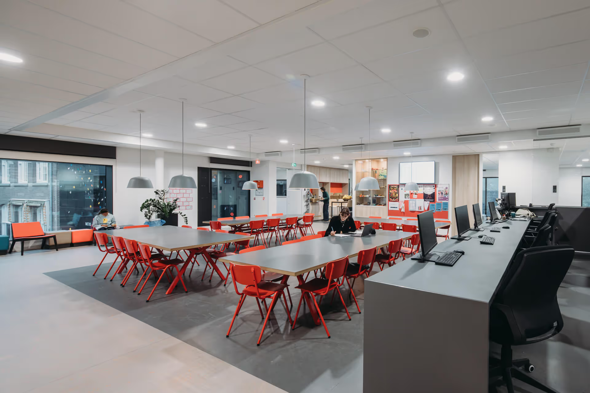
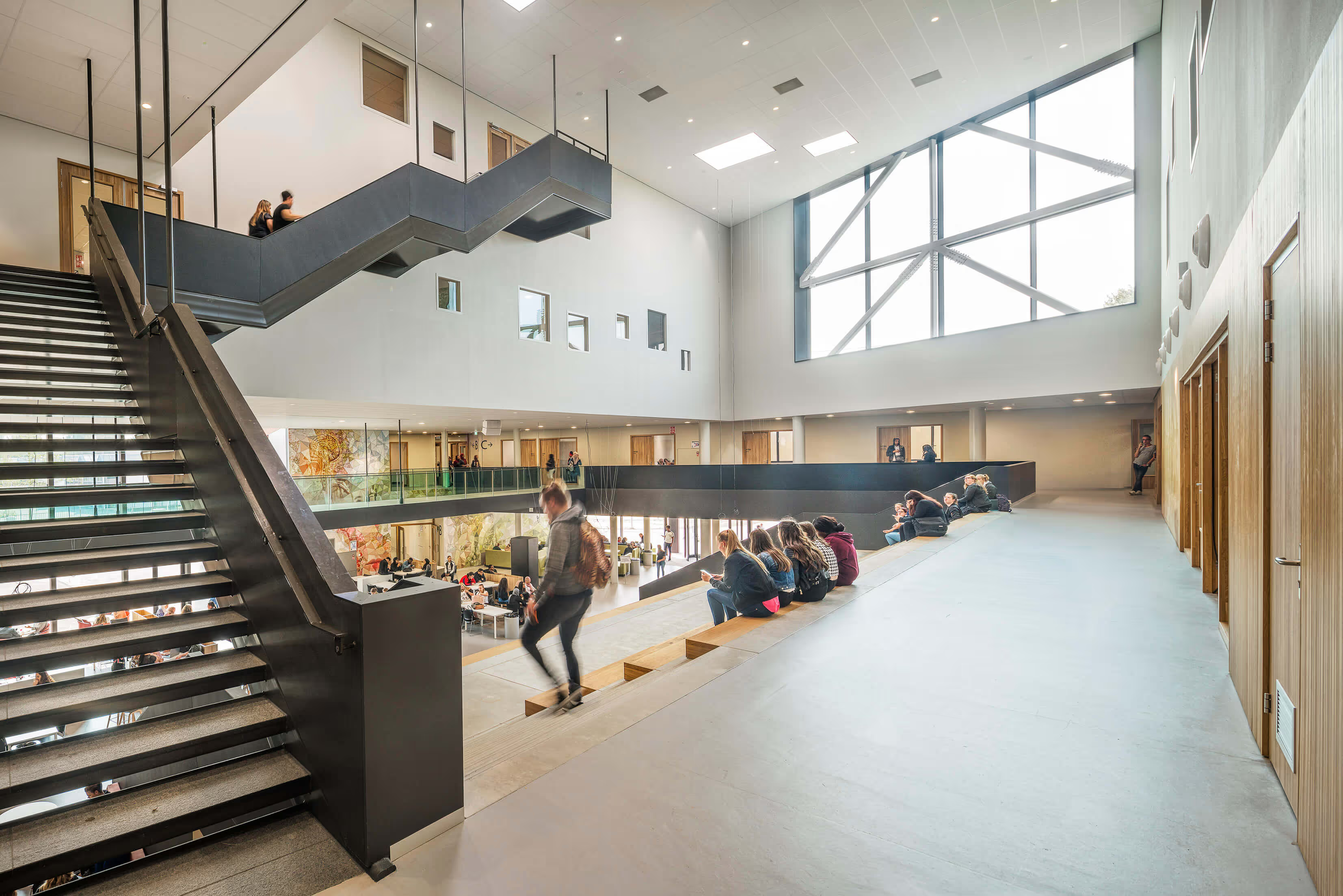
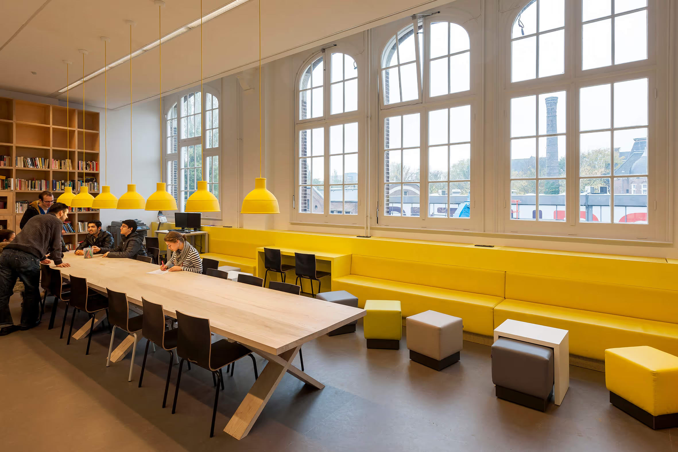
To break the strict rhythm of the classrooms in the classic school building, a “learning square” has been introduced in the heart of the school. Where there were once a number of classrooms, arches were installed in the load-bearing walls so that, together with the corridor, they now form one large space. According to the principles of Montessori education, students can work individually or in groups here in the lounge, the quiet room or the meeting place. In addition, by installing acoustic ceilings, we have also improved the acoustics of the corridors and classrooms; sound-absorbing panels were installed in the stairwell with portraits of global citizens — in order to still give a necessary intervention an educational function. Thanks to the new balanced ventilation, the building now complies with Frisse Scholen B.
New construction for new education
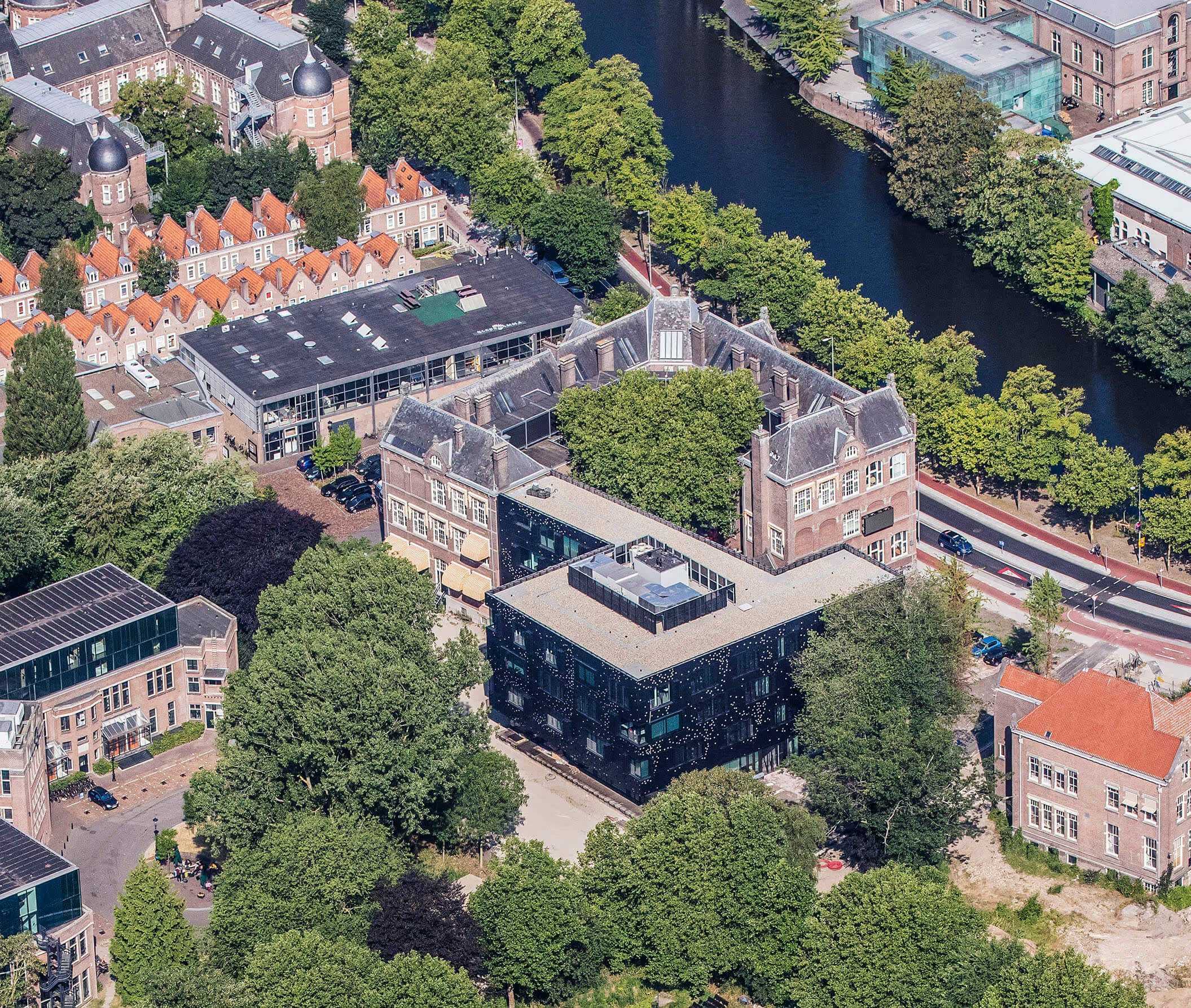
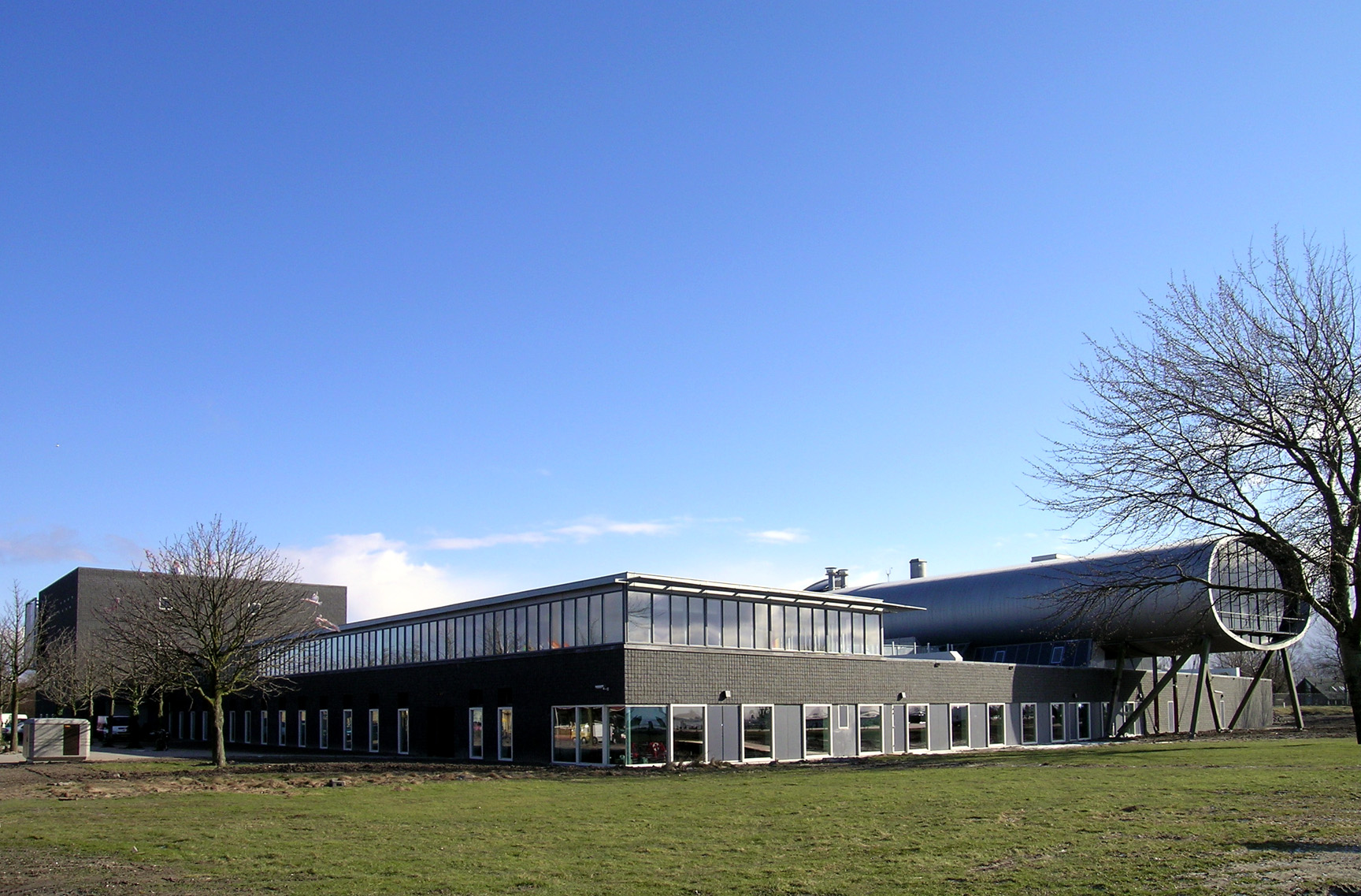
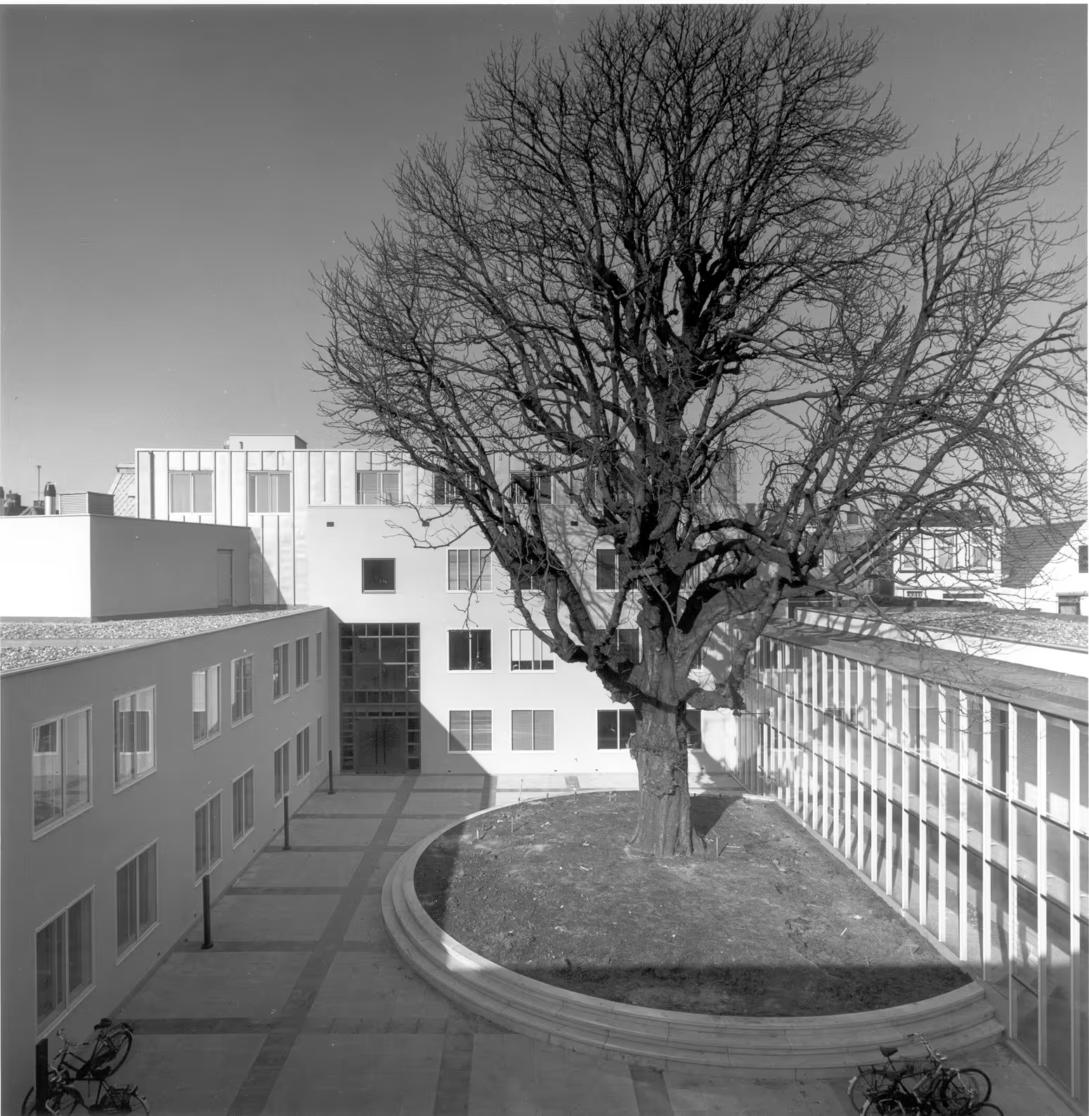
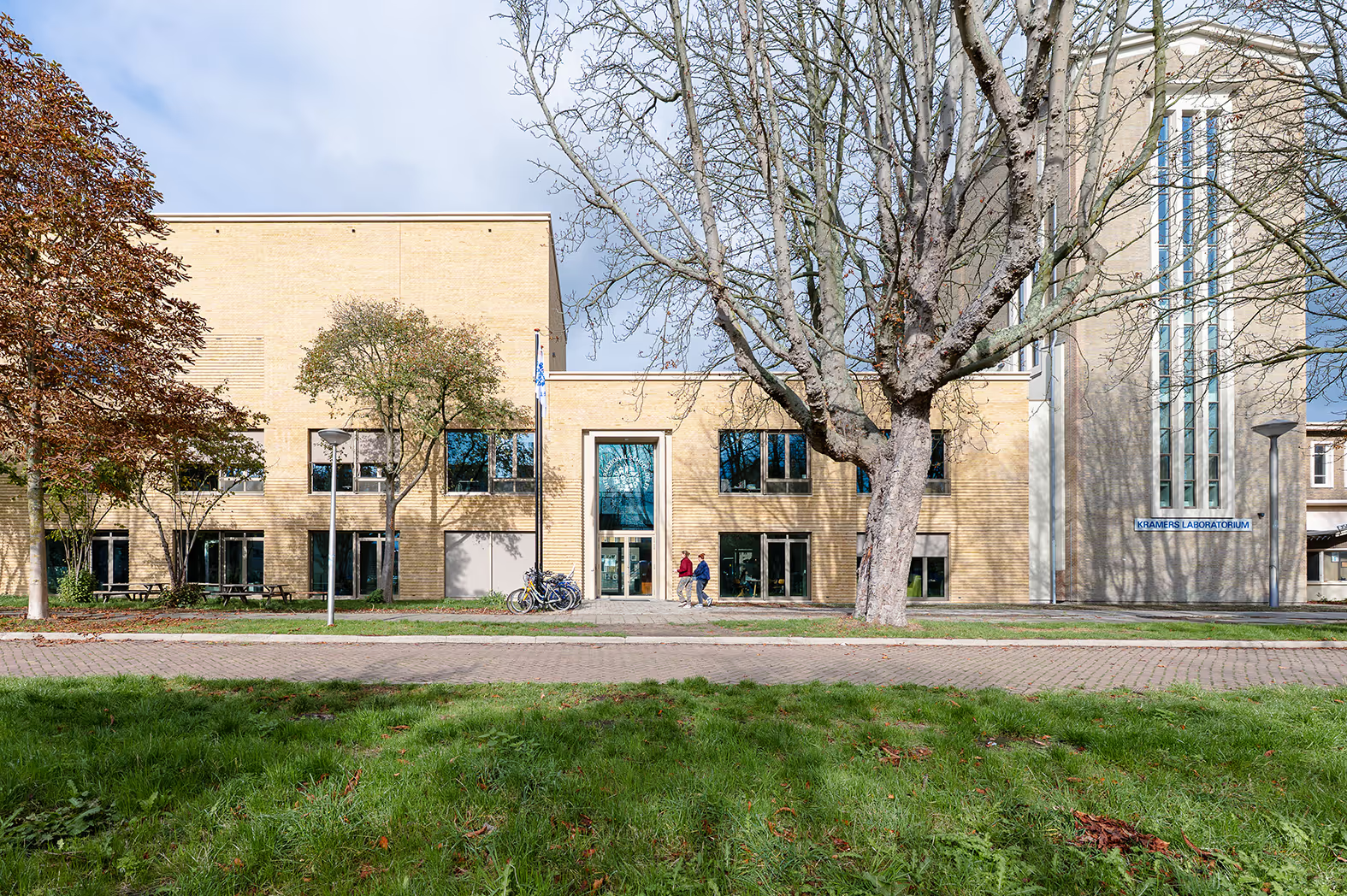
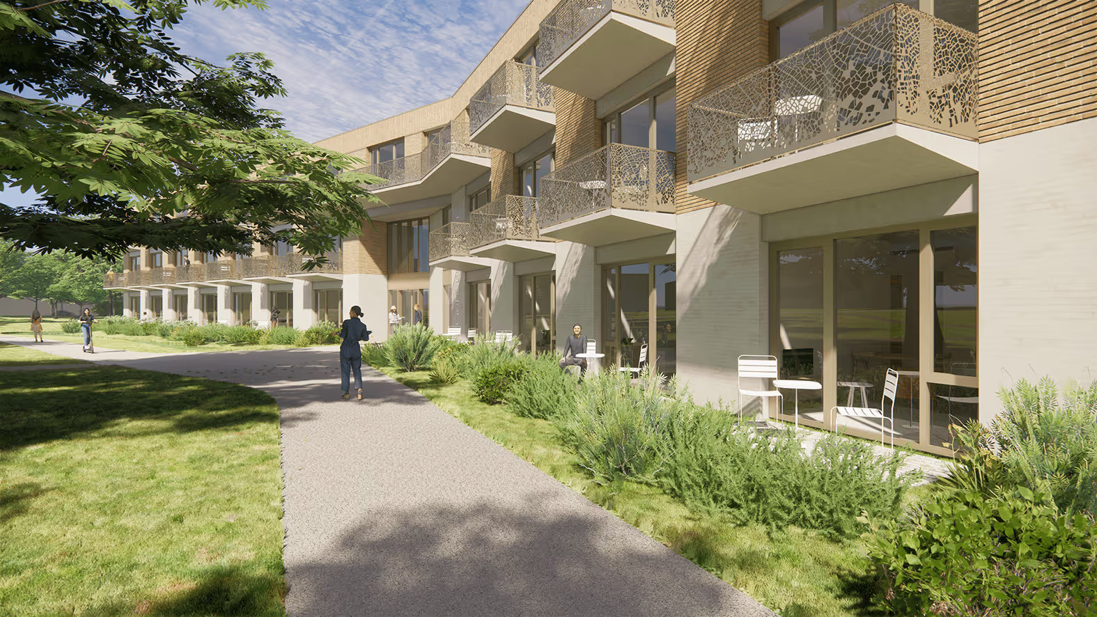
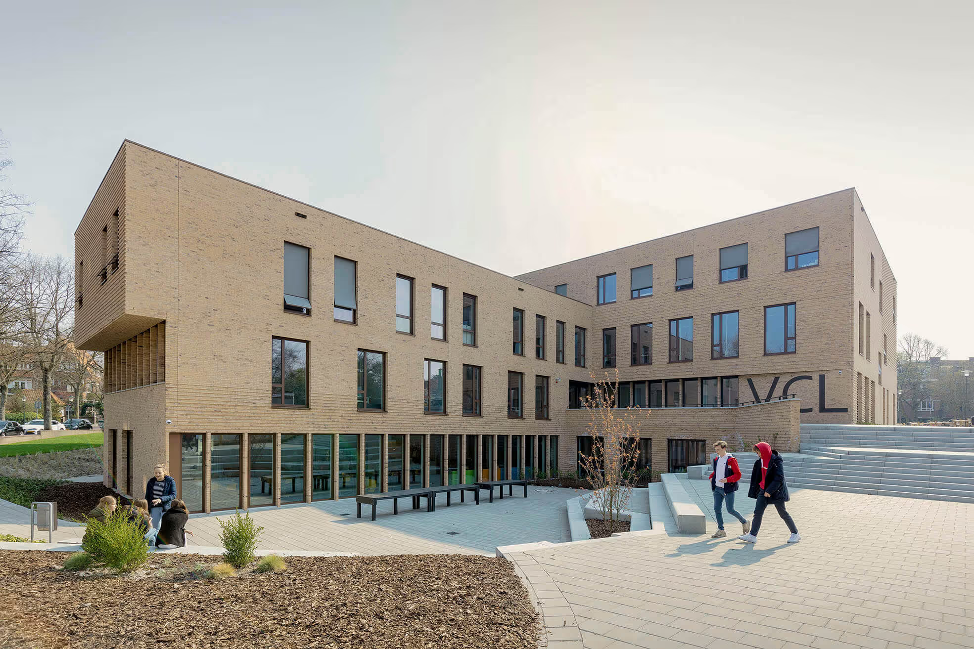
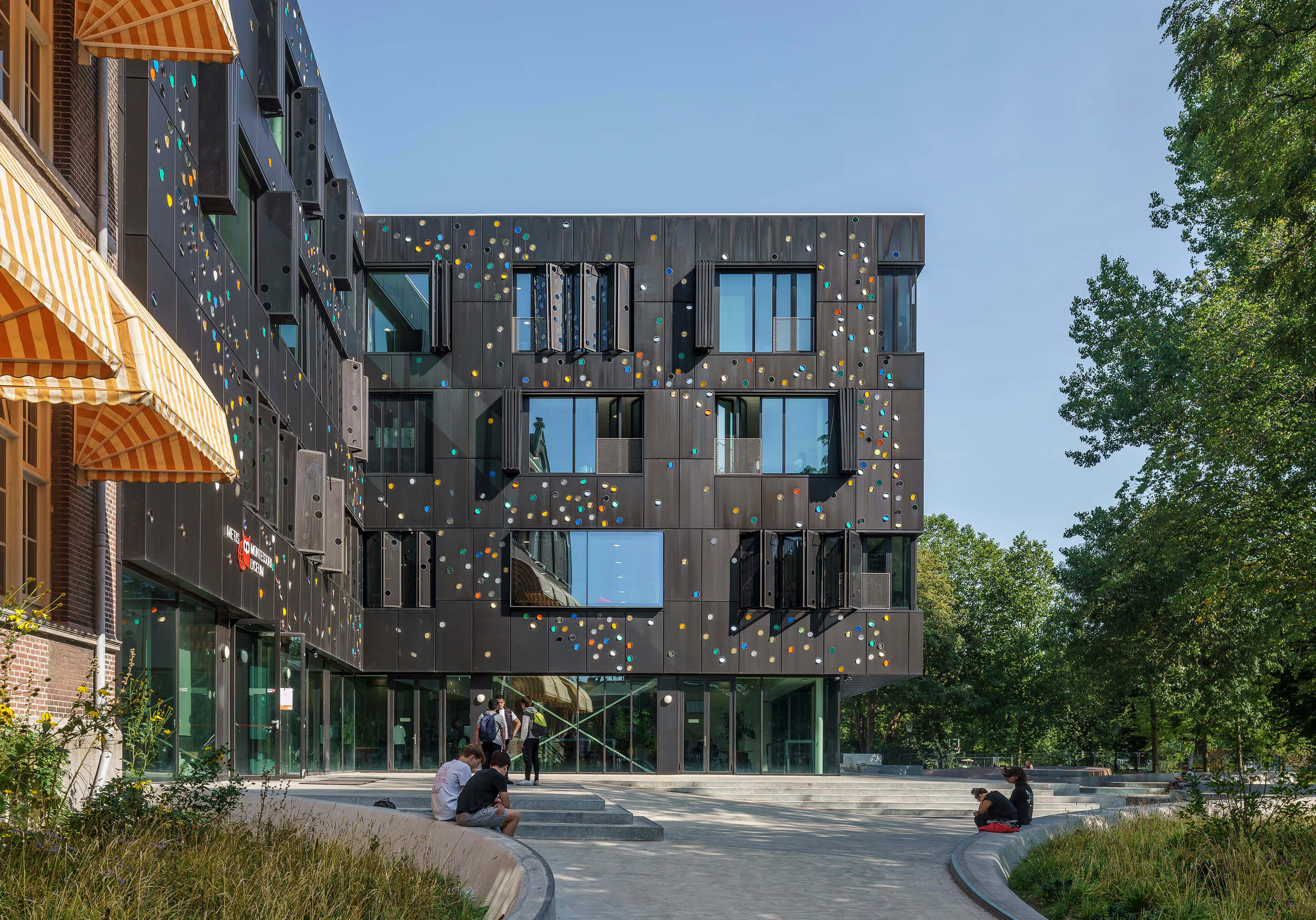
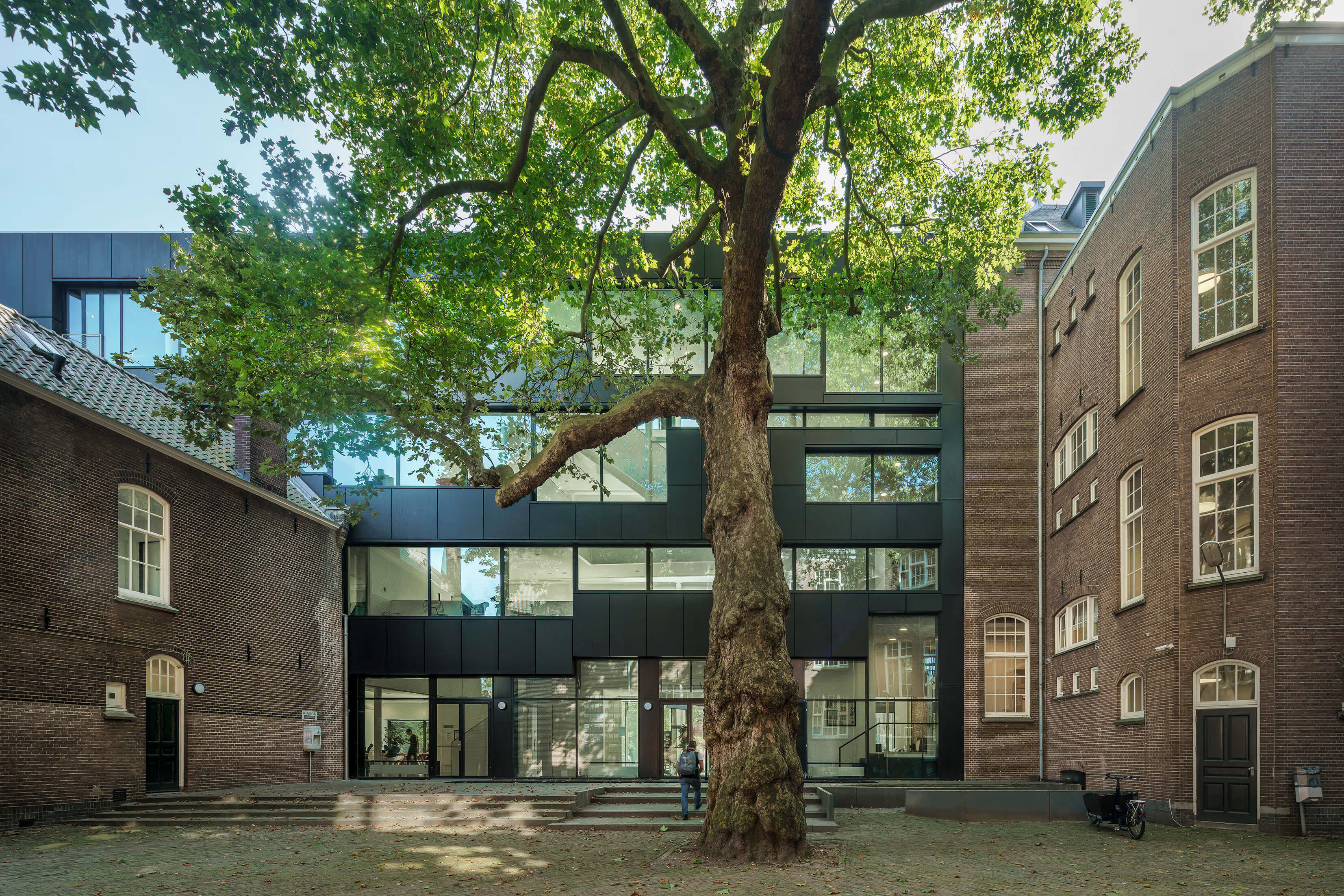
The Metis Montessori Lyceum wanted to grow from around 700 to over 900 students. However, the original building was too small for that and renovation alone was not enough. That is why a new wing was added, designed as a separate, all-sided pavilion in the park. Due to the special location, the new building had to meet a number of strict urban planning principles; for example, the footprint of the extension could be a maximum of 900 m², with a height of 4 layers. In addition, the new wing was supposed to strengthen the relationship between the school and the park and ensure an improved connection between the park and the Mauritskade; the connections between old buildings and new buildings and the logistics of student flows also required attention. And to complete the challenge, we also had to take into account the monumental caretaker's house and the monumental plane tree on the patio in our design.
A school building as a pavilion in the Oosterpark
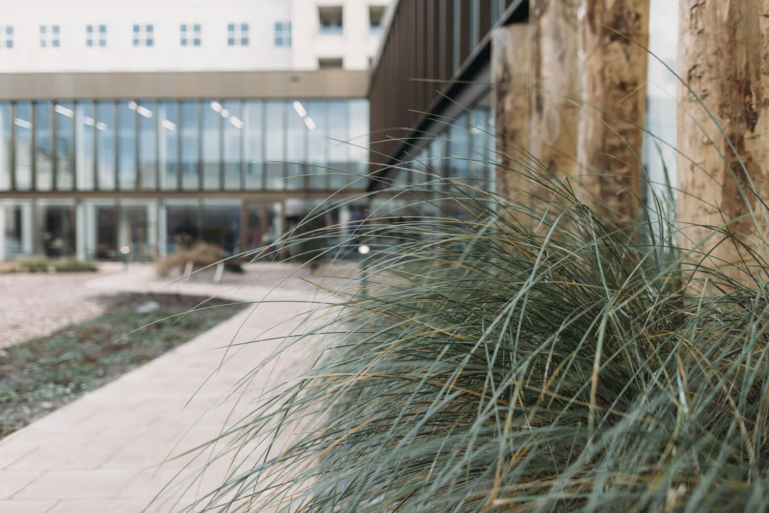
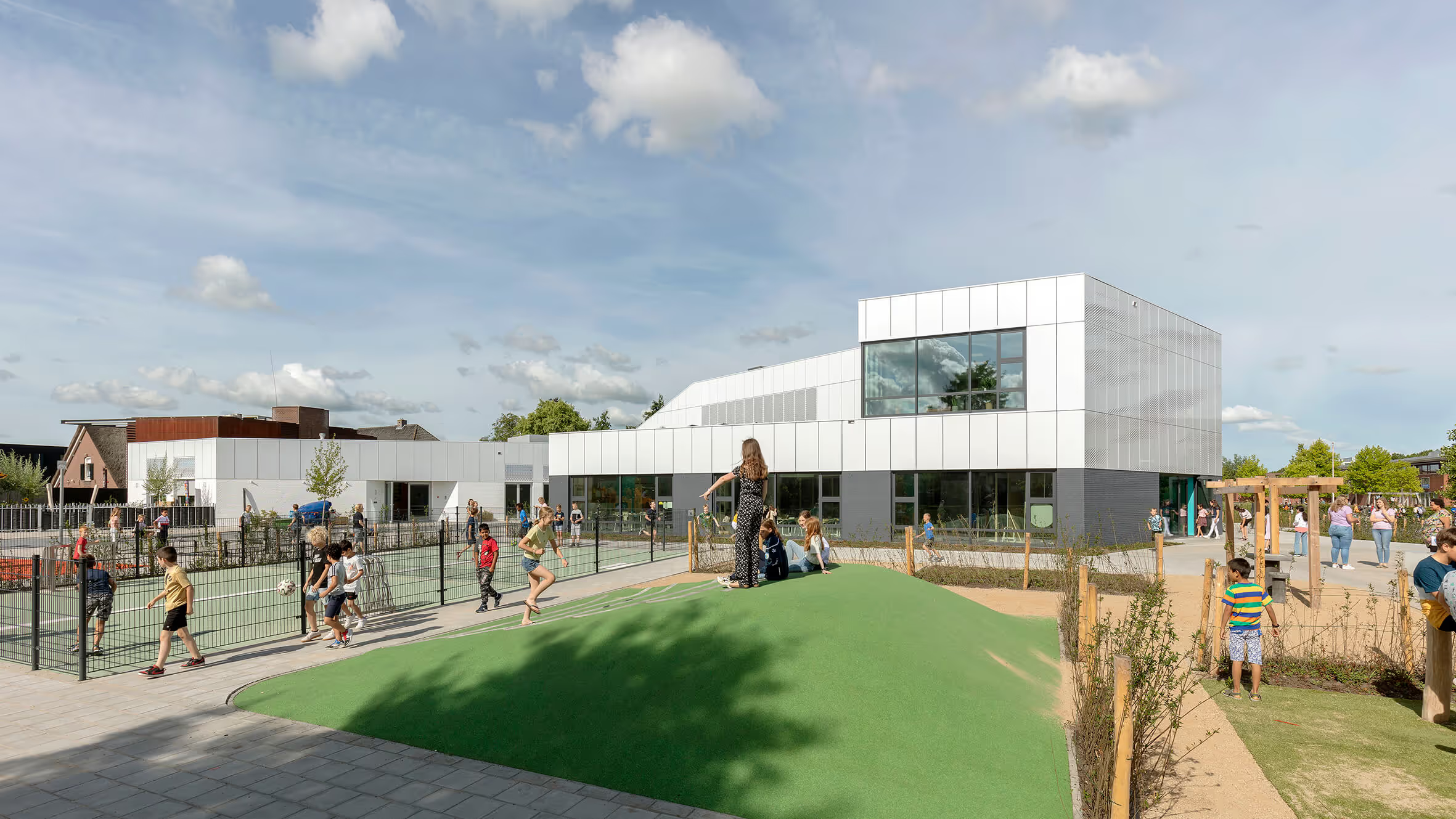
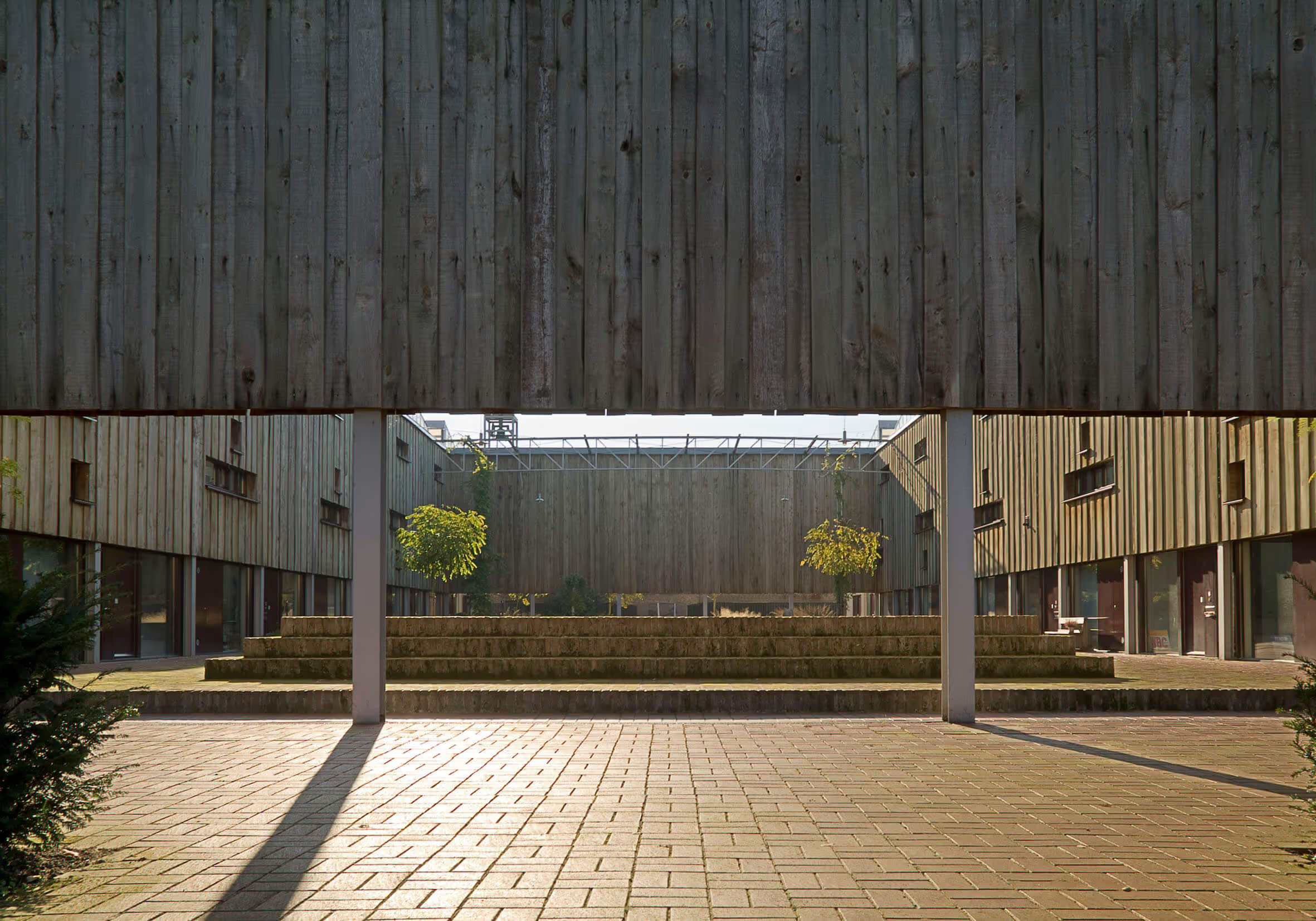
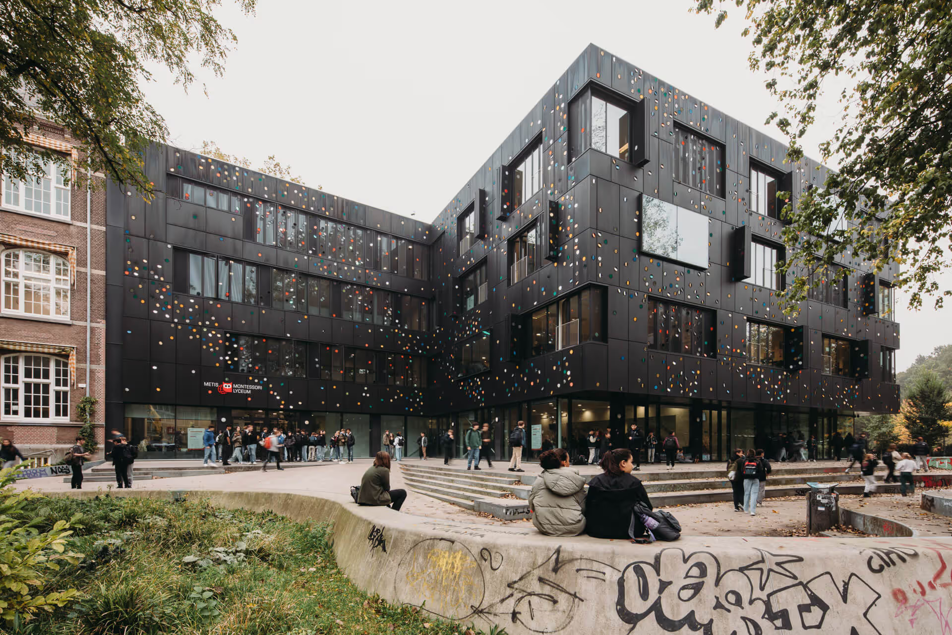
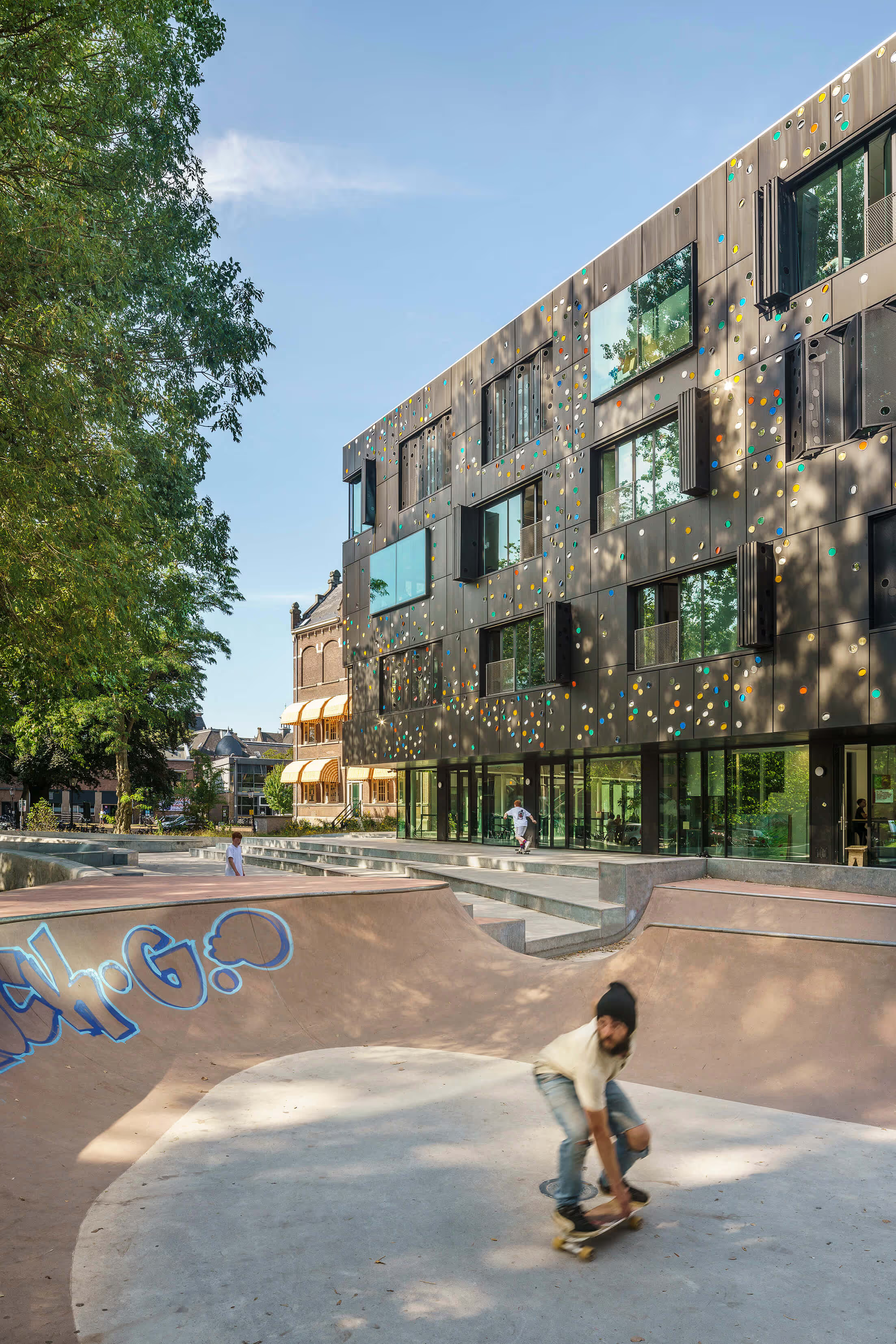
The southern part of the Oosterpark has always been more green and open, while the northern part of the Oosterpark had buildings surrounded by fences - including the former HBS. As part of a major park repair operation, this part was opened more, so that the Oosterpark has “doubled”, as it were. The fences around the school have been removed to create more public greenery. The landscape continues, from the park via the skate park to the pavilion façade, and even into the school complex: the old building and the new building together form a square around the monumental plane tree.
Connection between city, school and park
The buildings on the Mauritskade also used to have an entrance on the Oosterpark side - which have now been brought back. The Metis Montessori Lyceum also had its back to the park; the entrance and classrooms were all oriented towards the city. With the expansion, the school not only wanted to better organize the flow of the entrance zone, but also make optimal use of the location next to the park; that's why we opened the entrance to the park again. The 'reversal' gave the school the opportunity to also let classrooms overlook the park.
Here comes the sun — art as part of architecture
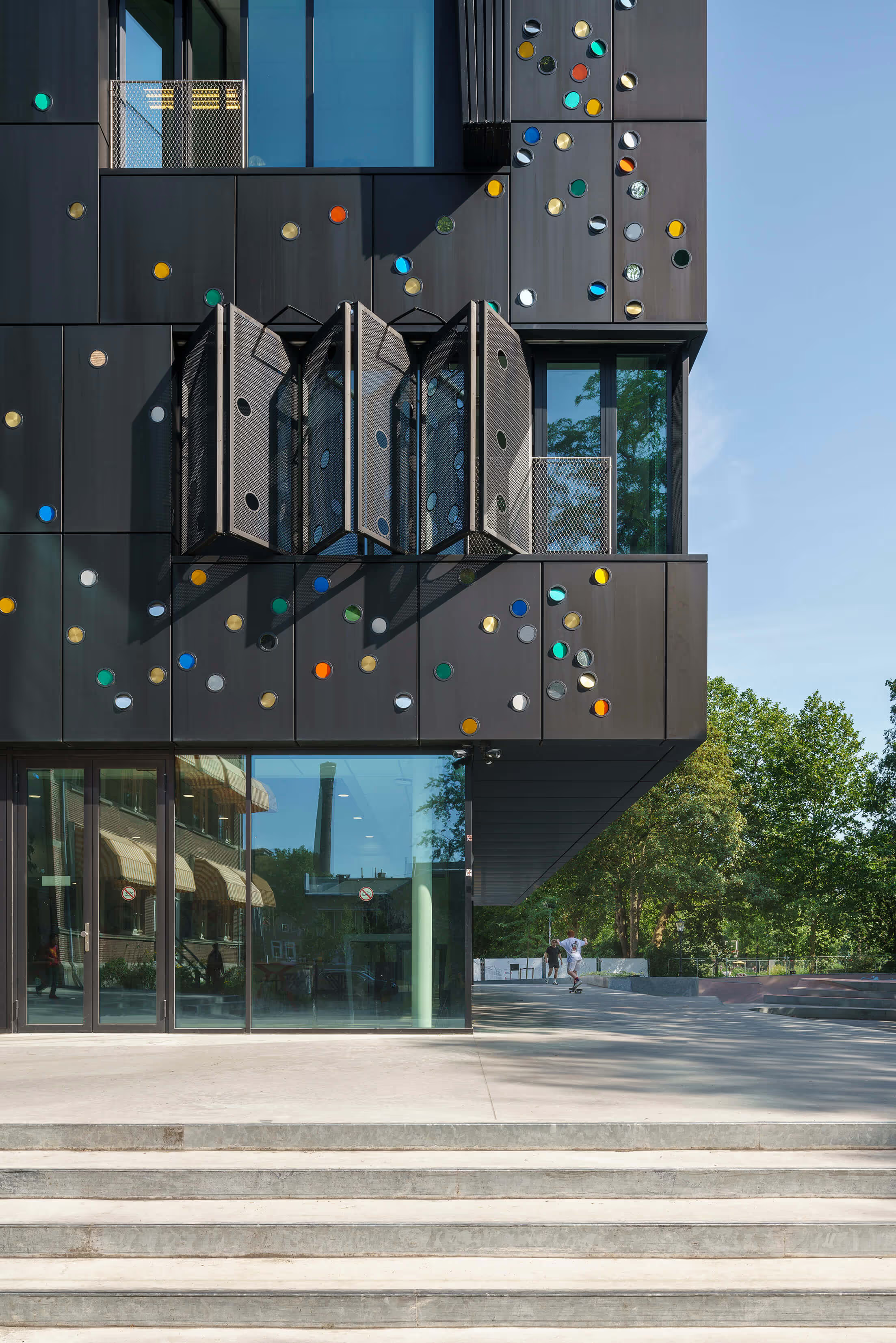
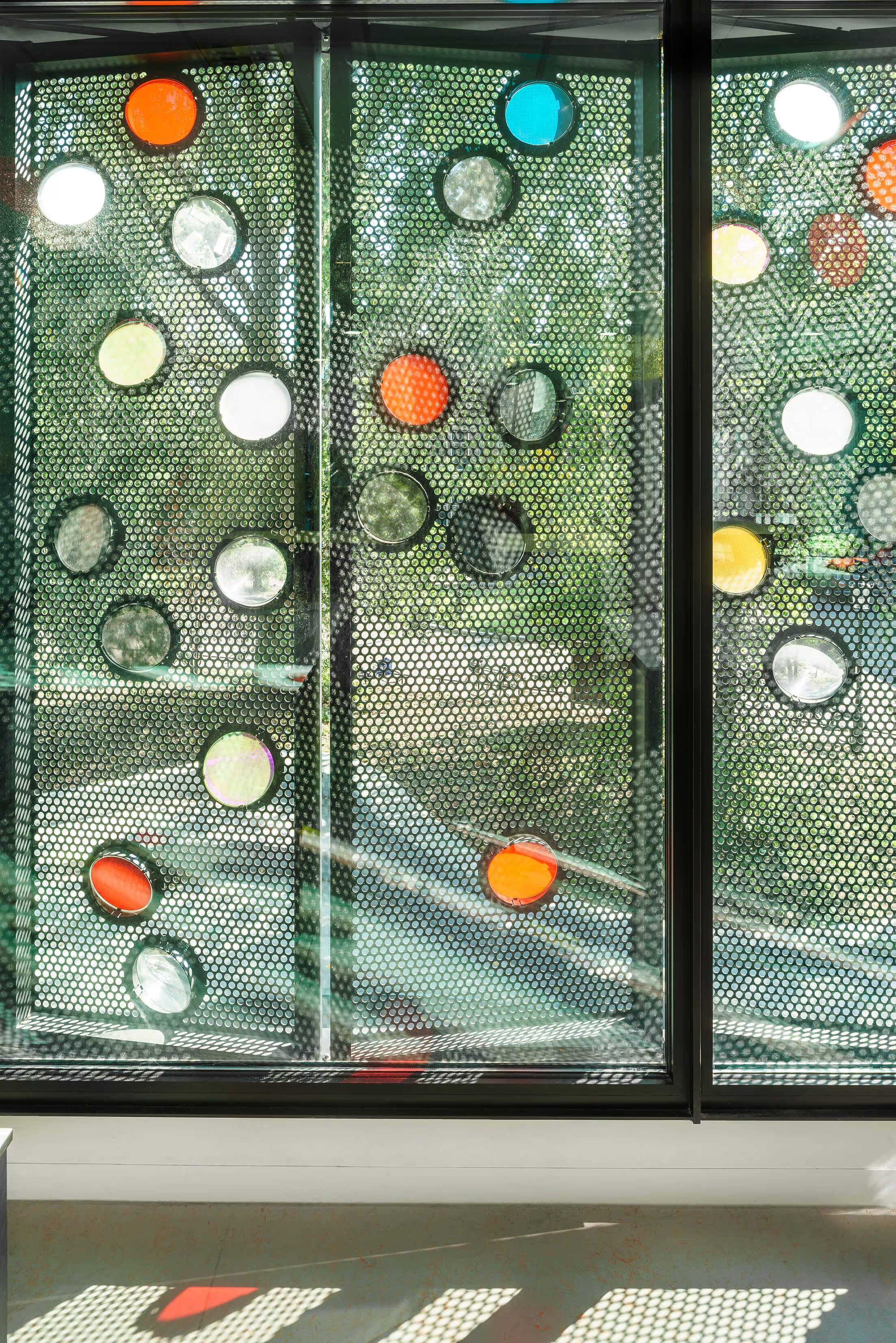
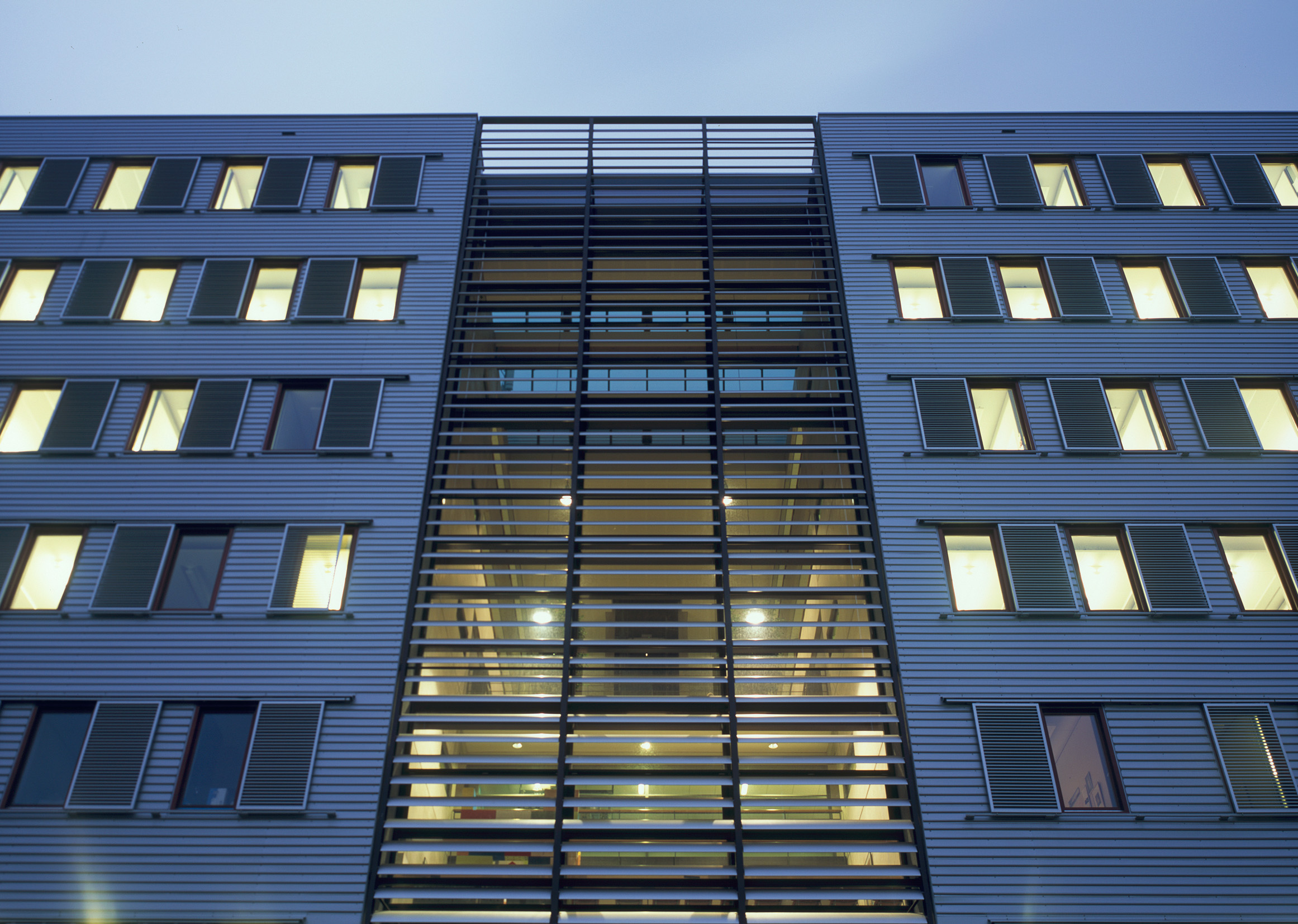
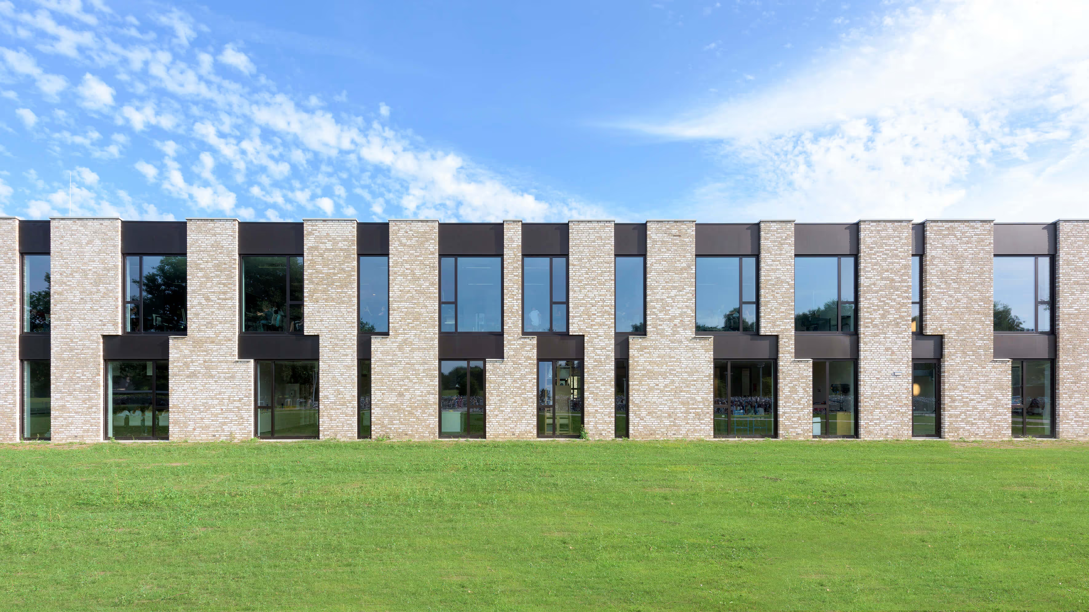
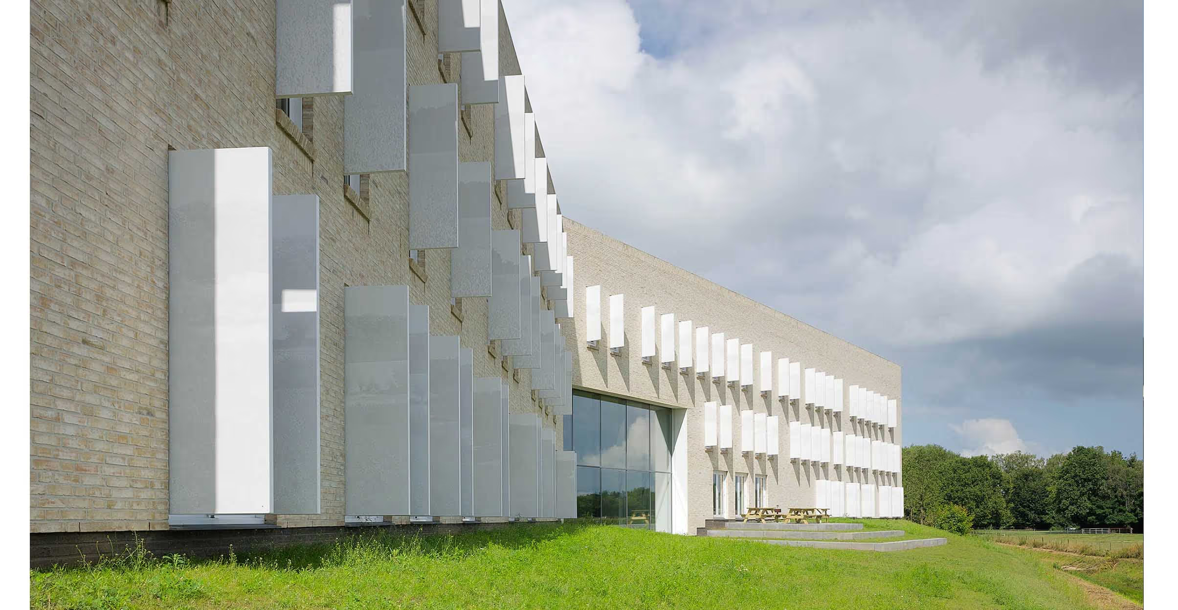
We deliberately designed the pavilion in contrast to the old building: the façade features striking, black perforated panels that not only function as sun protection, but are also part of Chris Kabel's artwork “Here Comes The Sun”. He has added more than 4,500 transparent glass lenses and filters in various colors to these panels; the light that falls through these lenses and filters creates a diffused and playful effect in the classrooms. The pattern of the lenses refers to the wave and particle nature of light, while the colors are chosen in line with Montessori teaching.
A building as a built educational vision
The Metis is a school that wants to train its students to become global citizens, with attention to the opportunities and talents of individual students. In line with the Montessori idea, the new building has plenty of room for collaboration, knowledge sharing and meeting; the school should be a place where everyone knows each other personally and can easily address each other. Interior design plays an important role in this, because the interior - as an 'interface' between building and user - has a major influence on people, their behavior and their learning performance. The interior is therefore the carrier of the “school culture”, but at the same time, from the point of view of the “school business”, it must also be easy to adapt to new opportunities, new processes and teaching methods. In addition, the interior must be a representative representation of the “school identity” - where attractiveness also largely determines sustainability.
Interplay between encounter and education
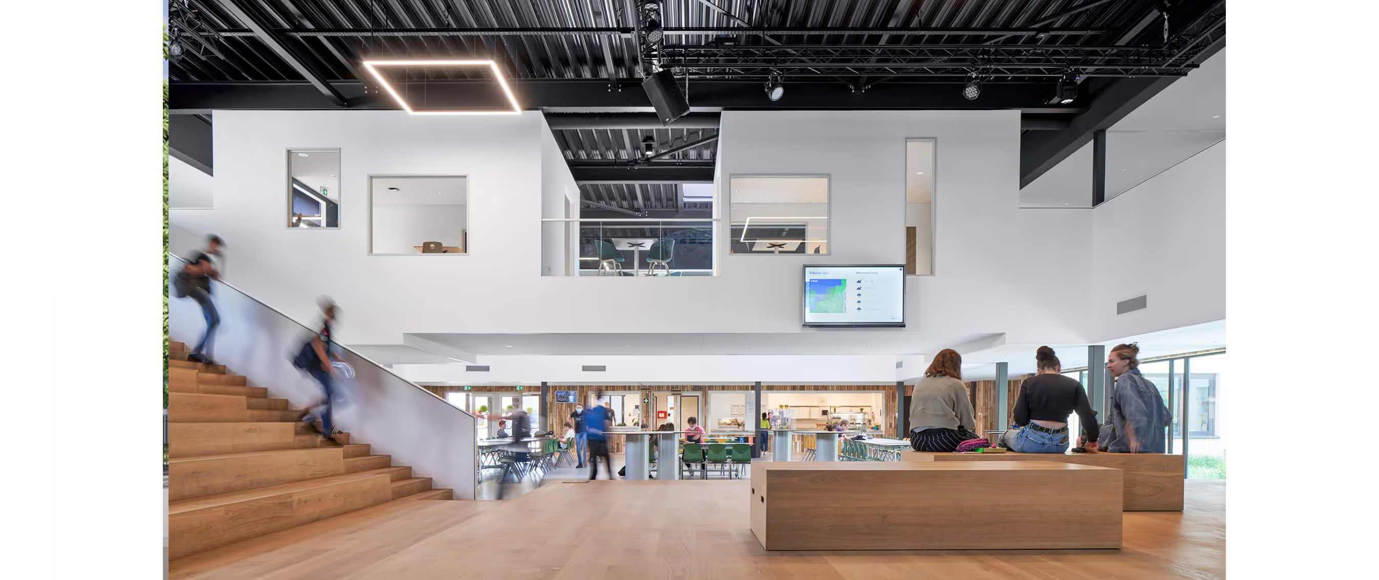
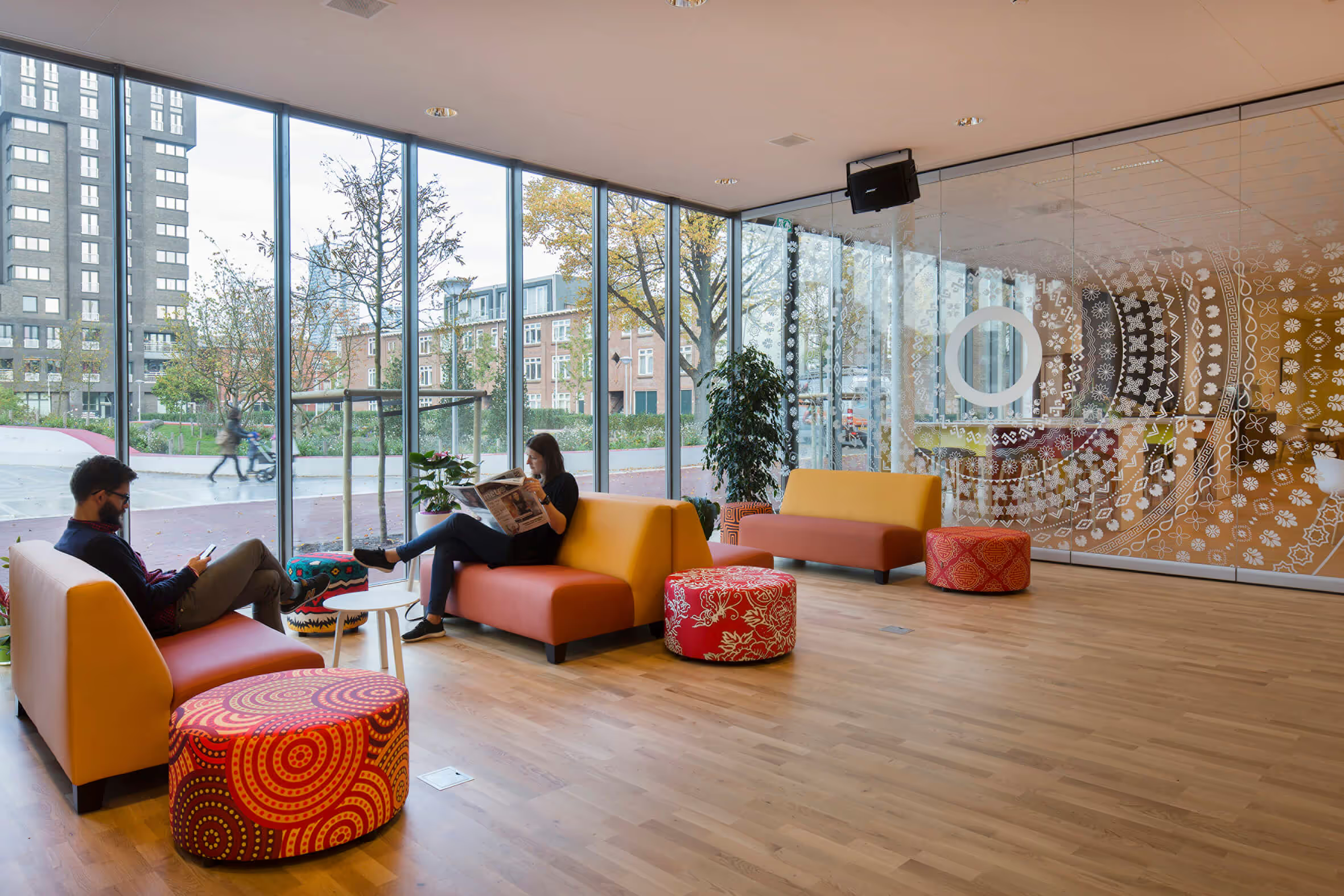
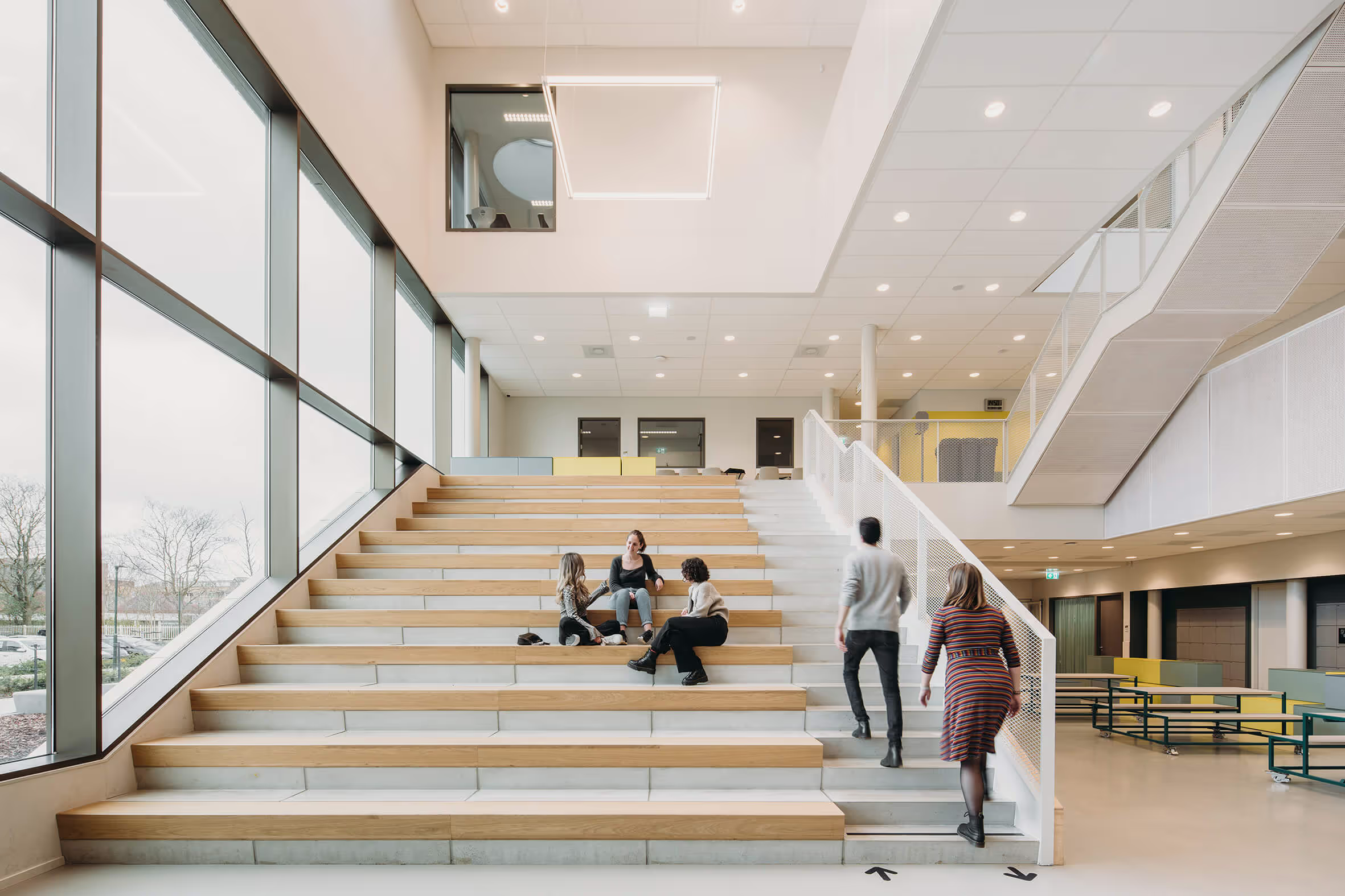
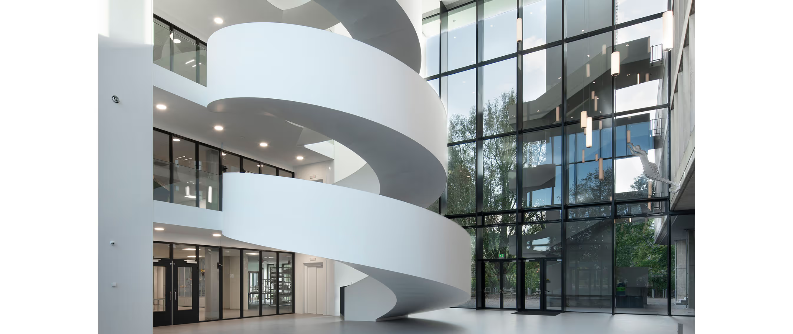
Encounter is central to the education of the Metis Montessori Lyceum. In interior design, the circulation areas — the entrance, the corridors, the auditorium and the learning plazas — therefore play an important role. The students enter via the private patio with the plane tree - the first meeting room, which is therefore explicitly also part of the (interior) design. There is a large central auditorium on the ground floor and on the upper floors, students reach the classrooms via the central learning square; teaching spaces thus transform into social zones where students meet each other and where cross-pollination takes place.
A flexible interior
The multifunctional auditorium is located in a beautiful spot on the Oosterpark, with large glass double doors to the outside, where students can work together on projects - even outside of class hours. On special occasions, the auditorium is transformed into a theater, with a stage, theater technology and an audience setting. The space can therefore be used multifunctionally, without sacrificing daily use as a comfortable place to stay and meet. But teaching spaces can also be used flexibly: for example, each learning square can be connected to two flex rooms, which are equipped for different types of education. Students and teachers can adjust and open these spaces in the blink of an eye, from a small-group project setup to a classroom presentation.
Technasium workshops as a showcase for the school
On the ground floor are the two large workshops for the Technasium — a form of education that focuses on beta subjects. These rooms are specifically designed for the Research & Design exam course; in this subject, which forms the core of the Technasium, students work in groups on current technical assignments — that's why the studios have placed large, tall group tables that can be moved (on wheels) in any desired setting. In addition, a workshop for Biology and a second workshop for Robotics, the school consciously opts for a practical and forward-looking form of education. The studios are ideally located on the ground floor, for maximum exposure, as a calling card for the Metis Montessori Lyceum.
Architecture and interior as a whole
Together, the interior and architecture form a coherent whole: they complement and reinforce each other, and provide identity and familiarity. At the same time, the interior of the new building, through the continuous use of neutral tones in combination with primary contrasting colors, also matches the interior of the monumental part. The classic type of school building has developed here into an educational landscape that makes lifelong learning possible.

