Meander Medical Center
Meander Medical Center
Meander Medical Center

A hospital as a 'healing environment'
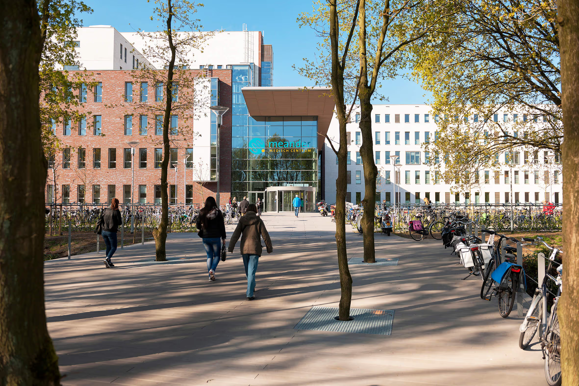
A building nestled in the landscape
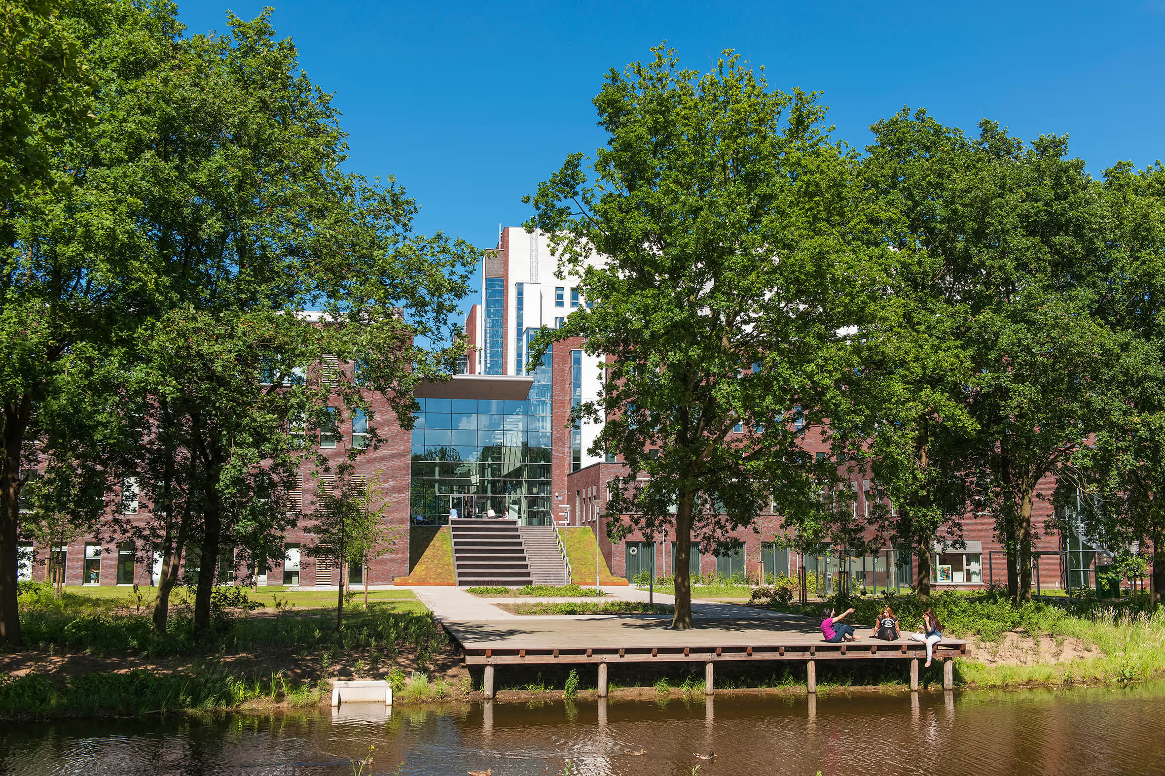
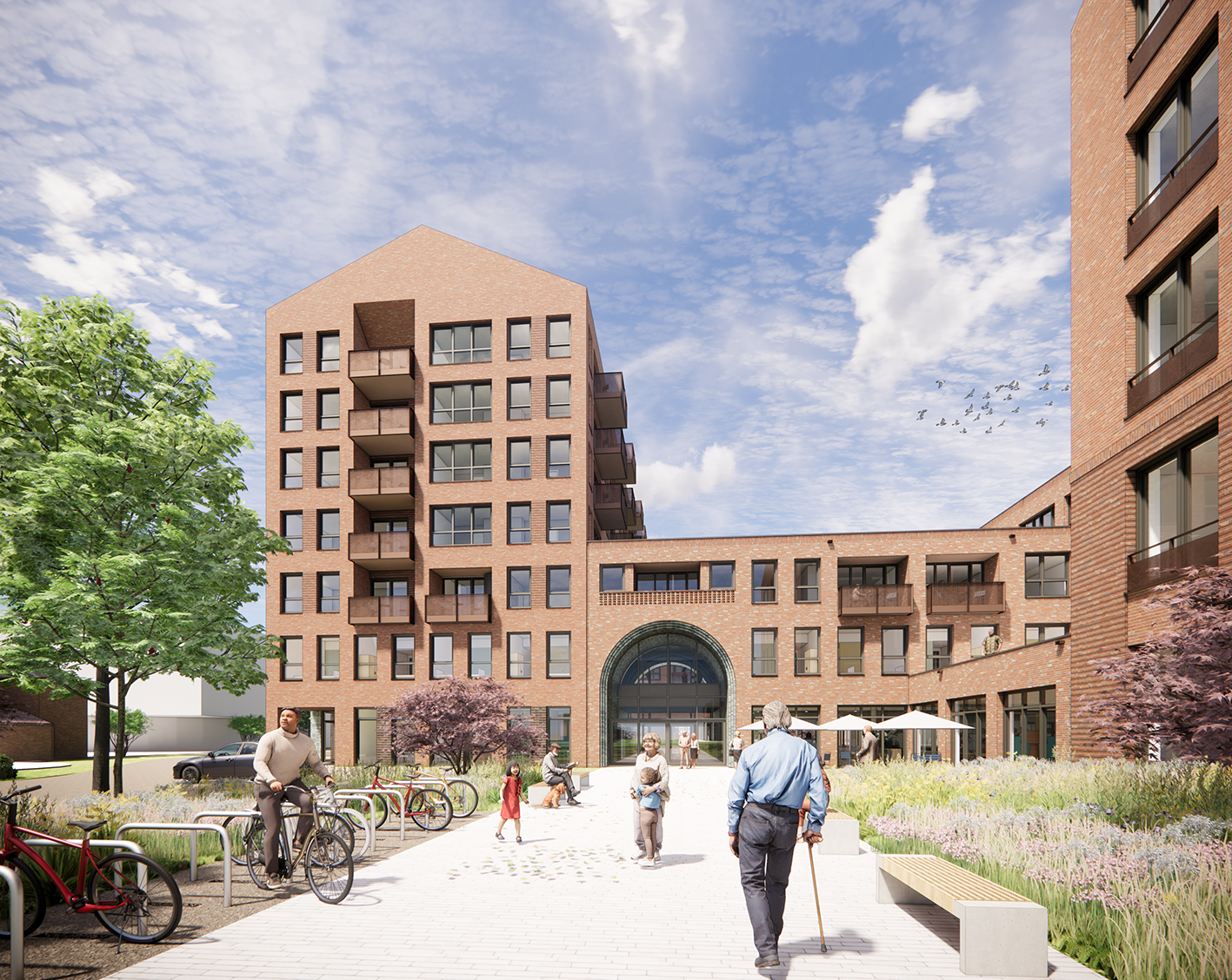
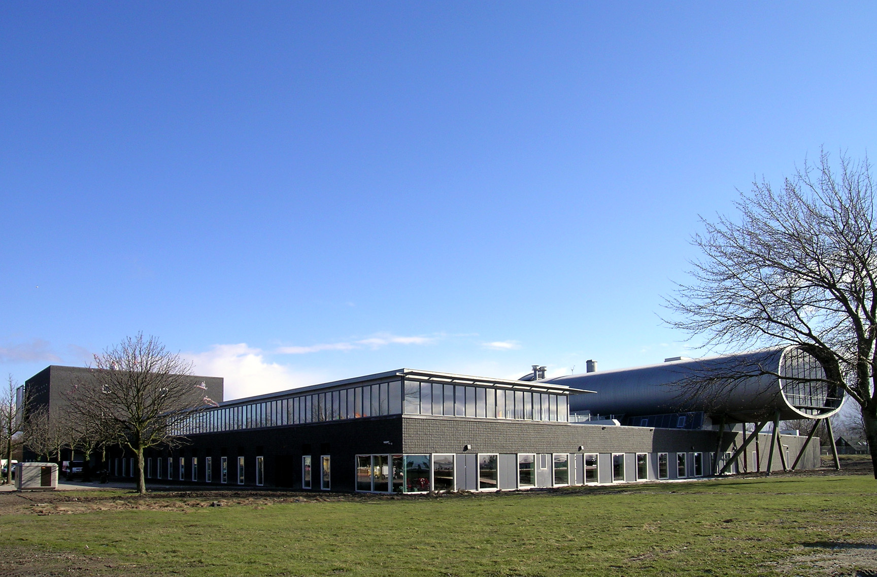
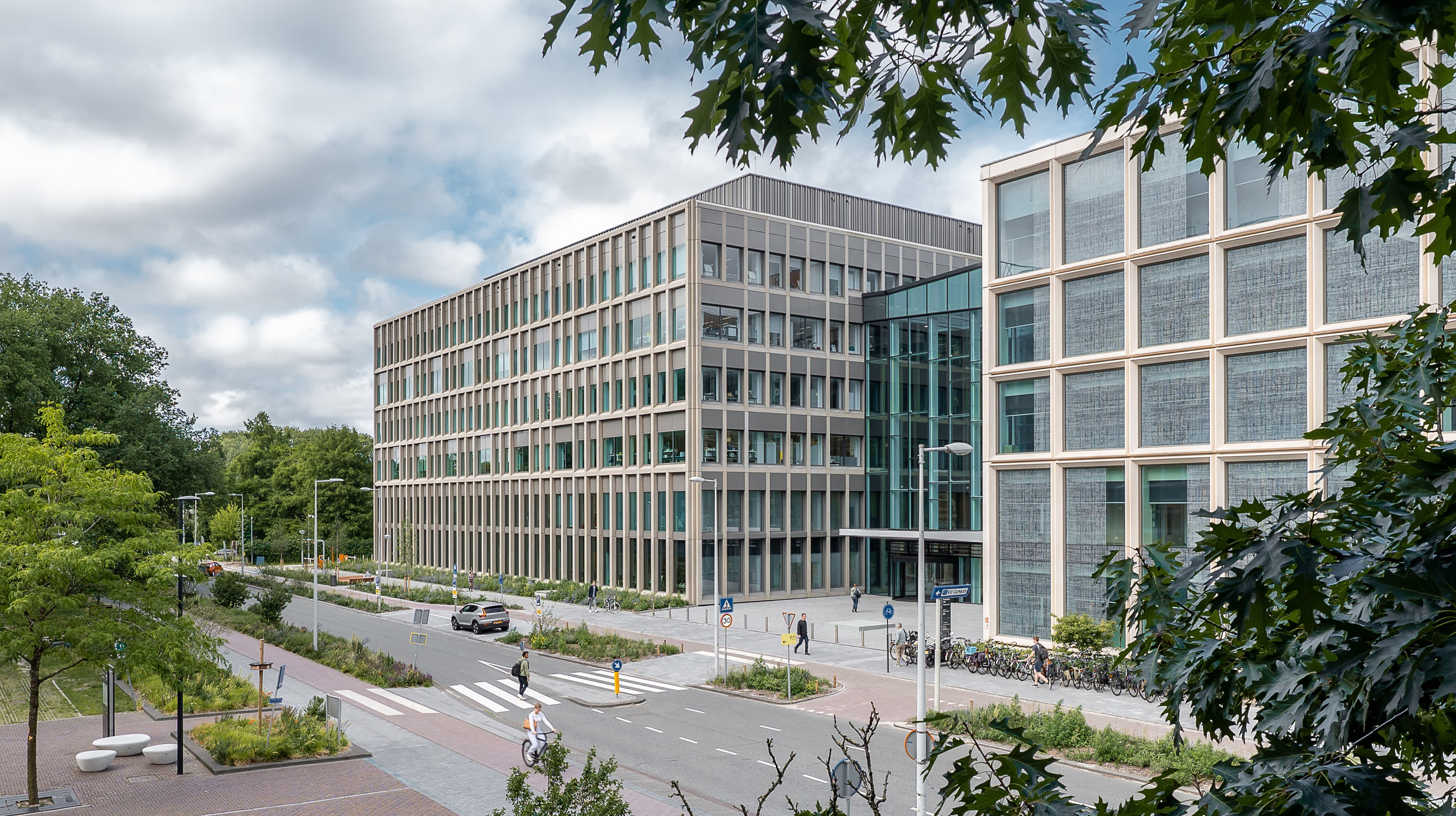
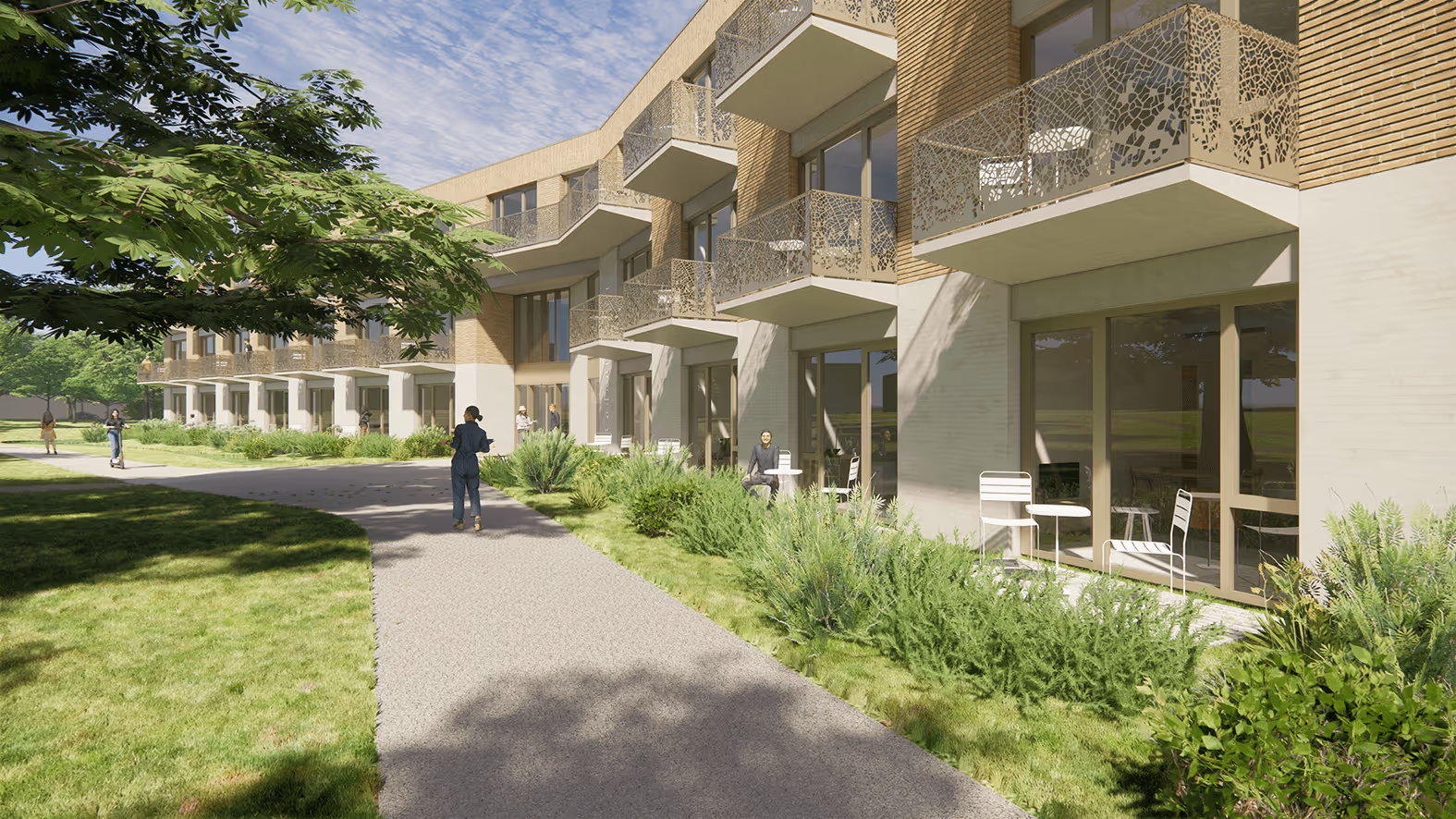
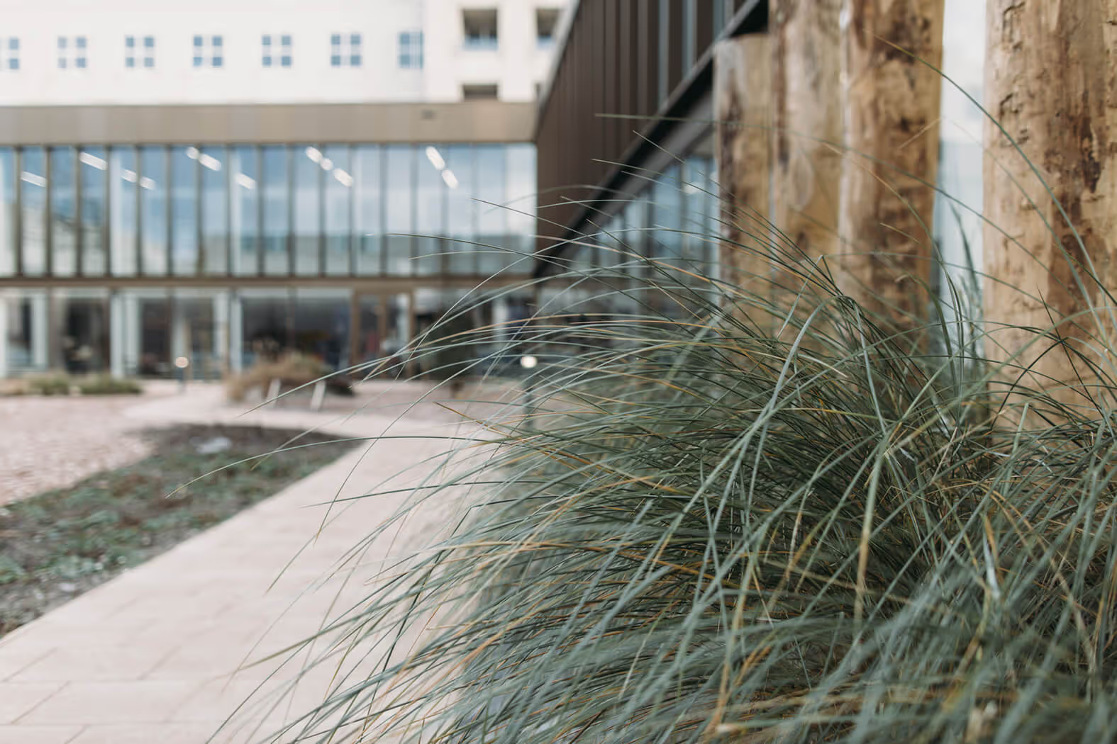
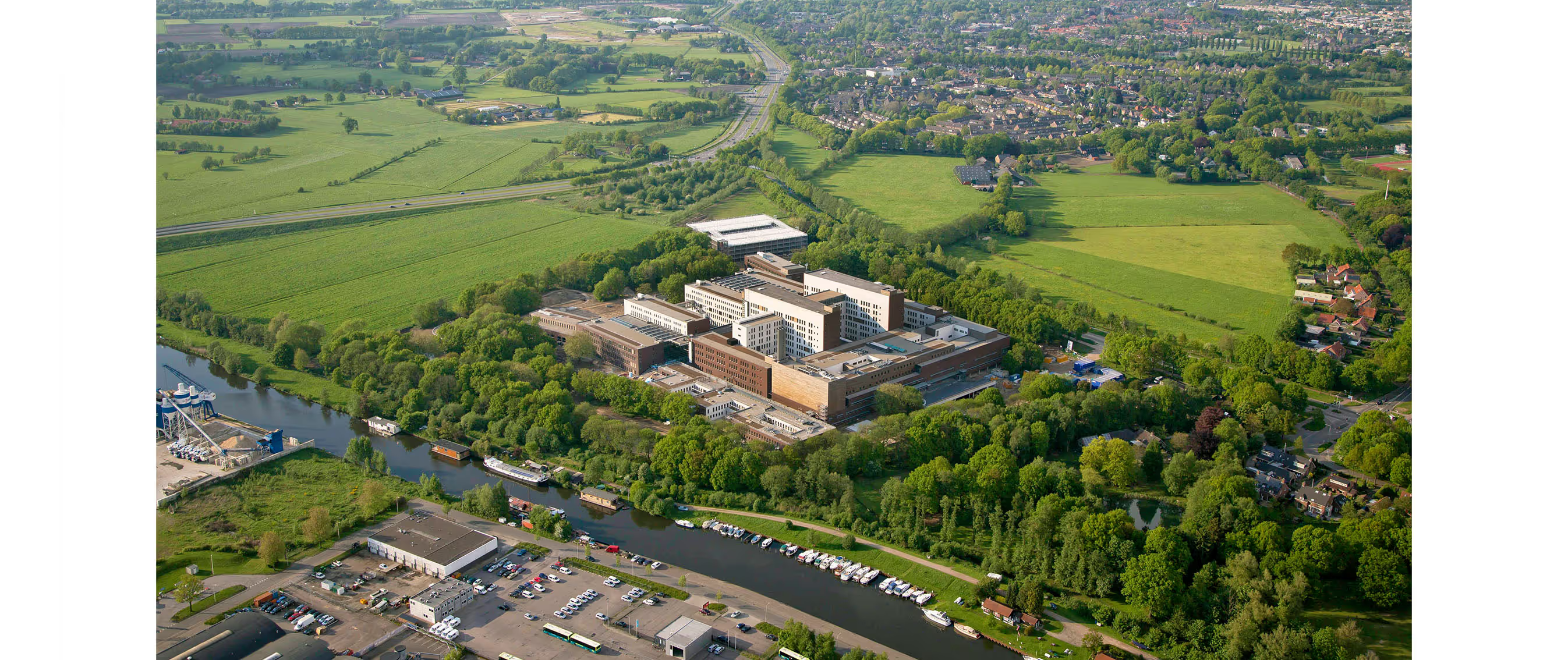
Meander is located in a park-like environment, on top of a mound. The building has an open plan, with different wings for the various medical departments - the Hotfloors, Nursing Departments, Outpatient Clinics and Day Treatments - to ensure that the huge complex does not look like a closed bastion, but is open in the landscape.
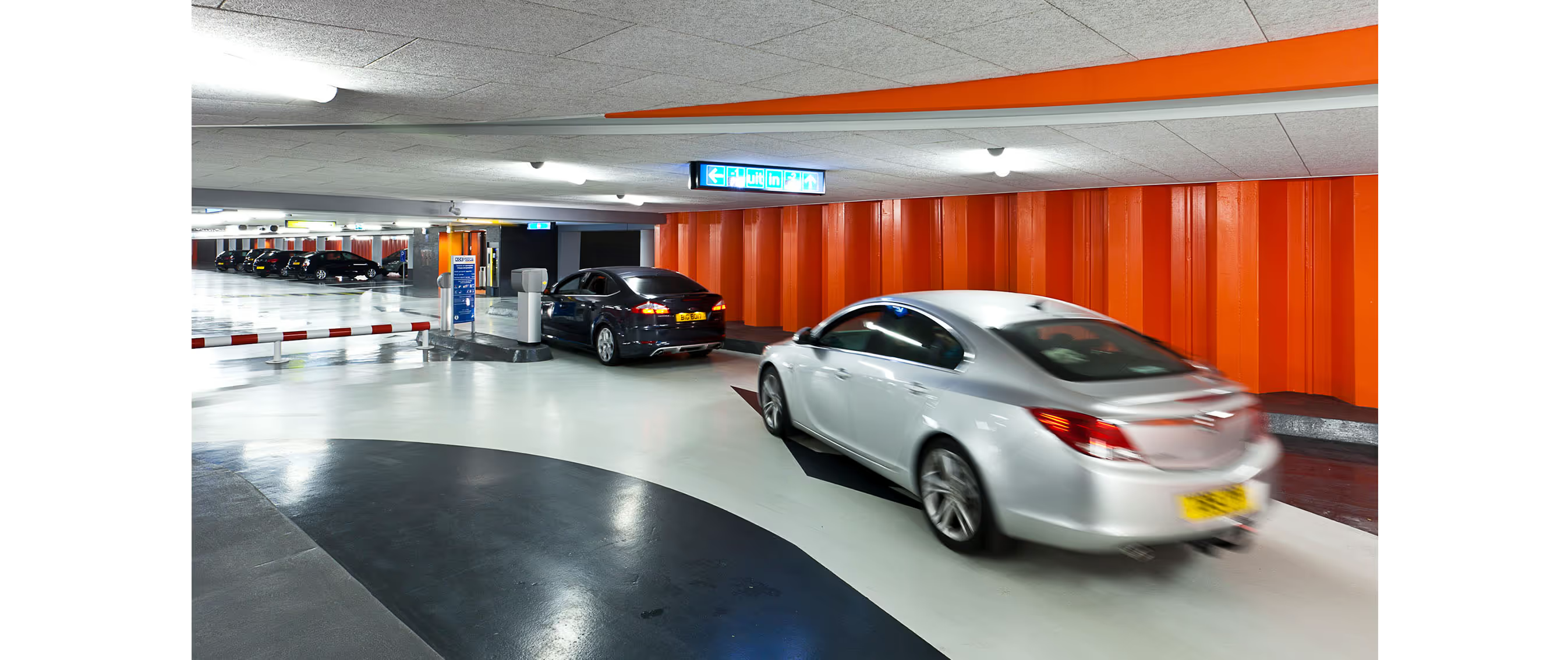
When you arrive at the Meander, you don't see the usual sea of cars or parking garages, but a building that is surrounded by nature. This is because parking in the mound, at ground level, has been solved; this is how we make space for nature and people's well-being.
Social spaces connect the building
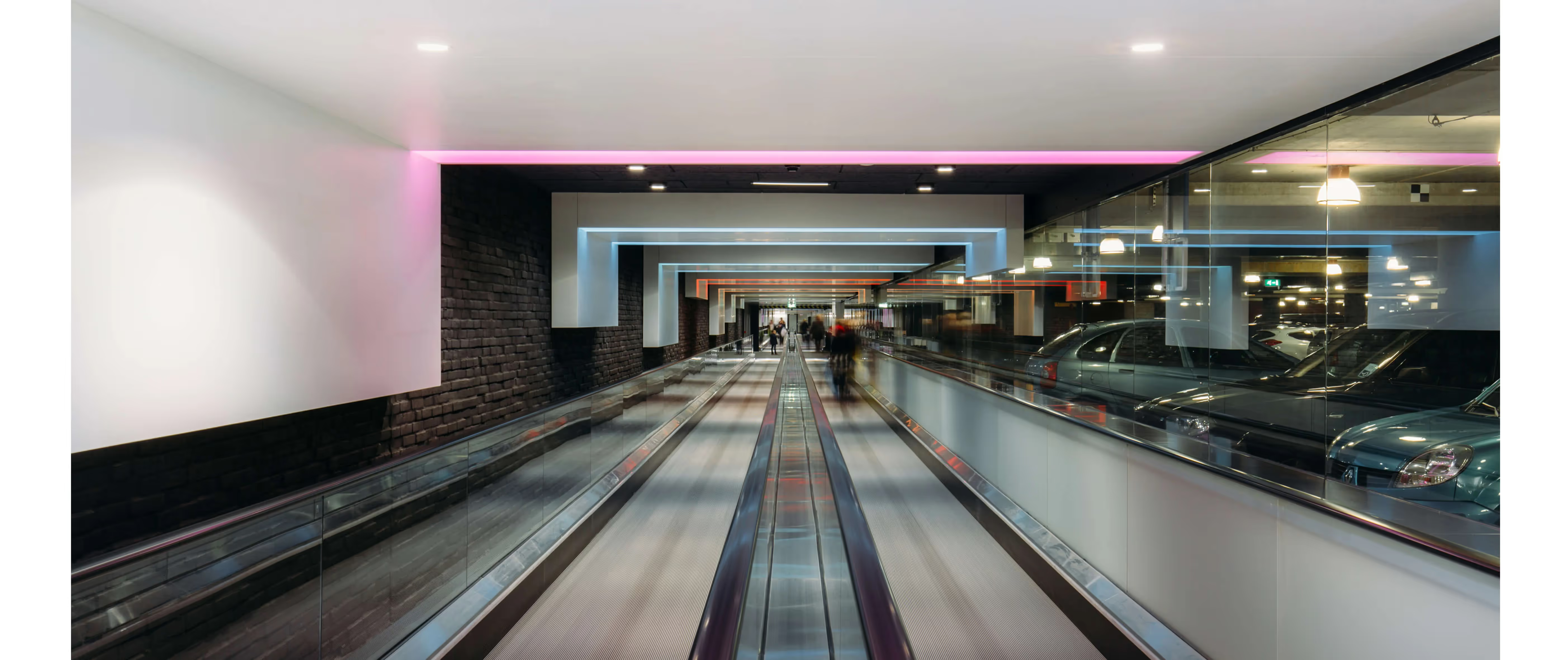
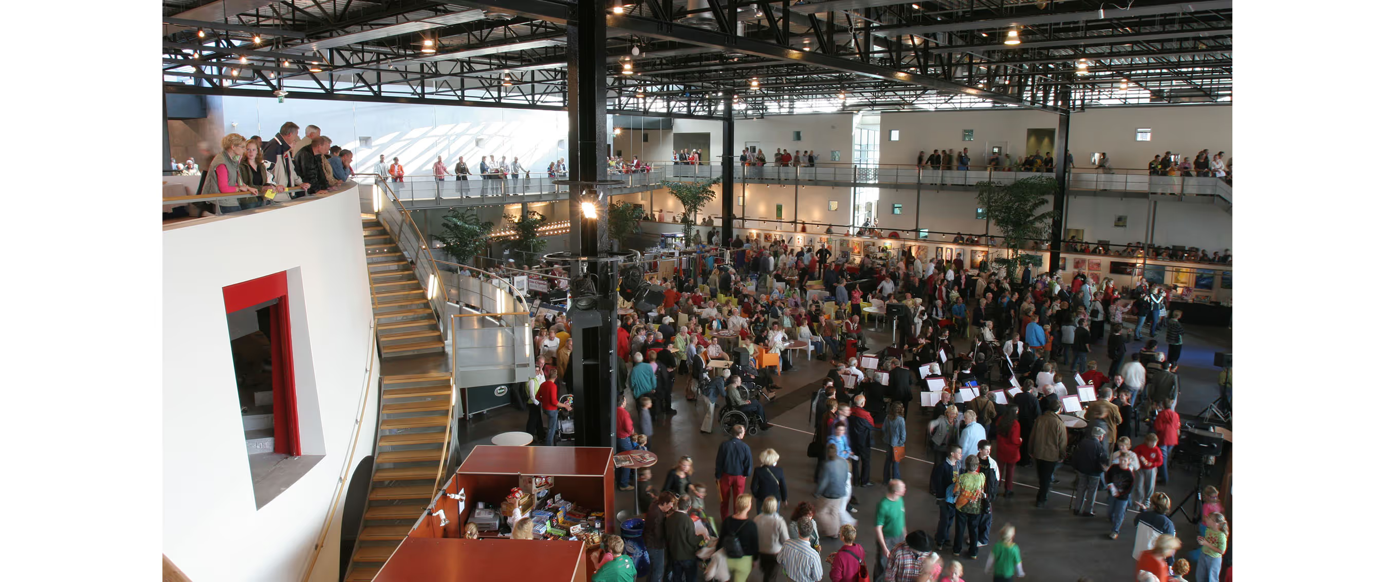
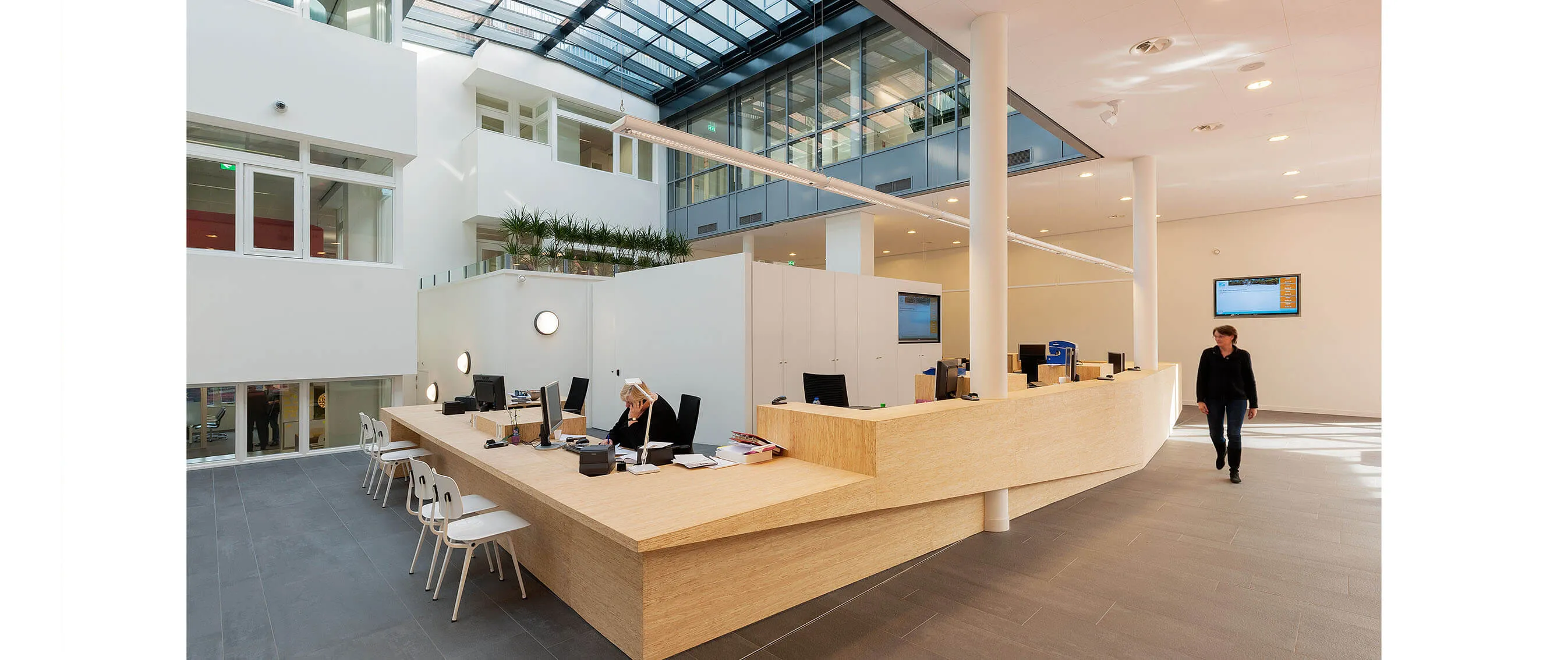
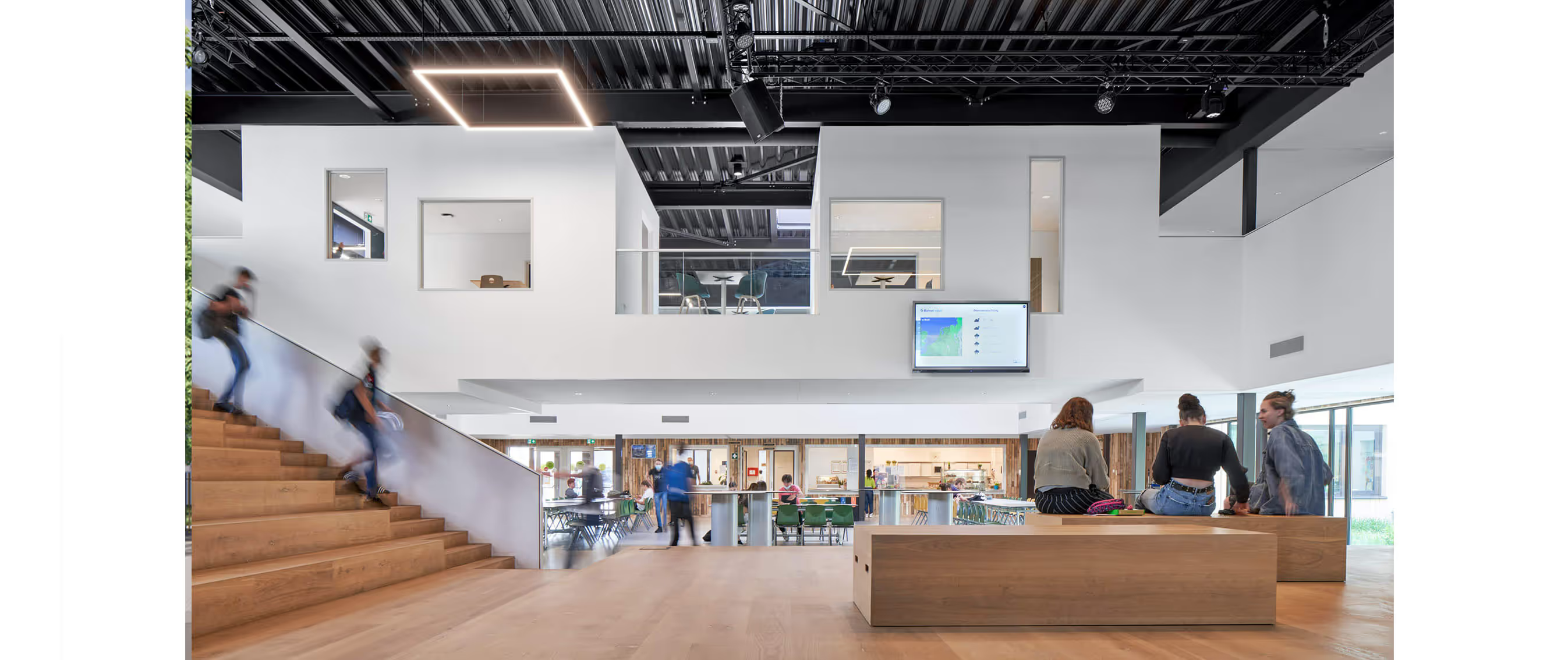
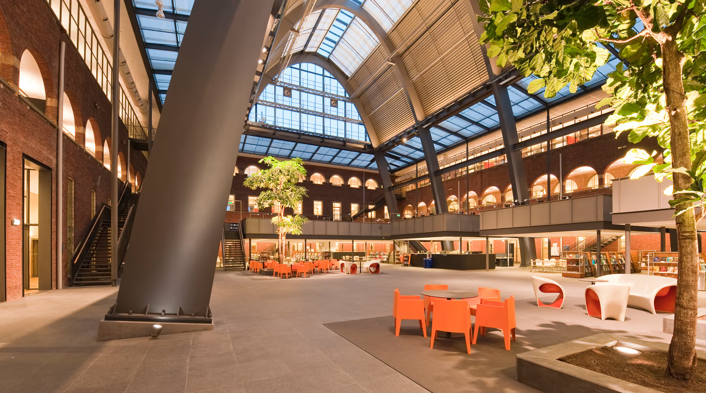
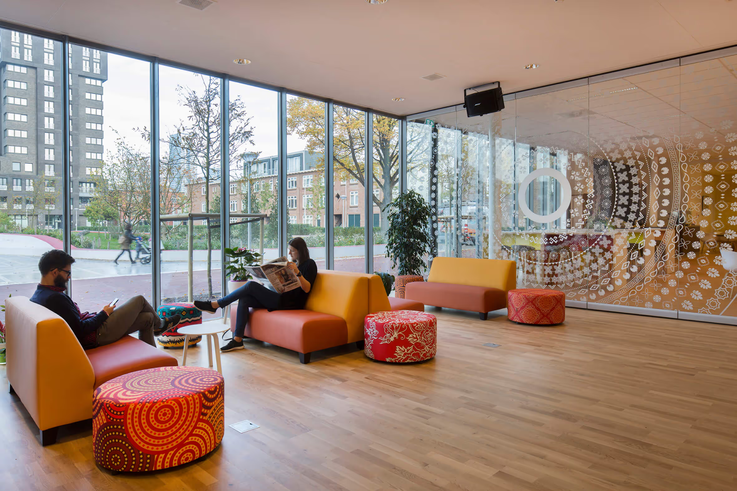
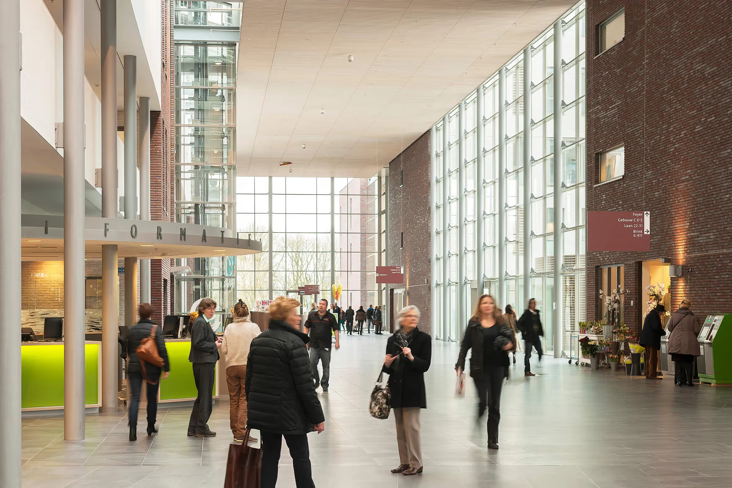
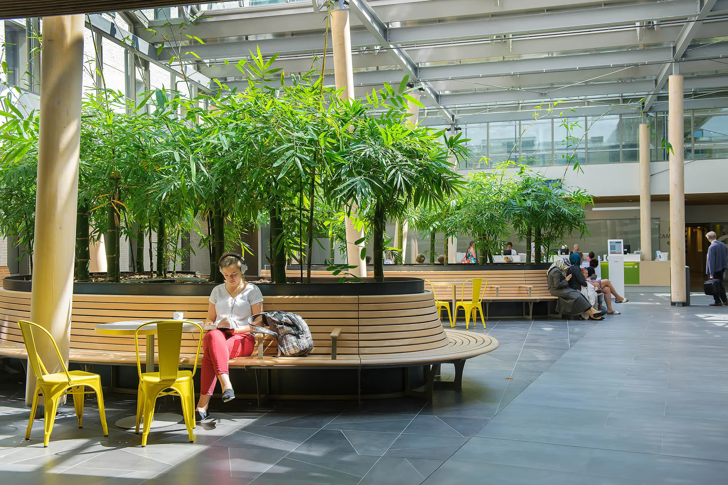
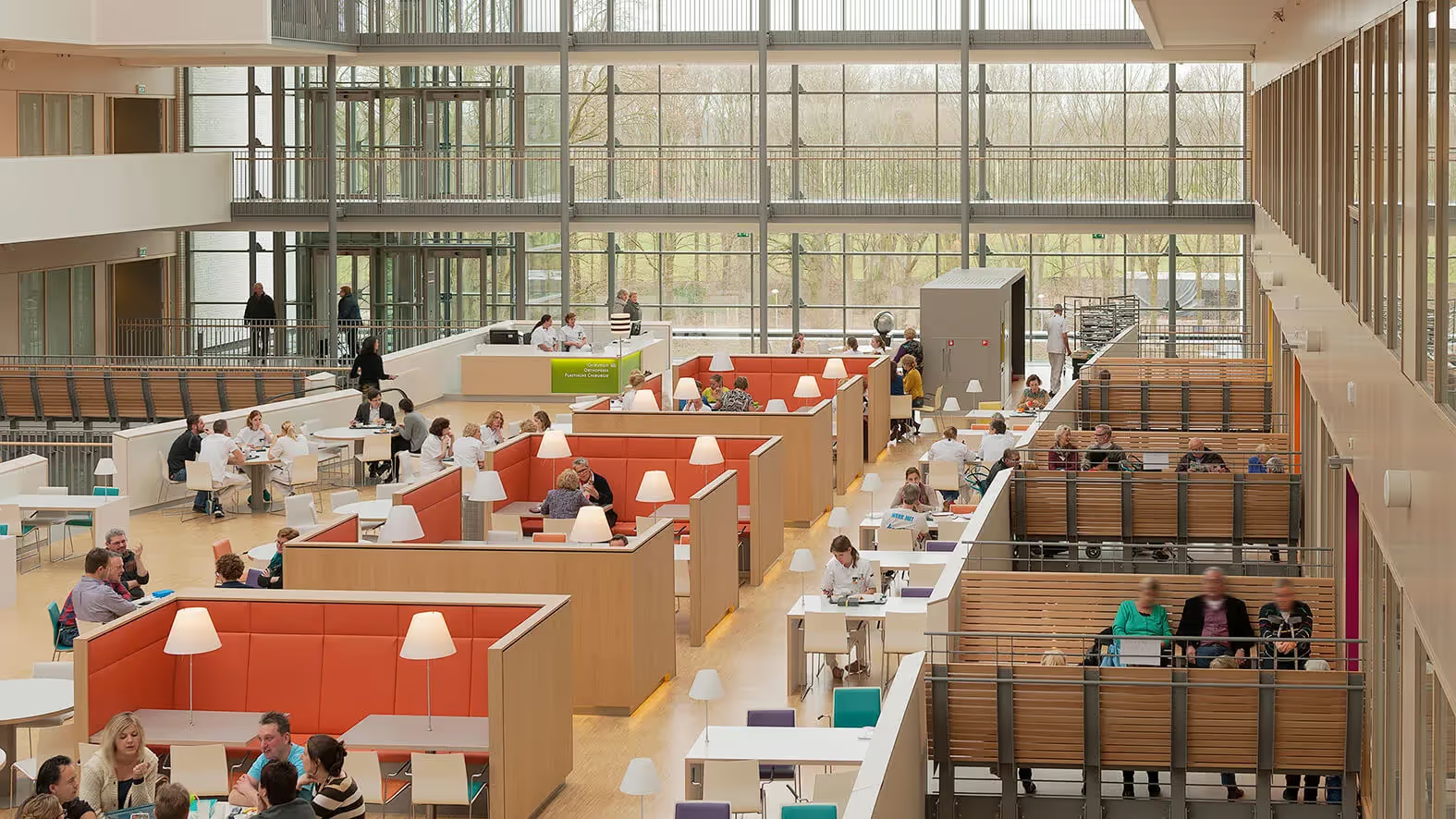
The hospital's wayfinding is set up around four public spaces, each with its own character: De Laan, de Brink, the Orangery and the Foyer. De Laan is the central axis of Meander, the backbone where people enter and find their way through the building. This is where the main pedestrian entrance is located, while visitors arriving by car come up directly by escalator, in the heart of the complex. There are glass-covered courtyards on either side of De Laan, all of which also have a social function: the Brink, where people can eat in the restaurant, the Orangery, with the pharmacy, and the Foyer, where events can be organized in and around the auditorium; all these courtyards also serve as informal waiting areas for visitors to the Polyclinics at the same time. From these four public areas, all functions in the hospital can be reached - the so-called “1-door principle” - so that the wayfinding in the building is clear, recognisable & easy.
A hospital tailored to people
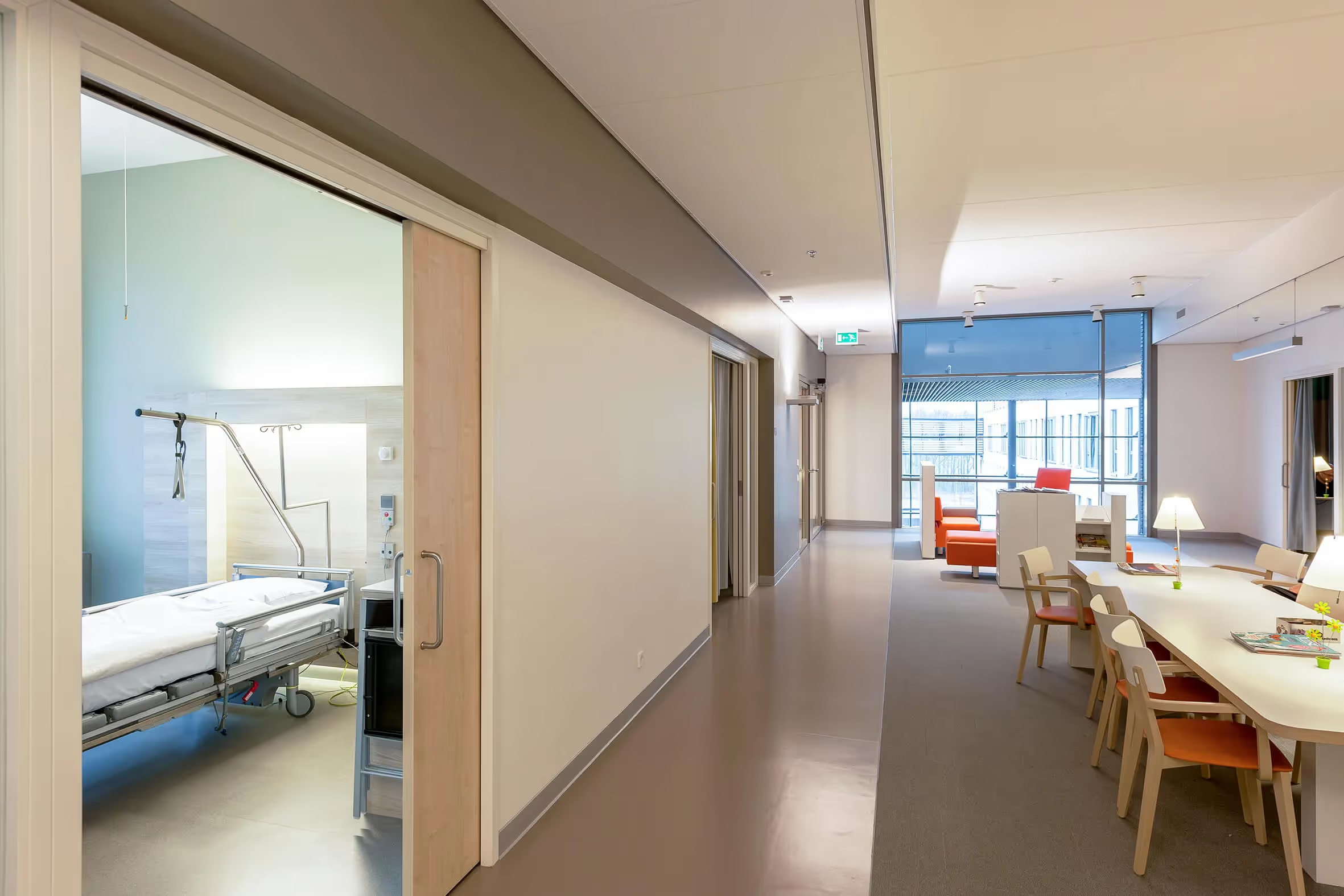
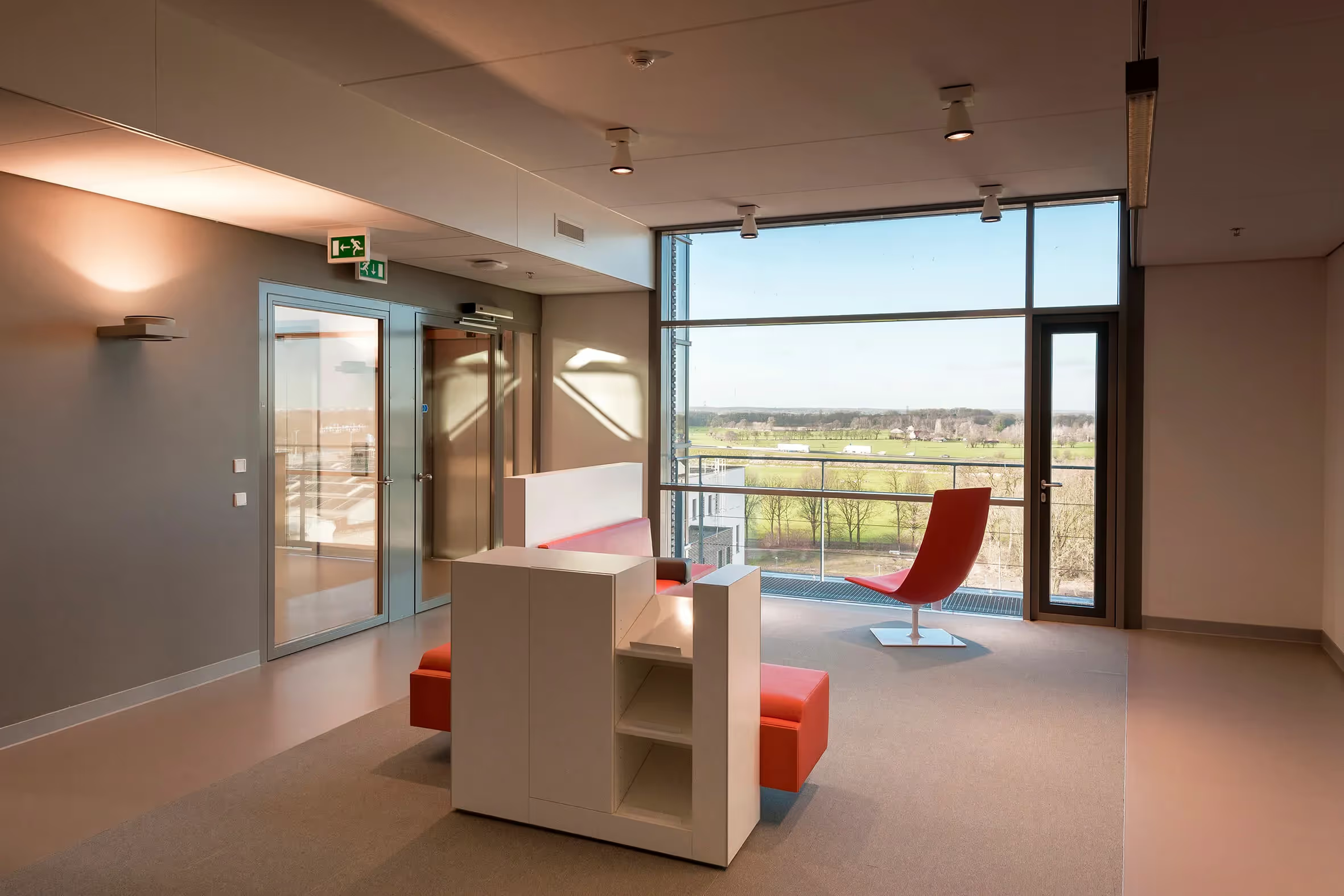
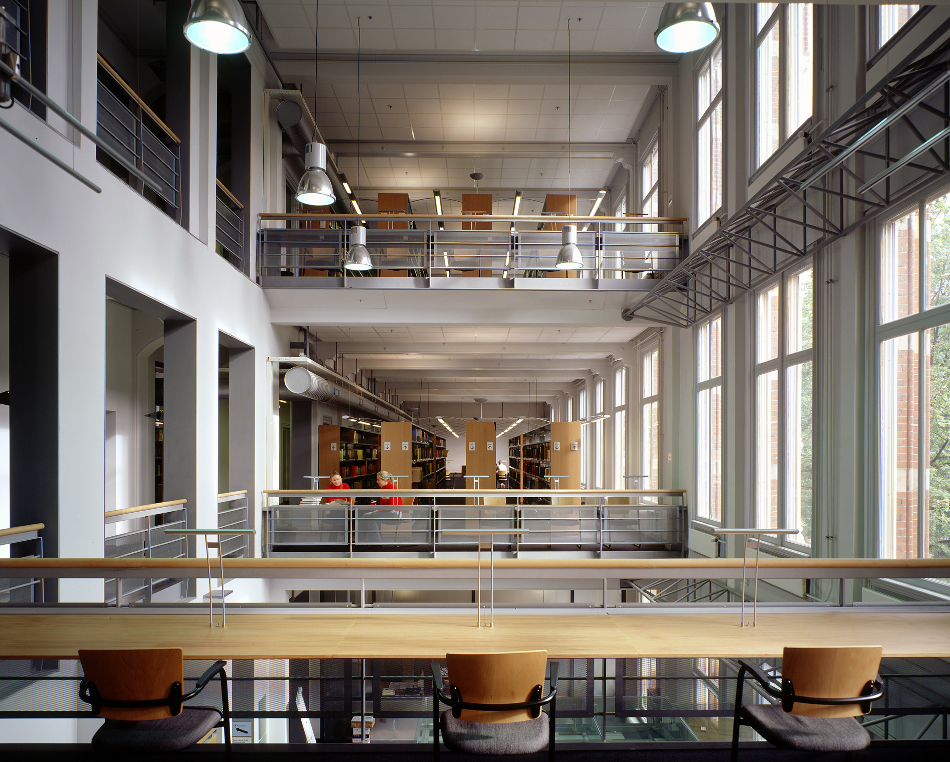
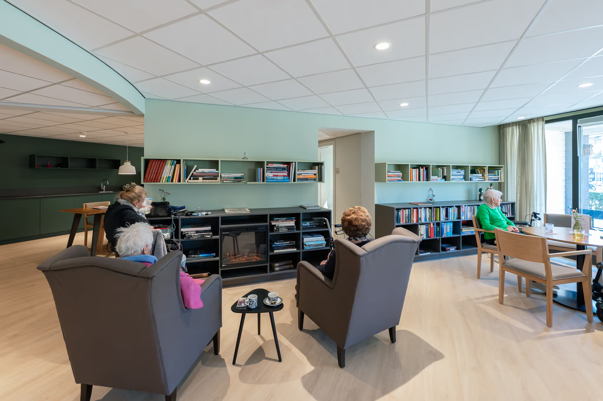
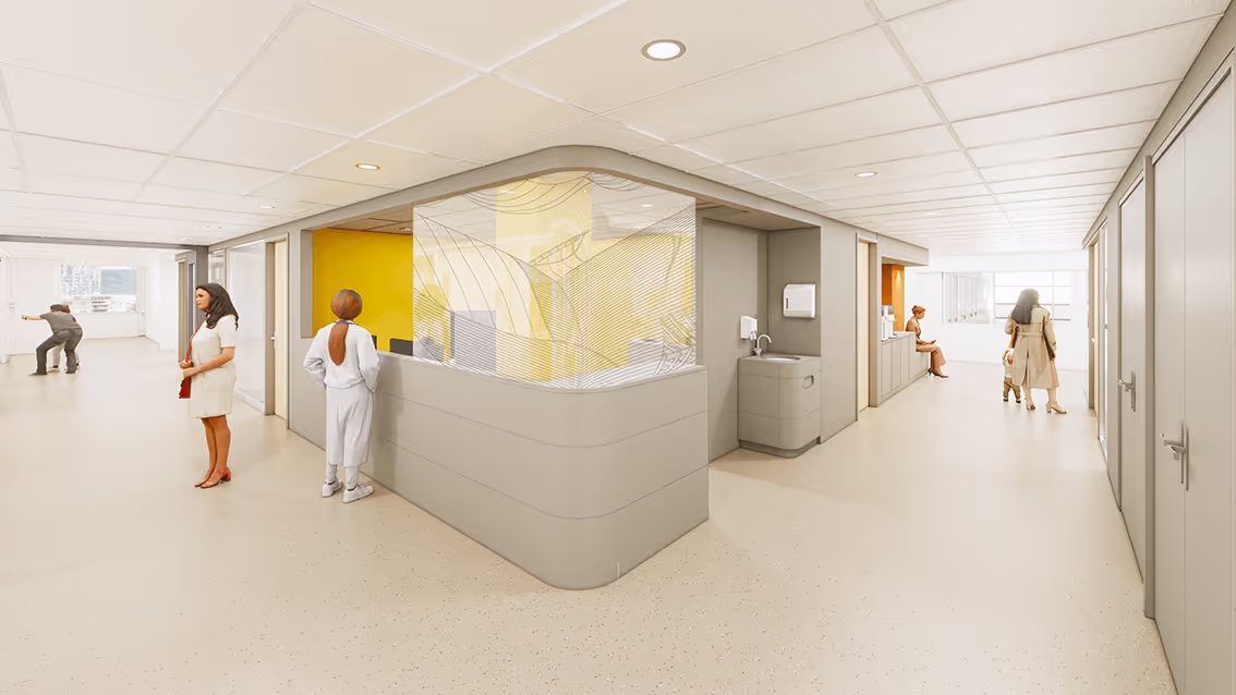
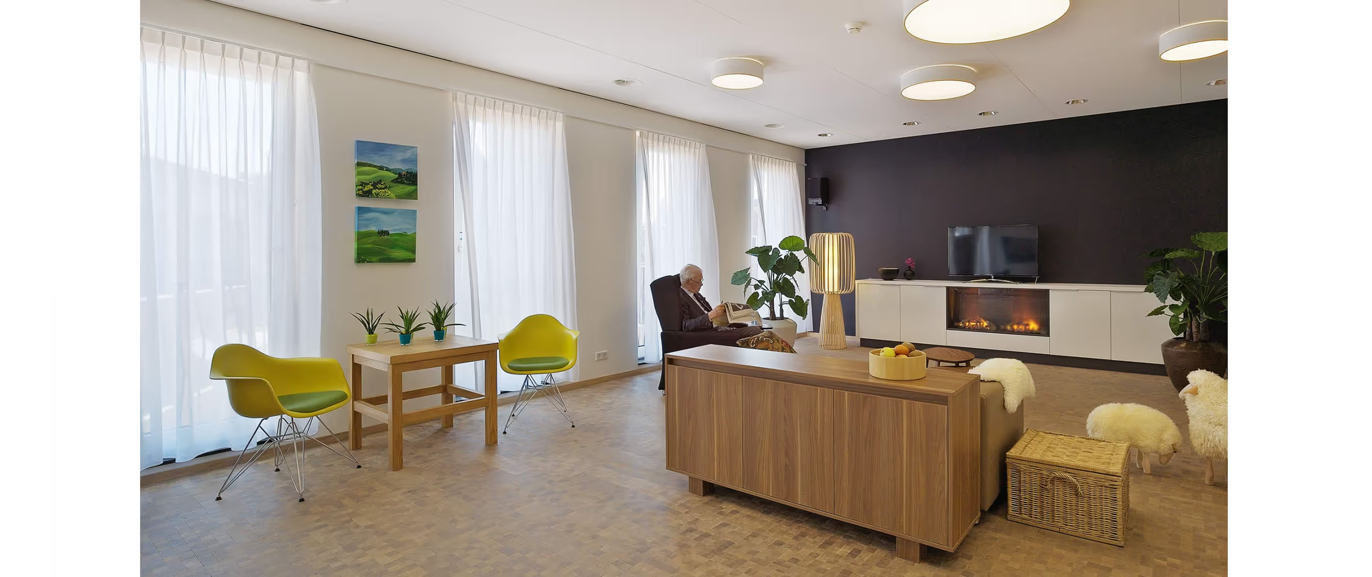
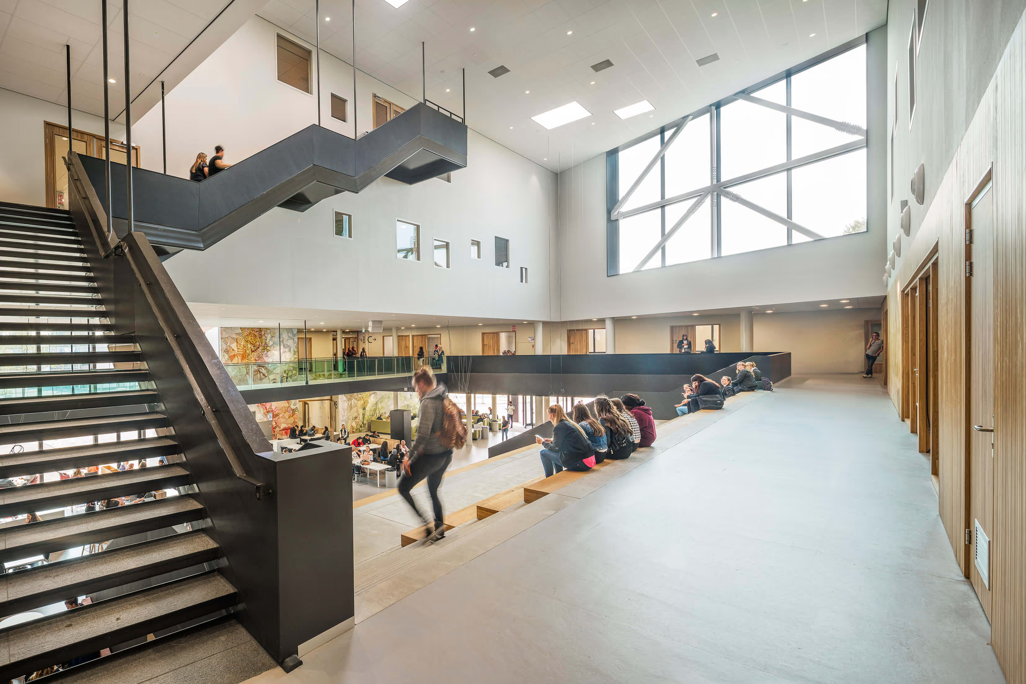
A hospital is often a stressful environment. That is precisely why good wayfinding is important, and that is why we wanted to design “humane” spaces where people can relax through the layout and design — something that contributes to the healing process of patients. Daylight, a sense of orientation and a view of the landscape play an important role in this. That is why we have created open spaces throughout the complex, so that the landscape is visible deep into the building; daylight also penetrates so deeply into the building. At the same time, the view of the outside world also makes it easier for people to orientate themselves in the maze-like, technical environment that a hospital often is.

The medical machine
At the same time, a hospital is also a “medical machine” that must function properly. That's why we paid a lot of attention to the organization of the building. Broadly speaking, there are three zones: a high-tech wing with the Hotfloors (operating rooms, Internsive Care, Coronary Care Unit and assistive technology) and facility areas; a middle technical wing for the Clinic, with nursing wards and day treatment; and a low-technical wing, where the Outpatient Clinics and office spaces are located. At the level of the parking garage, there is a logistical ring for staff, connecting the three wings. Without the visitor or patient noticing, the building can be supplied 24 hours a day.
Patient privacy
A separate connection zone has also been created between the Hotfloors and the Clinic, on the second floor and across the two wings, for medical staff, which is used, among other things, for patient transport (“bed transport”) to and from the operating rooms. This zone - like the Hotfloors themselves - is deliberately not part of the public spaces, and is not accessible to visitors and other patients; they use De Laan, which offers access to the wing with the nursing wards and that with the POLIs; there is deliberately no bed transport here. This is a very well-considered choice, because it is unpleasant for patients who are being transported and, at the same time, not to confront visitors with the turmoil associated with the hospital machine.

An appropriate and patient-centered design
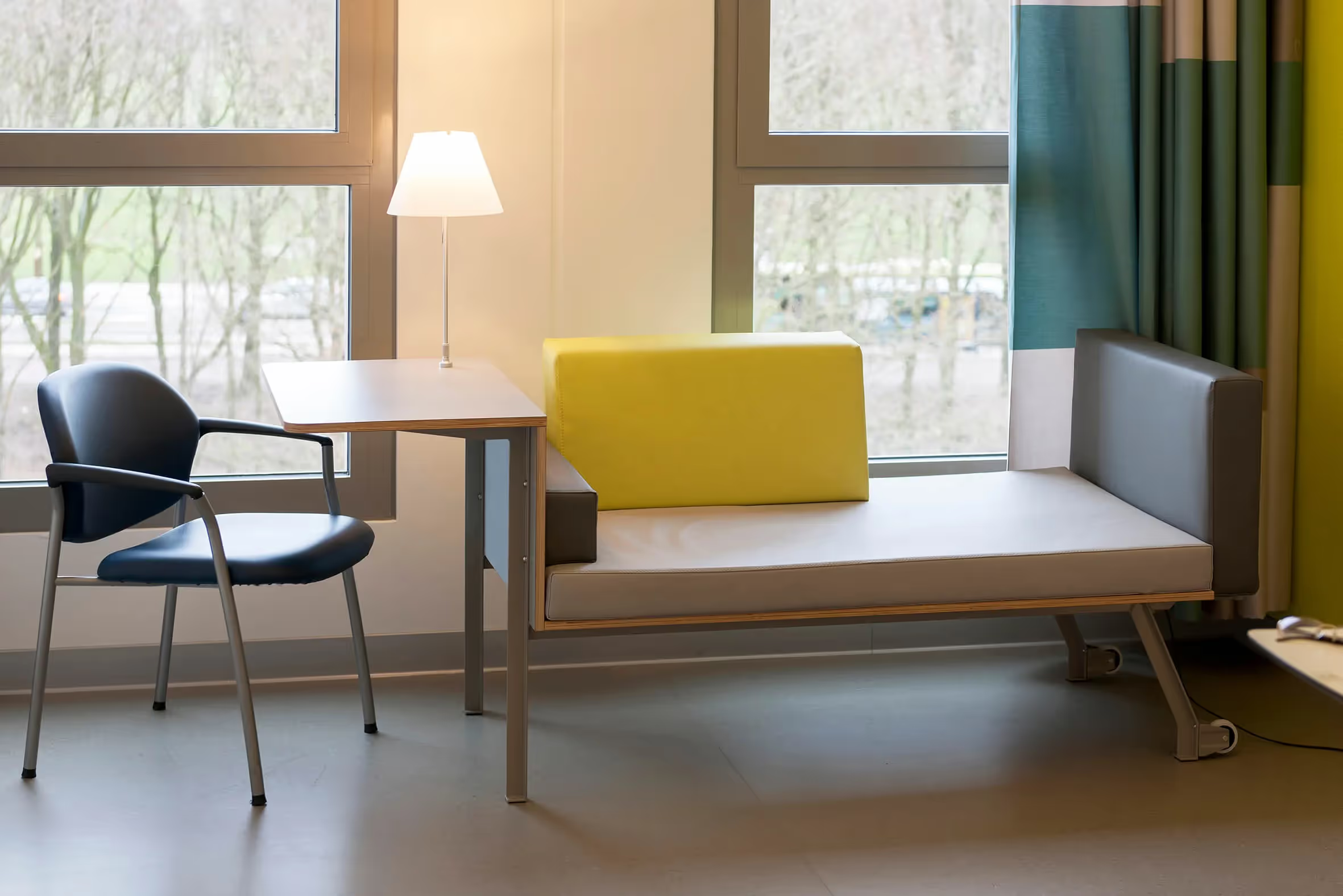
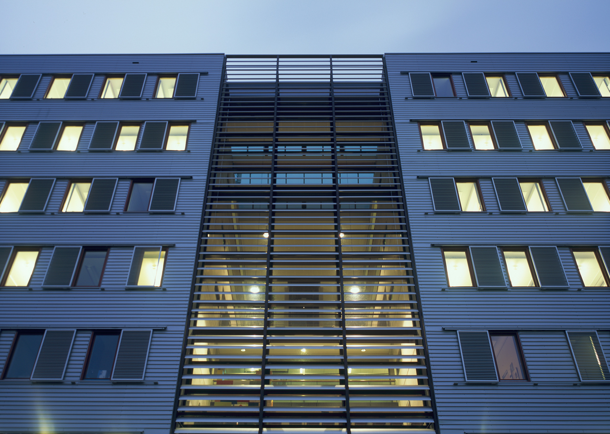
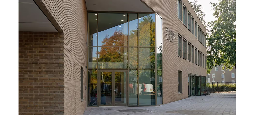
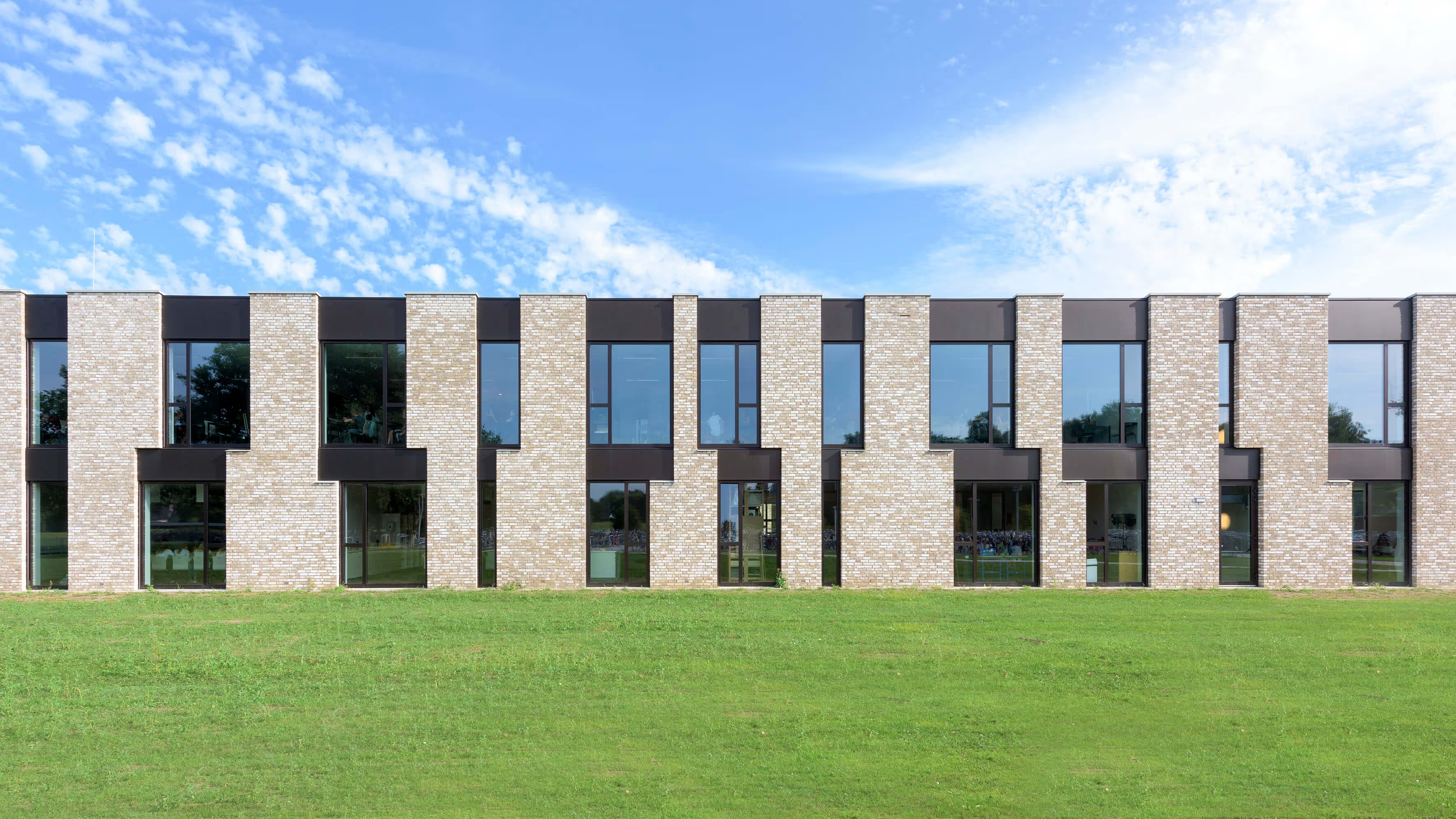
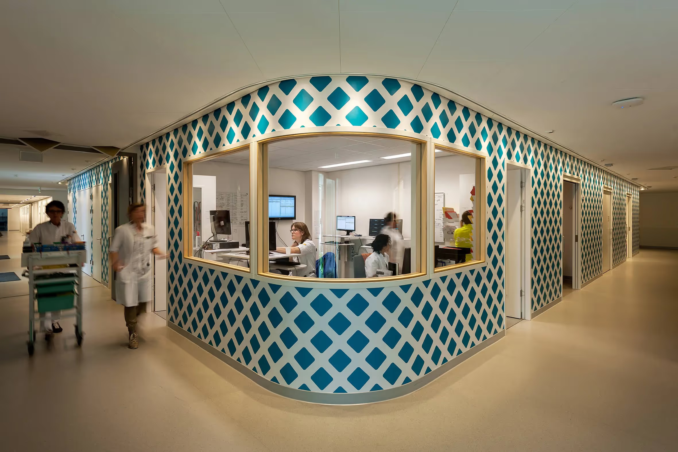
The starting point of the exterior design was that each wing was given a finish that matched the location and use: for example, reddish brown stone was used for the exterior facades that border the park, so that the building blends into the landscape. Inside the patios and the spaces between the buildings, we opted for a white brick, so that daylight is optimally reflected. The interior of the Meander Medical Center is designed as much as possible from the patient's healing process: a relaxing environment where everything contributes to recovery, a “healing environment”. That is why private rooms were deliberately chosen for all patients.
Sustainability and flexibility
The Meander Medical Center's sustainability ambitions were high, and with results: thanks to the careful choice of natural materials and future-proof construction techniques, the building received a GreenCalc+ label B with a score of 233. In addition, the complex is flexible and easy to expand. The nursing wards and outpatient clinics have a 'conventional' building structure and thus offer flexibility for the future. The Hotfloors, on the other hand, are custom-designed for the hospital and are fixed in their own location within the building - but the wing with the ORs can be extended into the park. The fact that this set-up works is evident from the fact that the psychiatric department was transformed into a center for oncological care in 2021 and the Meander was expanded in 2024 with an additional wing with Hotfloors, a Coronary Care Unit and an Eye Day Center — designed by atelier PRO.
